Archive for Uncategorized

Here We Go Again

The author’s roll-aboard stands stoically in a hotel room,
awaiting its next journey.


February 19, 2020

Son of a bitch. Here we go again with “rollerboard,” that odious, etymologically crippled term for wheeled luggage.

Originally I blamed the novelist Gary Shteyngart for mainstreaming this dismal word, scattering it throughout the opening pages of his latest book, Lake Success. Now, in a truly distressing blow, I discover that Jonathan Franzen — Jonathan Franzen! — is perhaps equally responsible. The word appears multiple times in “Missing,” one of the essays in Franzen’s 2018 collection, The End of the End of the Earth.

The End is a heartbreaking enough book to start with. The author and I share a love of birds (the feathered kind if not the metal ones) and I was having a tough time getting through his sober chronicle of all the depraved things humans are doing to ensure their destruction. To then stumble across “rollerboard” made it all a bit much. I had the same reaction as I did reading Lake Success, which was to fling the book in a corner and go pout.

Both books were published in the fall of 2018, which clearly points to a conspiracy of some kind. And both of my favorite authors having helped to normalize this lazy bastardization is something I take personally. I feel betrayed!

Of course, it seems pretty likely that “rollerboard” was accepted usage before Franzen or Shteyngart ran with it. It’s tough to imagine two authors of such eminence getting a non-word past their editors and fact-checkers. When and how the term entered the lexicon I can’t say for sure. If I weren’t so exasperated and afraid of what I might find, I’d look it up.

The problem is that “rollerboard” (sometimes presented as “roller board”) is a misconstruction. It’s a mis-hearing of the term “roll-aboard.” This is wheeled luggage we’re talking about. You roll it aboard. “Roll-aboard” (or “rollaboard”) makes sense not only logically and grammatically, but has a pretty sound to it as well. “Rollerboard” is something unrelated, that in no way evokes or describes luggage. A board with wheels on it? I picture a plank, or a surfboard, with wheels like roller skates.

Yes I know, this is the evolution of language. Our conversations, you’ll point out, are jammed with words that have come into general use through laziness or distortion. “Rollerboard,” meanwhile, has just enough of the right sound and meaning to be plausible, sort of.

I sense defeat. And there are, I suppose, worse words to pick on.


Related stories:

TWO NEW BOOKS BY SHTEYNGART AND FRANZEN
DAMN THE SPINNER BAG
ET TU, GARY?


Leave a Comment

Arrivederci, Alitalia

October 18, 2021

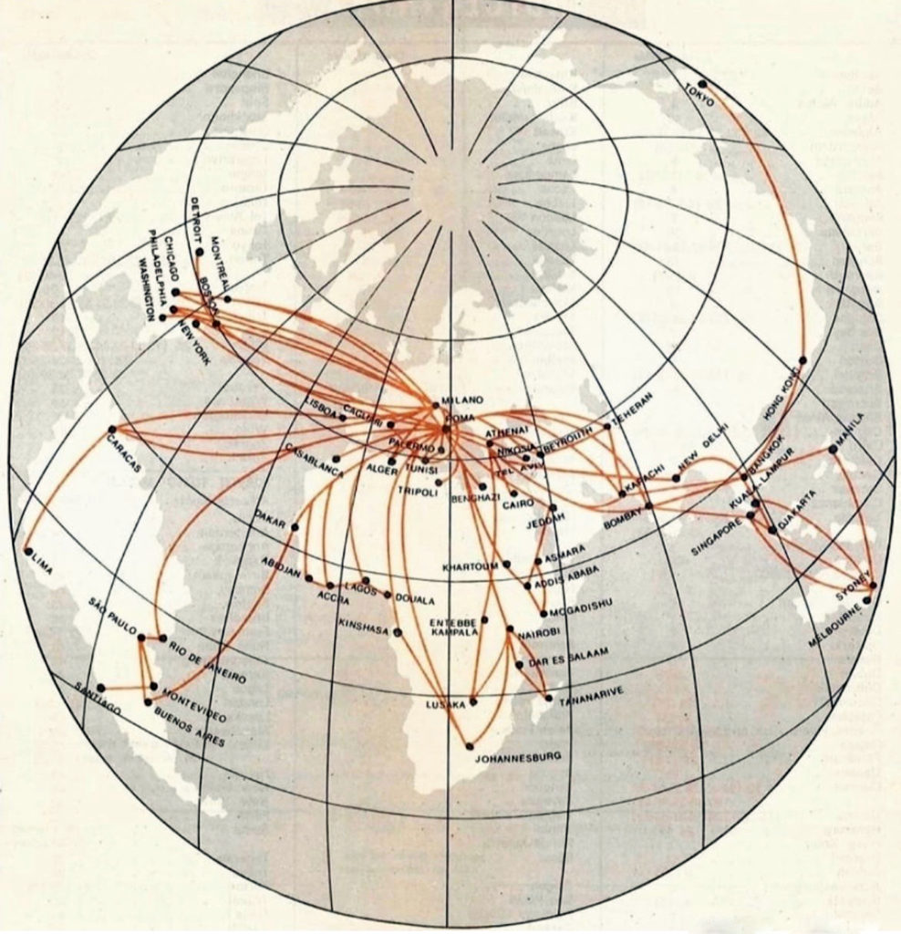
LATE LAST WEEK, Alitalia operated its final flight and officially ceased to exist. For seventy-four years, Linee Aeree Italiane S.p.A., as it was formally known, had carried Popes, kings, despots, movie stars, and tens of millions of tourists, across a network that once spanned six continents.

Its demise was both a complete surprise and not the least bit shocking. The airline spent its existence in a more or less permanent state of distress, yet it always managed to pull through, be it from a government bailout, cash from a foreign partner, or some combination. Not this time. Thus, one of the most recognized names in the industry has disappeared, joining the likes of Swissair, Sabena, Malev, and the other classic European carriers that have vanished.

Alitalia long-haul routes in the early 1970s

A new, government-owned entity, Italia Trasport Aereo (ITA) is taking its place. With the whole thing being schemed out in advance, it’s more of a reincorporation — a reinvention — than a shut-down in the traditional sense, with ITA absorbing most of Alitalia’s assets and employees. Could they not have done this without totally dissolving such a well-known brand? Though, maybe, having left such a legacy of struggle, that was the point.

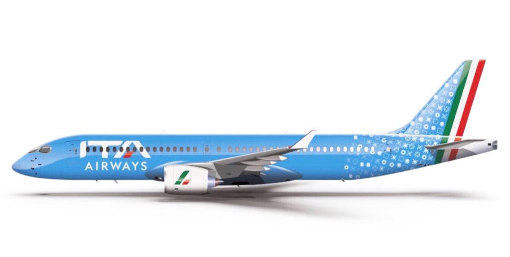
The transition has so far been messy. The ITA website and mobile app have been plagued with problems, and the new airline has struggled to receive U.S. government approval to operate here. While they sort things out, let’s do the fun thing and have a look at the identity they’ve come up with…

I can’t get my head around this one. It’s not ugly so much as confusing. Or maybe it’s confusing and ugly. The colors and styles are so mis-matched as to seem almost arbitrary — a big, weird, non-sequitur. The patterned tail motif reminds me of a doily, or the kind of tablecloth you’d find in certain Italian restaurants. To replace Alitalia’s iconic “A” emblem, worn since the ’70s, they needed to step up. They didn’t.

About the only positive thing is the ITA logo. The typeface is distinctive and elegant in an old-school sort of way. (In fact it’s almost too old-school, reminiscent of a made-up airline from a movie.) And, smartly, they’ve kept the red, white and green, which is a nod to Alitalia and the colors of the flag. On the airplane, however, the blue background requires the letters to be rendered only in white, so the whole effect is lost.

In an annoying last-minute decision, they went and added “Airways” into the carrier’s name. “ITA,” just by itself, was smoother, simpler, and perfectly adequate. But no, they had to jam “Airways” in there, because apparently passengers are stupid and might forget that it’s an airline. Loosely translated, the carrier is now called “Italian Air Transport Airways.”

With or without the extra word, it lacks the poetry of “Alitalia.” Still, it’s better than “Italian Air,” “Prego,” or any of several other garish possibilities. We may have dodged a bullet there.

Grade: D


Alitalia photo from author’s postcard collection.

Related Stories:

ART OF A LOGO
THE MANGLING OF AIRLINE NAMES
THE NIGHTMARE CONTINUES

Leave a Comment

R.I.P. William Langewiesche

June 18, 2025

WILLIAM LANGEWIESCHE, pilot and celebrated journalist, has passed away at age 70.

Langewiesche’s articles covered a lot of ground, from the 9/11 attacks to the Iraq War to nuclear proliferation. But it’s his air crash chronicles, which appeared in Vanity Fair, the Atlantic, and the New York Times, that to me are the most unforgettable. His accounts of EgyptAir 990, the 2006 midair collision over the Amazon, and the disappearance of MH370, among others, are the best examples of aviation journalism I’ve ever read.

William was a National Magazine Awards finalist eight times, and held a degree in cultural anthropology from Stanford. Not your typical reporter or your typical aviation nerd. He was on another level. In an era of “content creation” and slapdash news coverage, his meticulously researched stories and vivid narrative style will be sorely missed. Nobody did it better.

I never met William, but we exchanged emails and phone calls many times, and he was kind enough to contribute a blurb to my book.

His father was Wolfgang Langewiesche, author of the seminal art-of-flying primer, “Stick and Rudder,” which has been in print since 1944.


Related Story:
PLANE and PILOT

Comments (1)

Safety Video Hell

November 5, 2019

I’ve pretty much had it with the safety demo arms race: the noise, the gimmickry, the hoary attempts at humor.

The competition has been tight in this mad contest, with various carriers attempting to out-cute one another, setting their briefings to music, using animation, adding celebrity cameos, and so on. Some months ago, Virgin America brought us this unforgettable, five-minute fever-dream. We also had this, courtesy of Taiwan’s Eva Air. Could anything be worse?

Oh, yes. In what has to be the most excruciating of all the many efforts, comes the latest from Qatar Airways. Yes, we know, the world loves football. Which in no way excuses the skin-crawling awfulness of this production. It’s lifeless, aimless, and very, very long. We have a winner.

There’s no denying that airline safety briefings are dull. However, setting all of this ornamental gibberish to music or humor, while it might generate a little publicity and a bit of social media buzz, does not make it more compelling. It also undermines the purpose of the briefing in the first place. If safety is really the point, the briefing should be taken seriously. Here, you’re watching it for fun — wow, like, that’s so edgy and interesting and cool — rather than to learn something that could save your life. The informational aspects of it, many of which are important, are buried in the noise.

Here’s a better idea: shrink it. The reason people don’t pay attention to the safety demos is because they are too damn long — a kind of legal fine print come to life. They do contain some important and useful info, but it’s so layered in babble that people tune out and ignore the entire thing. With a pair of shears and some common sense, most of this ornamental gibberish could be trimmed away to create a lucid oration that passengers might actually listen to, and remember something that could save their lives.

Hit the bullet points and be done with it. No pre-flight demo, be it a video or the old-fashioned “live” version, should be more than about ninety seconds long.

And, of all the blather that is crammed into the typical briefing, one of the most potentially valuable pieces of instruction is frequently glossed over or is missing entirely: a warning that passengers leave their carry-on items behind during emergency evacuation. In the past few years, we’ve seen several runway evacuations during which passengers came down the escape slides with their roll-aboard bags and other heavy items. I cannot overemphasize how dangerous this is. This should be a bold-print, high-emphasis item in any briefing. Instead we get complicated, twenty-step directions on how to use a lifejacket — as if anybody might remember them. I could also mention that while neither is likely, a runway evacuation is a lot more likely than a water landing.

Flying is a noisy enough experience as it is, and airline passengers are already instructed, talked to, and yelled at enough, from the barrage of public address announcements in the terminals to the various on-board spiels. We don’t also need five minutes of singing and ridiculous performance art. I’m all for airlines thinking outside the box and getting creative. We need more of that, frankly. Just not like this.


Comments (1)

The Rolling Report Card

AS MY REGULARS know, critiquing airline liveries is my favorite thing in the world. Especially the ugly ones, which nowadays is pretty much all of them.

From now on, rather than grading them individually in separate articles, we’ll compile them here, one at a time. This post will act as a sort of rolling report card, updated with every new reveal.


AURORA OVERLOAD

Beginning next year, Alaska Airlines will launch flights to Iceland and the U.K. — the Seattle-based carrier’s latest foray into the long-haul realm. As part of the celebration, it’s painting up some 787s in a flashy new scheme. “Our new 787 exterior embodies Alaska’s transition to a global airline with beauty, grace and a nod to our heritage,” says the company CEO Ben Minicucci.

Color me bored. It’s not the ugliest thing I’ve ever seen, but the aurora theme is overdone (see Icelandair, below) and was all too predictable. As for the “heritage” invoked by Mr. Minicucci, the longstanding Alaska tail, starring the parka-wearing Inuk man, is a classic of American airline branding and should absolutely, no question, be up there for the 2026 route launches — an iconic emissary to the carrier’s newest outposts. Instead we get some neon nonsense. It looks like someone spilled anti-freeze across the back of the plane.

GRADE: D


ITA RECONSIDERED

A few years back, ITA Airways became the Italian flag carrier, replacing the chronically troubled Alitalia, which had been in and out of solvency for decades. I wasn’t a fan of ITA’s livery. “The colors and styles are so mis-matched as to seem almost arbitrary,” I wrote in an earlier post. “The patterned tail motif reminds me of a doily, or the kind of tablecloth you’ll find in certain Italian restaurants.”

That part about the tail is still true, but overall the look has grown on me. One thing you don’t notice in most photographs is the beautiful iridescence of the blue. And that mis-matching I decried isn’t so; there’s a sly synchronicity to the colors.

That blue, it turns out, is formally known as “Savoy Blue,” or “Italian Blue,” and has been associated with Italian royalty since the Middle Ages. It’s also the traditional color of the Italian national sports teams.

Indeed there’s an Italian-ness to it all, helped along, of course, by the Tricolore striping along the rudder. (The doily patterning is subtle enough not to steal the show.) It’s stylish, tasteful, and culturally apropos. Yet simple at the same time, as any good branding should be. My apologies for missing it the first time.

My gripe is no longer with the uniform, it’s with the name. Annoyingly, they went and added “Airways” to the carrier’s moniker. “ITA,” just by itself, was smoother, simpler, and perfectly adequate. But no, they had to jam “Airways” in there, because apparently everyone is stupid and might forget it’s an airline. They’ve even painted it on the fuselage, in a smaller typeface below the main titles, throwing off the livery’s balance (hence my B-plus grade instead of an A).

Loosely translated, the carrier is now called “Italian Air Transport Airways.” And with or without the extra word, it lacks the poetry of the old “Alitalia.”

ITA’s radio call-sign is “Itaro,” which is kinda sexy and wouldn’t be bad as a name on its own.

GRADE: B-plus


UP THE YIN YANG
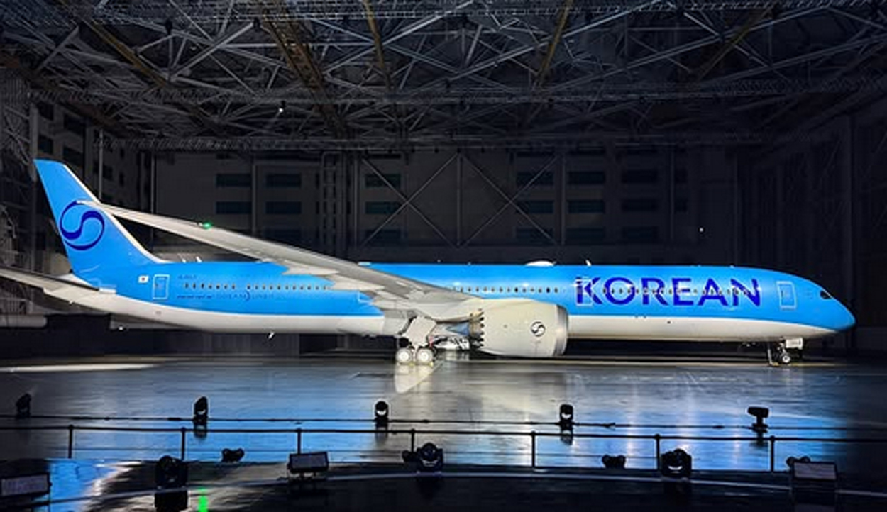
Korean Air has been making some buzz, unveiling its first brand refresh in three decades. And in doing so they win the “If It Ain’t Broke…” award for terrible decision-making.

The new look fails for two big reasons. First, it’s ugly. Or spiritless, maybe, is the better word. Second, there was no need for it; the scheme it replaces was among the industry’s best, a pleasant reprieve from the plague of all-white fuselages and lookalike swooshes.
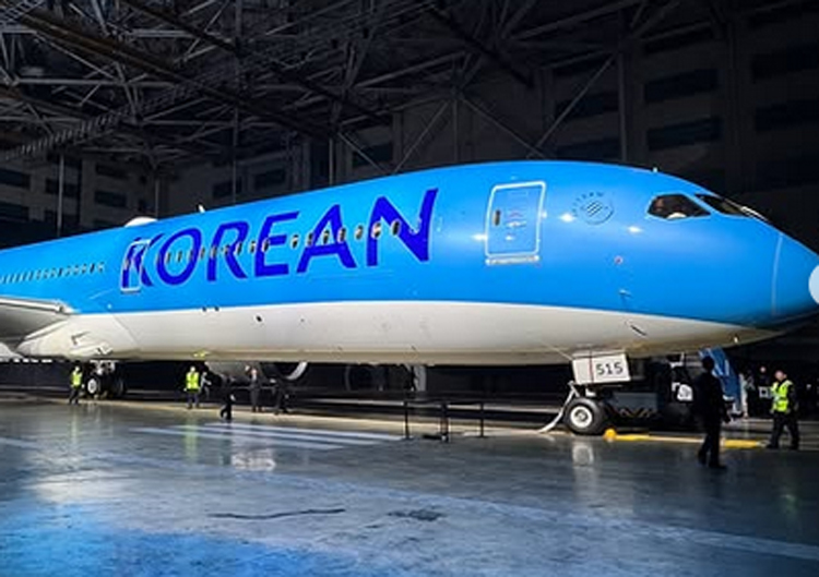
I don’t know which part irks me more: the boring typeface, the blank bottom, or the tail emblem, which is a neutered version of the one it replaces. The blue is pretty, but all in all it’s a livery without character. It looks like it was cooked up on a computer in about two minutes.

GRADE: D-plus


GOOFY GOLD
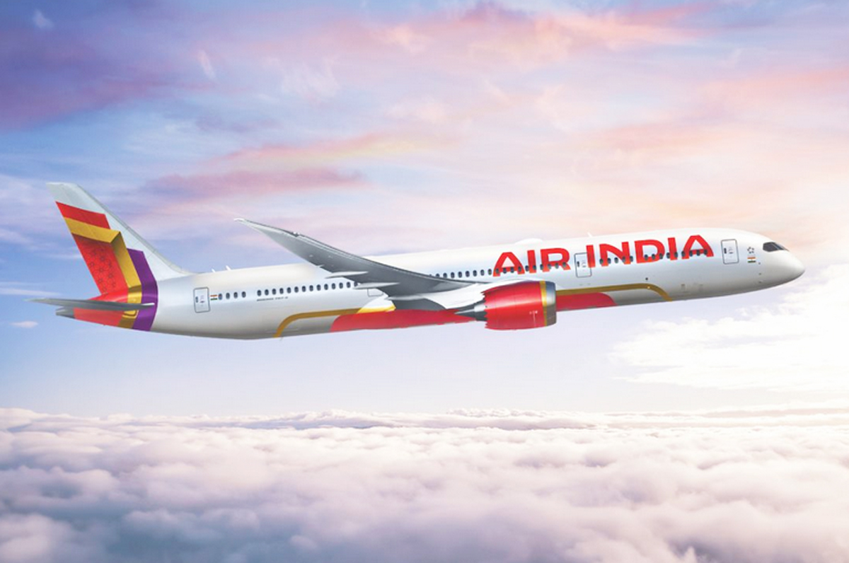
Air India was taken over not long about by the Tata Group. The new owners are expanding and hoping to establish the long-beleaguered carrier as a world-class brand. These sorts of reinventions are often accompanied, dangerously, by livery changes. To wit…

There’s a press release explaining all the meanings and symbolism here. It’s a brilliant self-parody. Someone asked ChatGPT to come up with a bullshit announcement full of pseudo-inspirational blather, and it happily obliged. “Purposeful and confident.” “Premium cues.” “Personality and storytelling.” It goes on like this.

Let’s keep it simpler. First of all, the lettering is too big. Billboard lettering is common these days, and Air India, like many others, crosses the line between assertive and overblown.  

Then we have the tail. Where do we start? The airline describes this weird-looking thing as a “hero signature window frame.”  Do we have any idea what this means? Heroes? Windows? What? I’m told the design is an evolution of the Rajasthani-style window decals that have heretofore been part of Air India’s livery for decades (do we dare call them iconic?). Possibly, but what most people will see is just a random, strangely angled pattern. The colors are pretty but the message is unintelligible. Neither does it work from a branding standpoint: it’s a pattern, not a logo, without any context or clarity. 

The element that really wrecks it all, though, is the gold accenting at the bottom. Specifically, the way it detaches from the red and goes off on its own, fore and aft. The red field, with the Air India name across the lower fuselage, is an obvious jab at Emirates, whose planes are marked similarly, and whose domination of routes into India the Tatas are hoping to unseat. All well and good, but those gold brackets… it’s like they put the wrong numbers into the paint-sprayer. This alone knocks my grade from a potential C to a D-minus. “The gold frame detail adds storytelling and and premium cues,” according to Air India. No, it doesn’t. What it adds is a rather bizarre coup de grace.

A shame how Air India’s look has degraded over time, from the masterpiece red swoosh livery of the 1970s, with its beautiful Sagittarius logo, to this. 

GRADE: D-minus 


MINTY FRESH

JetBlue’s livery features a grab bag of different tail patterns. According to the airline, these designs are “fun,” “distinct,” and — here comes that word — “iconic.” The latest one is named “Mint Leaves,” and it celebrates jetBlue’s premium class, branded as Mint. All planes outfitted with Mint suites will feature this look, which uses a scattering of the round-cornered “leaves” that serve as the Mint logo.
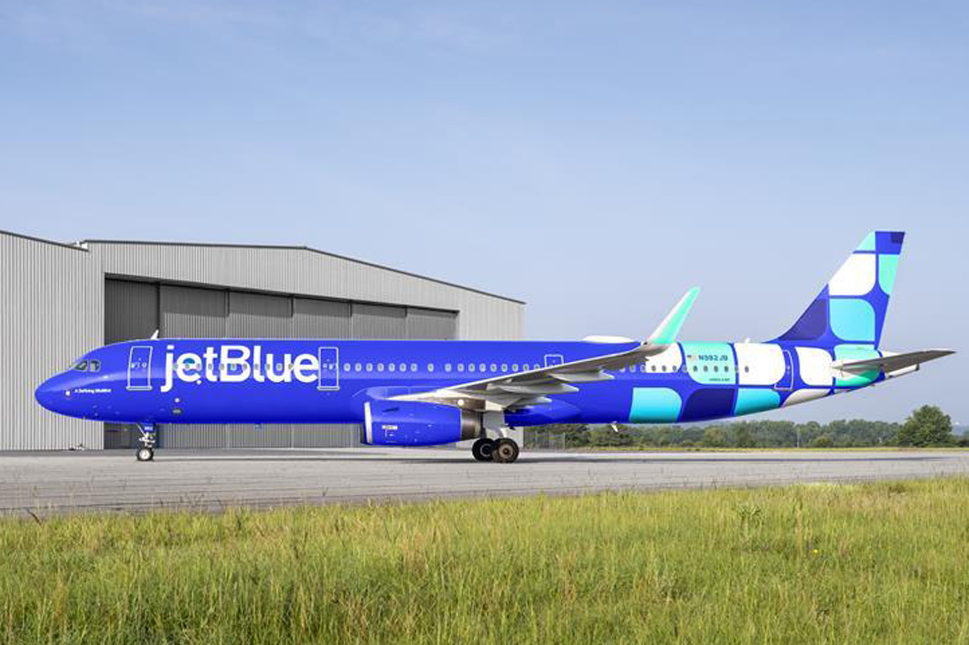
This is a nice idea, but it’s bound to be confusing to the average traveler, who has no idea what those little boxes represent. The Mint logo simply isn’t well-known enough. What most people will see is just a bunch of squares. And there are too many of them, top and bottom.

Up front, the oversized lettering is meant to balance out the heaviness of the tail, but it’s needlessly big and looks squeezed-in between the doors. The Southwest-style blue is too syrupy.

GRADE: C-minus


REALLY?
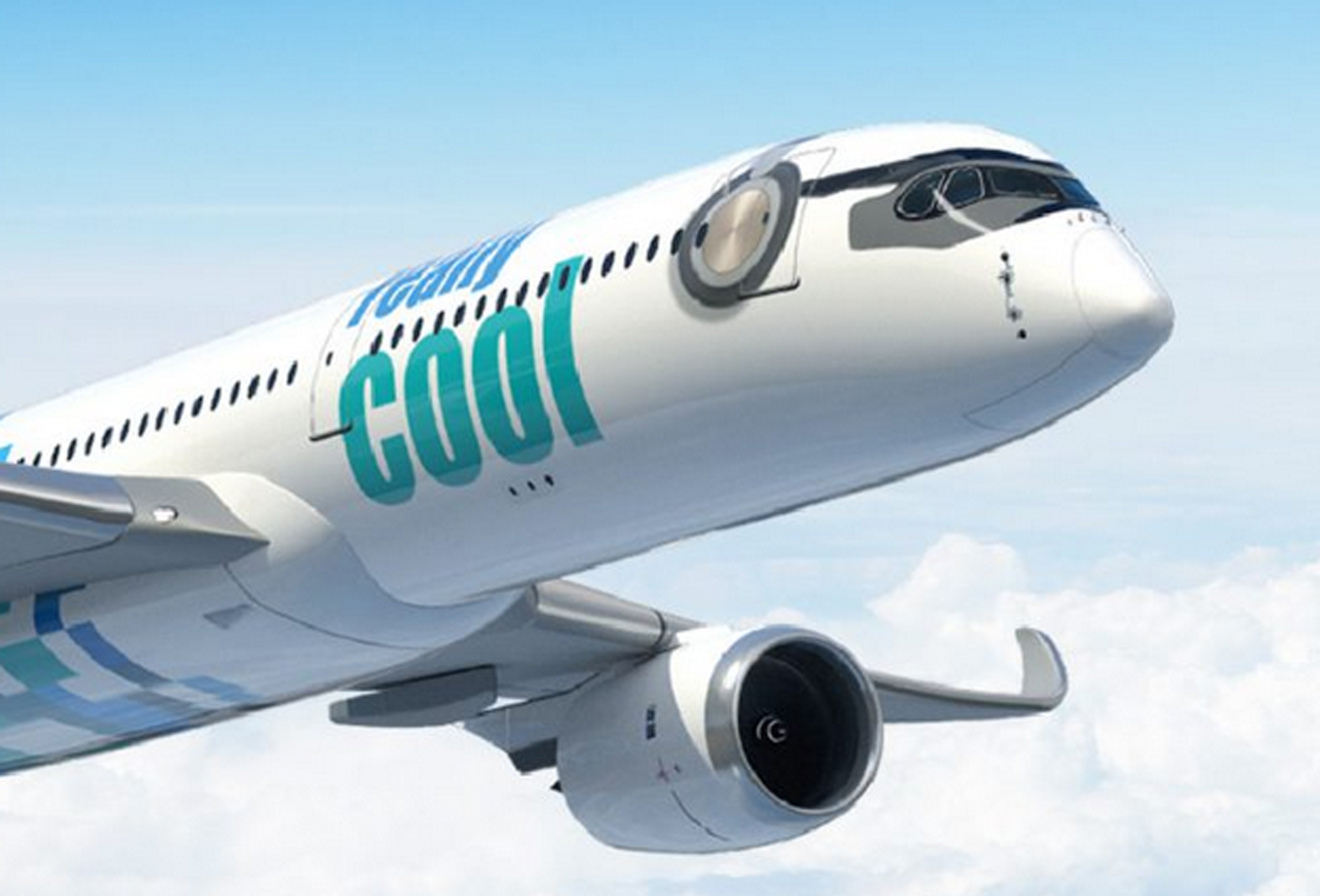
“Yesterday, our future was uncertain. Our economy in turmoil,” rumbles the home page. “Today, the dark clouds have passed. And we can take back to the skies. We were not ready for the turbulence that came before. Never again!” And with that we expect a grand crescendo, a sky-clearing crash of cymbals. Let the opening credits roll!

Welcome to Really Cool Airlines, a start-up out of Thailand that hopes to open routes around Asia using Airbus A350s. It should go without saying that any airline whose name requires an immediate set of parentheses to remind you that no, this isn’t a joke (this isn’t a joke), ought to maybe rethink its branding. But let’s save the name for another time. We shall defer, also, any exploration of the company’s business model, which has something to do with crypto and blockchains. (The carrier’s mastermind is Patee Sarasin, the same fellow who started Nok Air, a successful Thai LCC, so conceivably this could pan out.) To the livery…
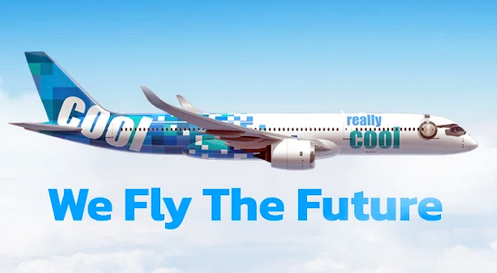
The plane appears to be wearing headphones. So, there’s that.

I’m getting an LCC vibe here. Not a cheap LCC vibe, like you feel with Spirit or Southwest, but a more sleek and sophisticated one. The colors are part of this. I don’t know about really cool, but they’re cool. What drags this one down is the back of the fuselage: the design is tail-heavy. There’s way too much going on back there. Go easier with all those blue and green squares (ditto for jetBlue, above) and let’s talk again.

GRADE: C-minus


DUBAI DO-OVER

If one airline didn’t need a re-fresh, it was Emirates. Can’t leave well enough alone, I guess. The kids have to put their art school degrees and fancy graphic design apps to use. So they took one of the boldest, cleanest, most distinctive liveries in the world and had to get all showy with it. Lo and behold, yet another overdone design fixated on motion and texture.
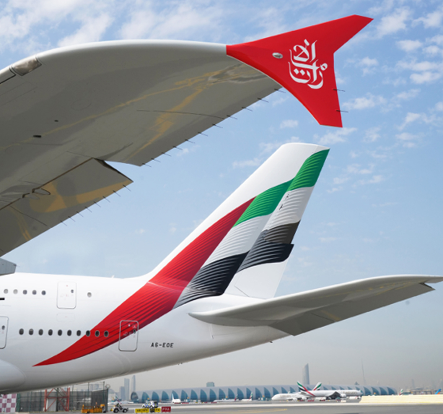
I don’t hate it. Truth be told, I like it, and if you insist it’s an improvement, I won’t argue. The basic blueprint — the Emirati flag — is still there, and it remains unmistakable. Just a little less so, because now it’s all wavy and scaly and even a little blurry. Identities are becoming less distinctive, not more, and sometimes it feels as if airline branding has been taken over by millennials trying to out-cool each other.

The red winglets are a great addition. The rest was unnecessary.

GRADE: B-plus


THE CONDOR BEACH TOWEL

Condor is a Frankfurt-based charter airline. The airline was set up in 1955 by Lufthansa, and for years its markings were handsomely reminiscent of that carrier’s: blue stripe, yellow tail, Lufthansa-esque condor logo. Later the Thomas Cook Group took control, and Condor adopted the group’s mostly inoffensive yellow and gray.

Today the airline is controlled by a European investment company, and in April, 2022, a bold new rebranding was unveiled, timed to coincide with delivery of Condor’s new Airbus A330-900s, which will replace a fleet of antique Boeing 767s. Each jet will feature a nose-to tail pattern of vertical candy stripes, in one of five colors. This, we are told, is to keep things more in synch with the leisure charter vibe: fun, friendly, easy, inexpensive and all that.
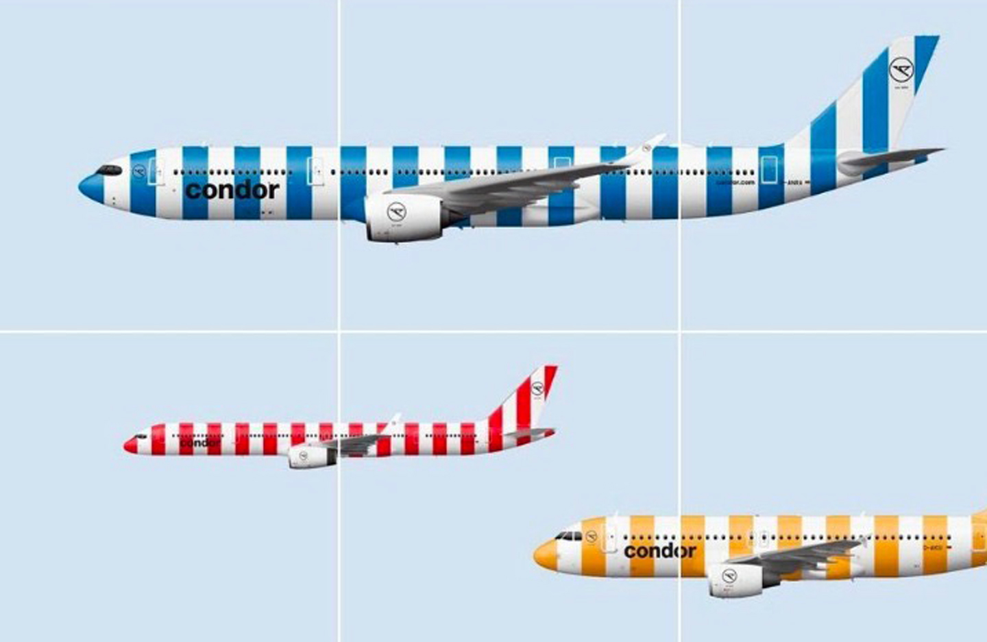
The main problem is, vertical stripes really don’t belong on a plane. The very shape of an airplane, in all its horizontal-ness, suggests motion, speed, and the traversing of distances. Vertical stripes suggest the opposite of that. The visual effect is one of negative motion, almost as if the plane is being held back and asked to stop.

Officially, according to the people who were paid to concoct this nonsense, the color representations go like this: blue for ocean; green for island; beige for beach, gold for sunshine, and red for “passion” — whatever that might mean. At least, for a change, there’s nothing here about the northern lights. I’m not seeing sunshine or passion. I’m seeing a picket fence, or maybe a couch cushion.

“Unmistakable,” is how Condor CEO Ralf Teckentrup describes it. And it certainly is — for the wrong reasons.

GRADE: F


CARIBBEAN CALAMITY

A hummingbird has long been the tail mascot for Trinidad-based Caribbean Airlines. For years the carrier used a photographic-style decal similar to the tails worn by Frontier. It was fetching. Here’s a picture I took one day at the airport in Georgetown, Guyana…
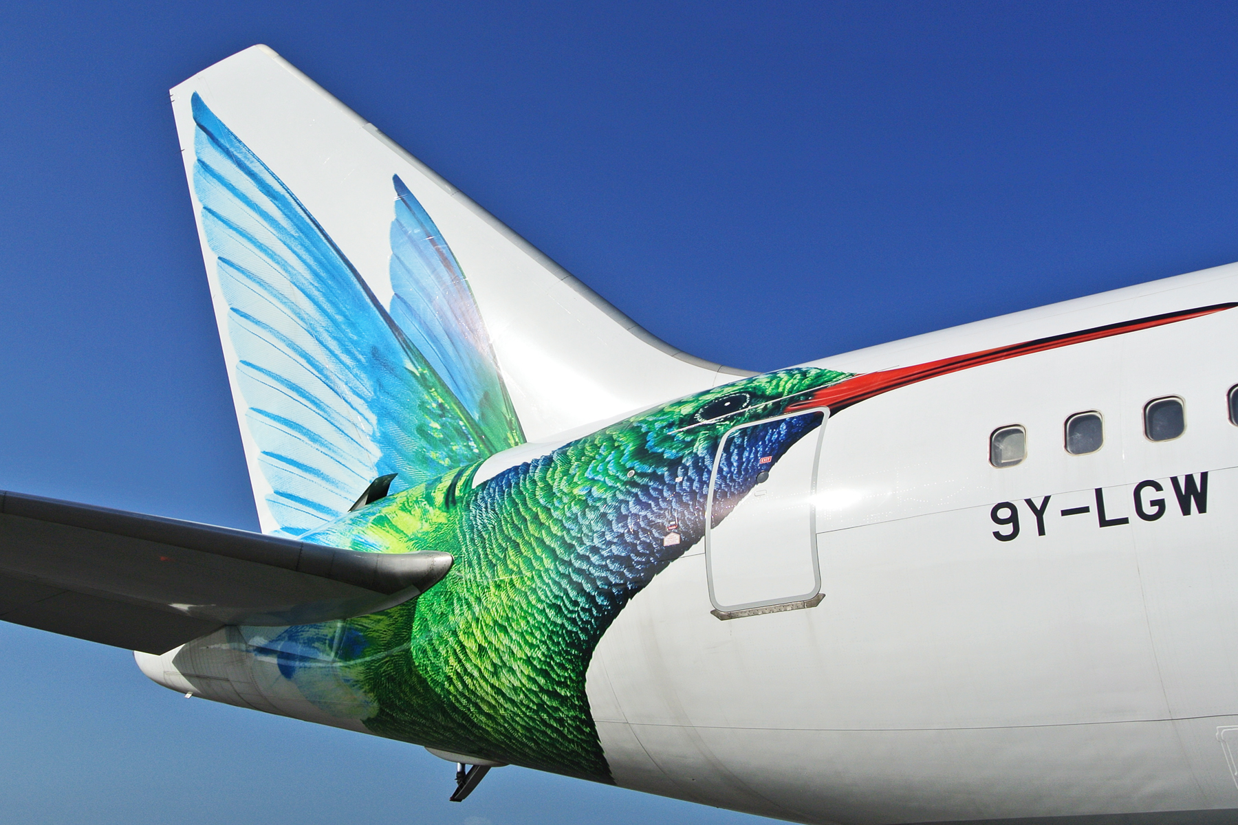
For reasons that can’t possibly be explained, this design has been made over into the abomination you see below. The updated magenta typeface (visible in the other links) is, in fact, an improvement. Nothing, however, can justify the psychedelic madness of the tail.
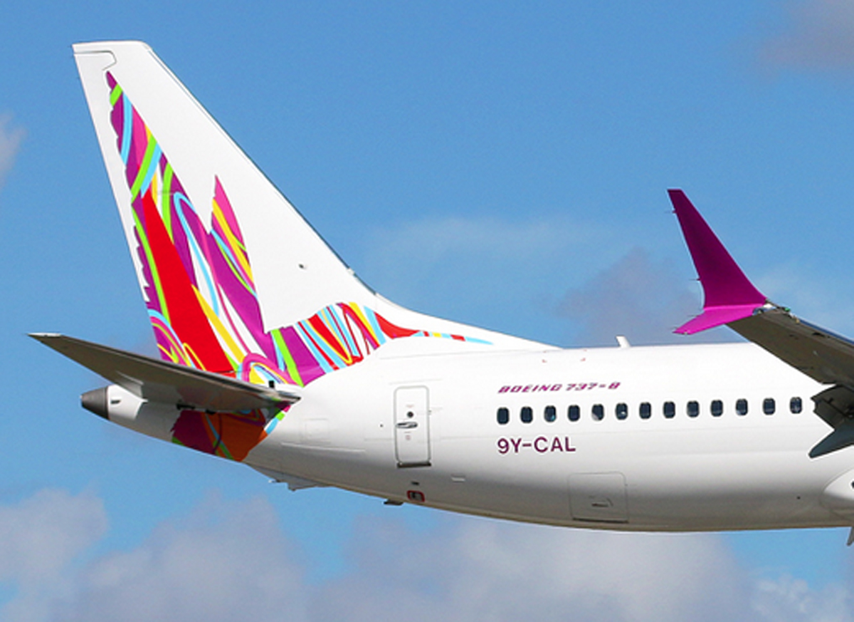
Caribbean is the successor to BWIA (British West Indies Airways), whose elegant livery and steel pan logo once graced the L-1011 TriStar. Talk about a devolution.

GRADE: F-minus


PRETTY IN PURPLE

Let’s ignore for a minute the question of whether we need another low-cost airline. Let’s also ignore the wisdom of operating 737s from the stubby runways at New Haven, Connecticut, one of Avelo Airlines’ hubs (the other is Burbank, where the runway isn’t much longer). Instead, let’s focus on their paintjob, which is rather pleasant.

The use of purple is unusual for an airline, and here it’s quite attractive. As is the typeface, which together with the engine nacelles and tail swoop, combine just right in a handsome, three-point balance.

This is one of those rare designs that works well even with a mostly bare fuselage. And unlike the looks of many LCCs, it’s not trying to be whimsical or amusing; it’s dignified.

I’m not sure the three-color, lightbulb filament tail was executed quite right. Maybe two colors instead of three, with thicker lines? It’s solid as a brand-mark, though, and it works.

GRADE: A-minus


UBERBLUE

This one, on the other hand. Were they having a hangar sale on blue paint? David Neelman is the founder of Breeze, which is opening a slew of routes from coast to coast, focusing mainly on secondary cities. Previously of jetBlue and Azul, blue has always been his thing. But come on, Dave, do you have to drown us in it, a light blue and a darker one?
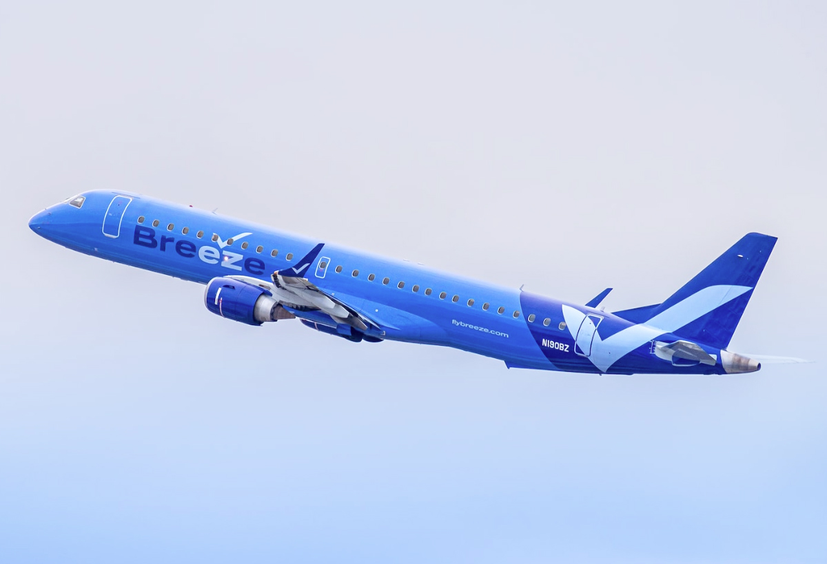
The checkmark motif is an effective one for an LCC — and affirmation of sorts, suggestive of ease and simplicity — but the rest of it is dead weight. Here’s a case where the fuselage isn’t painted white for a change, but probably should be.

GRADE: D


NORTHERN NONSENSE

Northern Pacific is a low-cost upstart out of Anchorage with plans to open routes within the western United States and to Asia. Behold their livery here.

Black is their go-to color. That’s not a bad thing, by itself, and we dig the raccoon-style shading around the cockpit. It’s a trendy flourish these days, but it’s cool. Can we stop there and award them a top grade? Alas, our survey of the wreckage must continue.

Let’s focus on that strange “N” logo. Except we can’t focus on it, because it’s vibrating uncontrollably. That’s not a shadow or a camera blur; that’s actually how it’s painted. Though maybe it’s better this way, seeing how, in its non-vibrating state, it resembles the logo for an amateur sports team.

On the engine nacelles, meanwhile, they’ve applied a completely different logo — a pair of offset thingies that remind us, painfully, of the American Airlines box-cutter. Then, up on the tail, we have yet another design. Isn’t that a black hole, or a special effect from “The Matrix”? The airline says its livery is meant to “evoke the natural beauty of Alaskan wilderness.” What I see here is a bending of time and space.

And sure, why not, go ahead and throw another “N” up in the corner, but this time make it turquoise. While you’re at it, paint the wingtips in turquoise too, because the northern lights or something.

What a garble of elements and patterns — a good example of a livery trying to out-clever itself at every turn.

GRADE: F-minus


SPANISH FLY FLOP
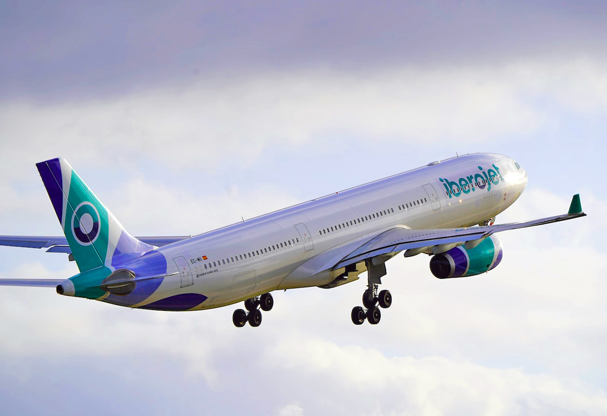
My plan is to start a Spanish charter carrier. Step one is to think up the stupidest name possible. I like “Iberojet,” as it sounds like it came from a third-grader. On the tail I want three bands. Mute the colors, and have that same third-grader do the painting so that the bands are warped and pinched, diverging/converging in bizarre random directions. If there’s any paint left over, add a navy blue arc to the underside of the aft fuselage. Do the same thing, more or less, on the engine nacelles, and then write “Iberojet” on the side. Use lowercase letters, because why not.

GRADE: F-minus


BOREAL BOREDOM

So, Icelandair has a new look, featuring, guess what, a Eurowhite body with blue titles. How novel.

The tail, though, is the exciting part, because each will boast one of five highlight colors apparently inspired by the people who make Sharpies. Wait, don’t tell me, the colors are meant to suggest… the northern lights! Which every smart tourist knows are best viewed in Finland or Norway, not Iceland.

Officially, according to a company press release, each of the accents “represents a different phenomena in Icelandic nature.” If true, they should include a gray, a black, and maybe a fiery volcanic red. What we get instead is lemon yellow, a magenta, a cyan blue. You could hunt around Iceland for a month and not see those colors. (Two additional colors are yet to debut. Surely they’ll be lovely.)
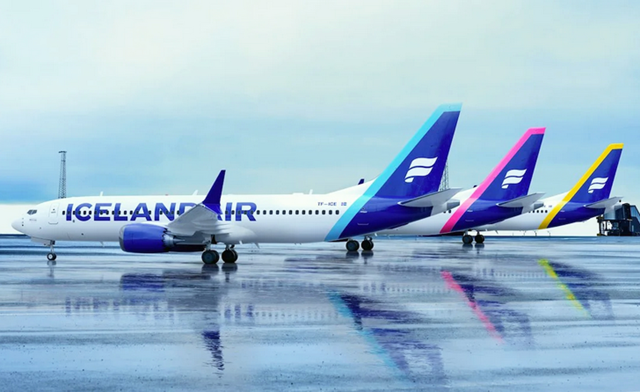
If they’d chosen only one accent color it’d be worse; the grab-bag keeps it lively, if nothing else. And when you really look at it, the problem is less the tail than the lettering. Sure, billboard-style lettering is meant to be big, but in this case it’s too big.

At least they’ve hung on to their logo, which for decades has been one of the most distinctive in the industry.

GRADE: D-plus


UNITED BLUES

After its merger with Continental Airlines in 2010, United came up with an amalgamation blending the United typeface with the Continental globe. Bland and ultra-corporate, it looked like something you’d see in a PowerPoint slide. A refresher was maybe inevitable. Unfortunately, they’ve gone way too far in the other direction. They’ve stayed with the 2010 template; except, now, they’ve sucked away whatever dignity it had.

We start with the “United” title, which has gone big. Big for big’s sake, unbalanced and oddly spaced, as if it were painted over some other name. The gold accenting is gone from the tail now, and the blue has been amped up, turning the old Continental globe into a fluorescent spider web. Is this the airline’s excuse for a logo? Do they even have a logo? It’s a tail that manages to be gaudy and boring at the same time.
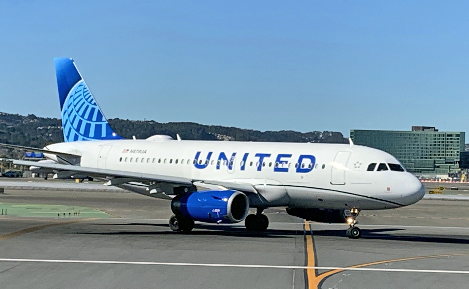
And, needless to say, you can’t have a livery these days without some annoying “in-motion” theme. United obliges with a mandatory curvy thing along the lower fuselage. Is it a worm? A garden hose? Worst of all it’s black.

Granted this isn’t as terrible as what American Airlines did a few years ago. It’s bold, I’ll give you that, and you can marvel in the simplicity of it. Or, you can call it what it is: an immature scheme that evokes the downmarket cast of a budget airline — hardly the look that a preeminent global carrier should hope to project.

GRADE: F


PHOTO CREDITS:

Alaska Airlines
Sam Chui (Korean Air)
Rocco Smet (Caribbean Airlines)
Daniel Shapiro/Unsplash (Breeze)
Jan Rosolino/Unsplash (Iberojet)
Patrick Smith (ITA)
Sam Chui (Korean Air)
Patrick Smith (United Airlines)
Comments (120)

Just Like Honey

March 6, 2025

MANY OF US associate the time of year with music from our pasts. Midsummer, maybe, reminds you of a song or an album. We all have our memory triggers, and often they correlate with a change in the weather, the turn of a season.

Here it’s the month of March, and for me that takes me back to 1986, when a strange band out of Scotland called the Jesus and Mary Chain was making a splash in the indie music scene. Their debut album, Psychocandy, had come out the previous fall, landing in my collection months later, after I’d developed a liking for the song “Never Understand,” which had gotten some radio play.

Once I started listening, I couldn’t stop. Over and over and over. The needle of my old JVC turntable must’ve gone incandescent from the friction.

I remember a lot of rain that month, and the grayness was a nice accompaniment to the album’s mood. Not maudlin, exactly, but heavy, and maybe a little creepy. Which is interesting, because, at heart, when you push past all the feedback and fuzz, this is the poppiest damn album in the world.

Stripped down, we hear a collection of kindergarten melodies that on their own would be tough to take seriously. The album’s conceit, it’s trick, is to crank the volume and soak them in waves of distortion. Cast the whole thing in a dressed-in-black, art school gloominess, and now the whole enterprise becomes cool — a masterpiece, even, of pop-Gothic-psychedelia.

This was an underground album, back when there were such things, but it had some mainstream bleed-over. Maybe you caught the kickoff track, ”Just Like Honey,” playing along with the closing credits of Sofia Coppola’s film, “Lost in Translation.” A great song, but better is the exuberant spookiness of “The Hardest Walk.” Or the creepy melancholia of “Cut Dead.”

Or, without a doubt the most astonishing song on the album, “You Trip Me Up,” a sort of haunted love poem sneaking out beneath a shrieking squall of feedback.

You may have heard the comparisons. “The Beach Boys on acid” or “The Velvet Underground meets Metallica.” And so on. Such descriptions are facile and one-dimensional. They’re also spot on, and only fair: this is a facile and one-dimensional album. In the greatest possible way.

There’s nothing complex here, and in a lot of ways Psychocandy plays like one long song. It’s pretentious and gimmicky, sure. And supremely addictive. This is the ultimate guilty pleasure album, and I’ve probably listened to it more times than any other record in my collection.

Just enjoy it for what it is.


Related Stories:

ZEN ARCADE AT 40.
NEW DAY RISING AT 40.

Comments (4)

Save Our Screens!

Emirates first class suite.   Author’s photo.

January 9, 2018

FOR TWO DECADES NOW, seat-back video has been the standard for inflight entertainment. Passengers the world over have grown accustomed to watching movies and shows on the screen in front of them. As well they should; it’s a fantastic amenity. I’ll go so far as to say that it’s the single greatest advent in onboard service in the past fifty years. Onboard comfort is all about the art of distraction, and nothing is a better distraction than being able to binge-watch your favorite TV series or catch a few films.

We’ve come a long way. Flyers of a certain age will remember “the inflight movie,” projected onto a scratched-up bulkhead screen. For the sound, you’d plug a bulky, stethoscope-style headset into the armrest. The picture was always blurry and the audio sounded like it was being transmitted from a submarine. Which usually was fine, because they rarely showed anything you wanted to watch in the first place. Today, passengers can choose between dozens or even hundreds of on-demand options. You can start, stop, pause, rewind…. In first or business class, with oversized screens and noise-reduction headsets, you essentially have your own personal theater. Indeed, one of my favorite guilty pleasures in life is sitting in an airline seat with a meal and a glass of wine, watching something fun on my screen.

Yet the days of the seat-back screen might be numbered. One of the big airline stories making the rounds of late describes how carriers are planning to do away with them. The future of inflight entertainment, we are told, is turning instead to wi-fi streaming, whereby passengers can stream shows and movies directly onto their own laptops, tablets or mobile phones.

And, we keep hearing, this isn’t just something the airlines want. Supposedly it’s what their customers want as well. People find the seat-back screens old-fashioned, or uncool — or something. They want streaming video instead.

Korean Air seat-back video.   Author’s photo.

I’m not buying it. Carriers might wish this were the case, but count me among those who don’t believe it. I suspect the media is simply repeating unchecked what airlines are telling them.

I don’t believe it because it doesn’t make sense: With a seat-back screen, you plug in your earphones and go. There are no power issues, no extra cords or wires, and the space in front of you is kept clear for eating, drinking, or whatever. Watching with your own device is cumbersome. For starters there are the sign-on and streaming settings to configure. Then, once you’re watching, you’ve got battery drain to deal with, and/or you’ll need to hook a power cord into an AC outlet, provided your seat has one. Tablet and smartphone screens are often smaller than the seat-back kind, and, if you’re in economy class, you’ll be using up pretty much all of the available tray-table space, making it impossible to enjoy a meal while you’re watching.

Not to mention the recline hazard: Any time you’ve got your laptop propped on your tray, you run the risk of it being crushed when the person in front of you comes hauling back without warning, jamming the screen between the tray and the seat-back (see photo below).

And some carriers won’t be offering a streaming service at all, leaving it up to the passenger to pre-download whatever he or she wants to watch. Fail to do this and, well, I hope there’s something good in the inflight magazine. Imagine a nine, ten, or twelve-hour long-haul and having absolutely nothing to watch. And what about those passengers who don’t carry a laptop or tablet?

Sure, in-seat systems are heavy and expensive — upwards of $10,000 per seat. But all airplane components are expensive, and the typical screen, over the course of its lifespan, will have entertained thousands of passengers. They’re reliable, convenient, and just so downright useful.

Hazardous viewing on China Airlines.   Author’s photo.

Now, I have to confess, I sometimes switch off my screen and watch something pre-downloaded on my Macbook instead. I don’t like doing this, for the reasons I just listed, but once in a while there just isn’t anything in the carrier’s library that I want to see. Thus the big caveat in my argument is that an airline needs a decent IFE system to begin with — one that’s easy to navigate, has a wide-enough variety to pick from, and has the hardware (i.e. a big enough screen) to go with it. To that last point, the tiny four or five-inch screens that some airlines have stuck with simply don’t do the trick.

There’s a lot of variation here. My sampling is by no means comprehensive, but I’ve flown a good number of carriers and I have my favorites:

For sheer volume, from blockbusters to Bollywood to documentaries to pop music, nothing comes close to Emirates’ “ICE” system (the letters stand for information, communications, and entertainment). Rest assured you’ll find something to watch or listen to, and the screens in all cabins are huge. The trouble with the Emirates system, however, is that it’s maybe too big for its own good. The ICE guide — a booklet in your seat pocket — is thicker than a novel and confusingly organized; sifting through it all — there are thousands of channels, including many Chinese, Arabic, Hindi and Urdu movies that seem a bit superfluous — can be taxing.

Other airlines have lots to pick from but a clunky user interface. Qatar Airways’ IFE, for example, for an airline of such renown, is appallingly tedious to navigate. Still others have decent usability but limited choices.

My vote for the best all-around system? Delta Air Lines. Theirs is a Panasonic-based platform that is both user-friendly and packed with movies and shows. The layout and navigation functions are the cleanest and most intuitive I’ve seen, and there’s a more than ample, eclectic selection of films and shows. (The one catch is that when clicking into either the TV or movie sections, the default screen shows only the newest additions. Look for the drop-down menu that allows you to access the entire “A-to-Z” archive.) Over the past few years I’ve flown with Emirates, Qatar, Singapore, Cathay Pacific, Korean Air, Thai, and a dozen or so others. Delta’s system beats all of them.

I should note that Delta also has an onboard streaming option called “Delta Studio,” offering much of the same content, at no cost. If that’s your thing, have at it. I’ll keep watching it seat-back style.

Whichever airline we’re talking about, the idea of fumbling around with a computer or an iPad, with wires all over the place and all my personal space taken up, is not a welcome change.

And why should the onus be on the passenger to worry about battery charging, lugging around wireless headphones, and so on, when for two decades the airlines have been supplying the hardware? And what of the millions of people who don’t have tablets or laptops, and/or who resent having to carry them onto a plane in order to enjoy something that heretofore was already there and hard-wired in? I’m still not getting this. Why would a passenger choose to voluntarily make the inflight entertainment experience more cumbersome and more of a pain in the ass?

Moving map on Delta’s outstanding IFE.   Author’s photo.


UPDATE: November 1, 2018

Last month, on a Philippine Airlines Airbus A330, I had my first ride in a long-haul cabin with no seat-back entertainment screens. In business class the cabin crew passed out iPads through which you could stream a selection of films and shows. For those in economy it was strictly BYOM (bring your own movies).

The experience was just as I feared it would be: cumbersome and uncomfortable, with a tangle of wires and insufficient space. I’m trying to watch season four of “Better Call Saul” on my MacBook Air. I’ve got a power cord over here, ear pod wires over there, and my screen is in constant danger of being crushed every time the dude in front of me reclines his chair. Worst of all, it’s impossible to enjoy a meal and a show at the same time. There’s simply no room for both a meal tray and a laptop (or even a drink and a laptop). You can eat, or you can watch. But not both.

It wasn’t much different in the business cabin. There were charging issues with the iPads, and even with bigger tables there wasn’t enough room for both tablet and food.

Here’s hoping this is not the future of onboard entertainment.


Comments (5)

Potomac

February 1, 2025

“Perhaps a boring 2025 is what we should hope for,” I wrote back on January 21. A week later, a Blackhawk military helicopter collided with a PSA Airlines regional jet maneuvering to land at Reagan National Airport. Both aircraft plunged into the Potomac River, killing 67 people.

Not a good way to begin the year.

As I understand it, the crew of the helicopter told air traffic control it had the regional jet in sight, and was asked to “maintain visual separation,” as we say. When this happens, the onus of avoiding a traffic conflict falls to the pilot, rather than ATC. Maybe that sounds a bit old school, and I suppose it is. But it’s a common procedure when operating close to an airport, and almost always a safe one.

So the big question is: why did the helicopter not do as instructed? It’s possible the pilots misidentified their traffic, confusing the lights of a different plane with those of the PSA jet. Or, They had the correct aircraft in sight, but misjudged their trajectories. Were they paying close enough attention? Were they reckless, negligent, or something in between?

Another question is why the regional jet’s collision avoidance system, called TCAS, didn’t save the day. For one, although all commercial aircraft are equipped with TCAS, military helicopters are not. For the system to work optimally, both aircraft need to be wired in, so to speak, with their transponders exchanging speed and altitude data.

Regardless, the most critical TCAS function, called a “resolution advisory,” or RA, which gives aural commands to climb or descend, is normally inhibited at very low altitudes. The collision happened at less than 400 feet above the ground, maybe 25 seconds from touchdown. The RJ pilots might have received a basic TCAS alert — a synthesized voice announcing “Traffic! Traffic!” — but they would not have received maneuver instructions, and were likely preoccupied with aligning themselves with the runway. That close to the runway, a pilot is focused on landing, not on scanning for traffic.

DCA is a busy and challenging airport. There are twisty approach and departure patterns, and military copters are often transiting the airspace. It’s hard to know at this point what the takeaways of this crash might be, but the whole “maintain visual separation” thing may need to be reevaluated, especially for operations at night.

This was the deadliest U.S. aviation accident since 2009, when 49 people died in the crash of Colgan Air (Continental Connection) flight 3407 outside Buffalo.

PSA is an Ohio-based regional affiliate of American Airlines. Although wholly owned, it operates independently, with its own employees and facilities. Its pilots are neither employed nor trained by American Airlines.

Unfortunate as this accident was, it didn’t involve a major carrier or a mainline jet. And so, if nothing else, our 23-year crashless streak, which I discuss often in these pages, remains intact. And we hadn’t had a serious crash of any kind in fifteen years, which itself is remarkable. Making these points is, I hope, not in poor taste; the deaths of 67 people is still a significant tragedy.

PSA Airlines is not to be confused with the original PSA, a.k.a. Pacific Southwest Airlines, which operated from 1949 until 1988, when it was taken over by USAir.

As it happens, the old PSA was involved in an infamous midair collision over San Diego in 1978, in which 144 people were killed. In that disaster, which remains the deadliest midair collision in U.S. history, the pilots of the PSA Boeing 727 lost sight of a private plane that ATC had instructed it to follow, eventually colliding with it. There’s an irony in there.

Hans Wendt’s photograph of the stricken PSA 727, flames pouring from its right wing, is one of the most haunting airplane photos ever taken. Google it.

Neither was last week’s crash the first involving the Potomac River. Some of us are old enough to remember the spectacle of Air Florida flight 90, in 1982. The pilots of flight 90 failed to run their engine anti-ice system during a Janauary snowstorm at DCA. The plane took off, stalled, slammed into the 14th Street Bridge, then disappeared below the frozen river.

I was a sophomore in high school at the time. I remember our teacher wheeling a television into the room so we could all watch the rescue efforts. The heroics of Arland Williams and Lenny Skutnik.

No heroics this time.

And nope, not the first time a military aircraft collided with a civilian one. I can think of at least three others, including the 1971 collision over California between a Hughes Airwest DC-9 and a U.S. Air Force F-4 Phantom.

Comments (40)

The Year Ahead

January 21, 2025

OUT WITH the old. As it happened, 2024 closed on a sour note, with two major crashes in the span of a week, capping what was, statistically, one of the deadliest years in some time.

Maybe so, but how deadly, exactly? Compare last year to many of the years of the 1970’s and 1980’s, when multiple major crashes were the norm. Suddenly 2024 doesn’t look so bad. Fact is, year over year, we have nowhere near the number of serious accidents we used to.

Just the same, it’s tempting to view 2024 as a correction, rather than an aberration. Perhaps what was surprising wasn’t the spate of accidents, but rather how long we’d gone without such a spate. Maybe we were too lucky for too long.

There’s no telling what might happen in 2025. If nothing else, let’s hope the U.S. majors maintain their remarkable streak of disaster-free years, currently standing at 23.

In the meantime, who’s next in line for a computer crash? The “airline meltdown” has become a recurrent event — a revolving series of tech-related fiascos. Every few months, it seems, things at one of the big carriers go haywire for a few days. Last summer, Delta had its fifteen minutes of infamy. More recently it was American. Is it United’s turn? Southwest? JetBlue?

Other predictions are easier. The unrelenting tedium of TSA, for instance. No changes there. You’ve been standing in line for the past two decades, mostly for no good reason. And you’ll be standing again.

Things have gotten a little better with delays and cancellations, as airlines have reduced their dependence on regional jets and rationalized their schedules. Somewhat. But the skies remain overcrowded, and ATC remains understaffed and underfunded. So I don’t foresee much improvement.

What else? Bankrupcties? Mergers? Will Spirit Airlines hang in there, or will they disappear under Chapter 7 or a last-minute acquisition? How about a new black swan event, akin to the COVID surprise of 2020?

Who knows. I don’t really see any markers. Nothing feels likely. And maybe that’s good. Perhaps a boring 2025 is what we should hope for.

Feel free to leave your own prognostications in the comments section.


Photo courtesy of Unsplash

Comments (10)

Out With a Bang

Note: Thoughts and opinions herein are based on the best available information at the time of posting. Updates may follow.

December 30, 2024

NOT A GOOD ending to the year. Two serious accidents in less than a week.

First came the shooting down of Azerbaijan Airlines flight 8243 on Christmas day, killing 38 people. Five days later, Jeju Air flight 2216 crashed in a fireball at Muan International Airport in Korea, killing all but two of the 181 passengers and crew on board.

The Azerbaijan incident appears pretty straightforward. The Brazilian-built Embraer E190 crashed after being hit by an anti-aircraft missile — the latest in a surprisingly long list of commercial jets downed by military fire. It could have been worse: twenty-nine people managed to survive, owing to the fact that, unlike the tragedy of MH17, for example, the plane did not break up in midair, instead hitting the ground in a semi-controlled state.

The Jeju Air disaster is, for now, more mysterious.

Some witnesses describe a flock of birds being ingested by the 737’s right engine, with flames coming from the engine thereafter. This is unconfirmed, and in any case does not explain what happened next: the plane touching down with its landing gear retracted, skidding off the runway into a berm and exploding in a fireball.

A gear-up landing, by itself, should be perfectly survivable. Never is a landing gear problem — any landing gear problem — a dire emergency. Just as a bird strike doesn’t explain the gear being up, the gear being up doesn’t explain the crash.

Which brings us to the flaps. Watching the accident footage, it appears to me (and others corroborate this) that the 737 landed without its wing flaps or leading edge slats extended. This is important because he 737 has unusually high approach and landing speeds to begin with. (In normal operations, flaps and slats are deployed incrementally during approach, allowing the plane to maintain lift while slowing to a safe landing speed.) These speeds would be even higher — much higher — if attempting to land without flaps or slats.

Under those circumstances you’d want the longest runway possible. The runway at Muan is 9200 feet long, but was shortened by a thousand feet due to construction. That left the pilots with 8200 feet. That’s not short, but it’s not long, either. How much runway would a 737-800 require if touching down with no flaps or slats, and no landing gear? I don’t know.

Which takes us to the issue of why the crew didn’t spend more time troubleshooting and better preparing for an emergency landing — preparations that might have included diverting to an airport with a longer runway. It appears the landing was quite rushed.

Landing inadvertently without gear and flaps is all but impossible. It was obviously done intentionally, and hurriedly. What we don’t know is why.

About two years ago, a flight I was piloting had a somewhat serious flap malfunction going into Bogota, Colombia. We spent a good half-hour in a holding pattern, going through checklists, coordinating with our company and with ATC, reviewing runway distance data, and so on. We landed without incident. It appears the Jeju pilots did nothing of the sort, short of issuing a brief distress call. They broke off one approach, circled around, and about five minutes later made the second, fatal landing.

It’s hard to imagine a professional airline crew needlessly hurrying and choosing a too-short runway. Something, I would think, was driving their urgency. A malfunction involving both the landing gear and flaps hints at a serious hydraulics problem. It also — especially combined with the rush factor — hints at the possibility that both of the plane’s engines had failed or were shut down. Did a bird damage one engine, and the crew then accidentally shut down the other one, leaving them with no power at all? Wrong-engine shutdowns have happened before (Google “British Midland crash”).

Others have speculated that complications from the bird strike may have caused the cabin to begin filling with smoke. Did the pilots then panic? Ultimately, we could be looking at a human factors failure as much as any mechanical one. In years past, Korean aviation was heavily scrutinized for its cockpit authority culture and a lack of what today is known as “crew resource management.” It’s worth noting that both pilots were, at least by U.S. standards, fairly inexperienced. The captain had about 6,000 flight hours, and the first officer fewer than a third as many. As a point of comparison, I have about 20,000 hours and currently fly as a first officer.

We’d also like to know the reason for that barrier wall and concrete antenna support at the end of the runway, rather than the type of clearway found at most airports.

One thing for sure is that putting the plane down in the ocean, as was suggested by a supposed aviation expert in a Wall Street Journal online article yesterday, would not have been wise. Any landing, including one without flaps or landing gear, would be far more dangerous on water than on pavement, provided the right precautions are taken. I emailed the reporters at the Journal, recommending they remove those lines, but got no reply.

Jeju Air is a Korean low-cost carrier named after the popular holiday island off the country’s south coast. The Seoul-Jeju route is one of the busiest air routes in the world.

The Azerbaijan Airlines flight, meanwhile, is at least the third commercial jet to have been shot down by Russian or Russia-backed military forces. In 2014, 298 people died when Malaysia Airlines flight 17 was hit by a Buk missile over Ukraine. And in 1983, 267 people died when Korean Air Lines flight 007 was downed near Sakhalin Island by a Soviet fighter after drifting off course. MH17 and KAL 007 stand as the 7th and 11th deadliest crashes of all time.


Comments (50)