AS MY REGULARS know, critiquing airline liveries is my favorite thing in the world. Especially the ugly ones, which nowadays is pretty much all of them.
From now on, rather than grading them individually in separate articles, we’ll compile them here, one at a time. This post will act as a sort of rolling report card, updated with every new reveal.
AURORA OVERLOAD

Beginning next year, Alaska Airlines will launch flights to Iceland and the U.K. — the Seattle-based carrier’s latest foray into the long-haul realm. As part of the celebration, it’s painting up some 787s in a flashy new scheme. “Our new 787 exterior embodies Alaska’s transition to a global airline with beauty, grace and a nod to our heritage,” says the company CEO Ben Minicucci.
Color me bored. It’s not the ugliest thing I’ve ever seen, but the aurora theme is overdone (see Icelandair, below) and was all too predictable. As for the “heritage” invoked by Mr. Minicucci, the longstanding Alaska tail, starring the parka-wearing Inuk man, is a classic of American airline branding and should absolutely, no question, be up there for the 2026 route launches — an iconic emissary to the carrier’s newest outposts. Instead we get some neon nonsense. It looks like someone spilled anti-freeze across the back of the plane.
GRADE: D
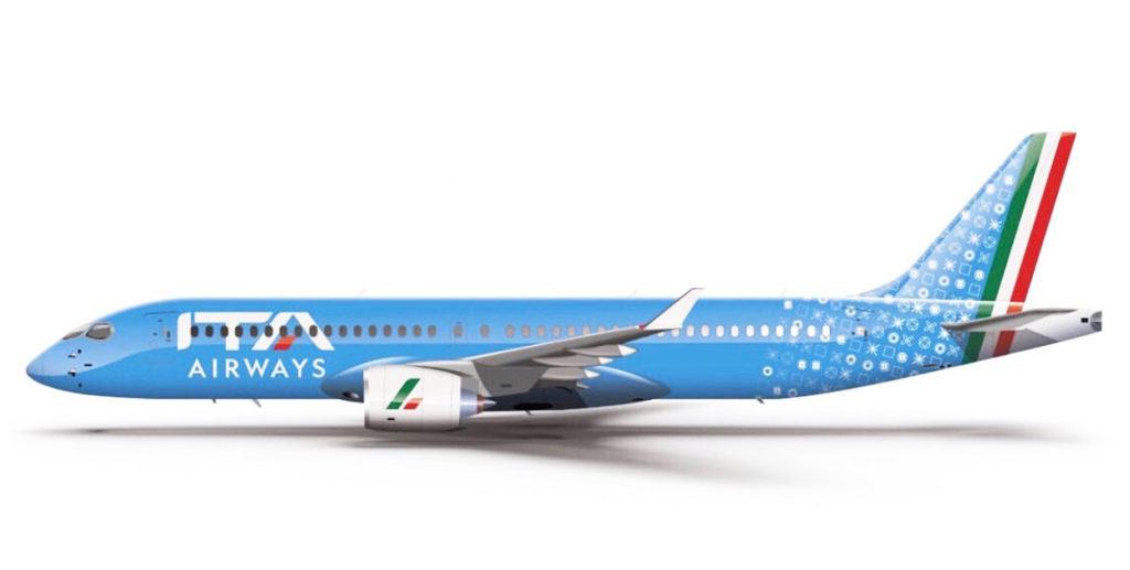
ITA RECONSIDERED

A few years back, ITA Airways became the Italian flag carrier, replacing the chronically troubled Alitalia, which had been in and out of solvency for decades. I wasn’t a fan of ITA’s livery. “The colors and styles are so mis-matched as to seem almost arbitrary,” I wrote in an earlier post. “The patterned tail motif reminds me of a doily, or the kind of tablecloth you’ll find in certain Italian restaurants.”
That part about the tail is still true, but overall the look has grown on me. One thing you don’t notice in most photographs is the beautiful iridescence of the blue. And that mis-matching I decried isn’t so; there’s a sly synchronicity to the colors.
That blue, it turns out, is formally known as “Savoy Blue,” or “Italian Blue,” and has been associated with Italian royalty since the Middle Ages. It’s also the traditional color of the Italian national sports teams.
Indeed there’s an Italian-ness to it all, helped along, of course, by the Tricolore striping along the rudder. (The doily patterning is subtle enough not to steal the show.) It’s stylish, tasteful, and culturally apropos. Yet simple at the same time, as any good branding should be. My apologies for missing it the first time.
My gripe is no longer with the uniform, it’s with the name. Annoyingly, they went and added “Airways” to the carrier’s moniker. “ITA,” just by itself, was smoother, simpler, and perfectly adequate. But no, they had to jam “Airways” in there, because apparently everyone is stupid and might forget it’s an airline. They’ve even painted it on the fuselage, in a smaller typeface below the main titles, throwing off the livery’s balance (hence my B-plus grade instead of an A).
Loosely translated, the carrier is now called “Italian Air Transport Airways.” And with or without the extra word, it lacks the poetry of the old “Alitalia.”
ITA’s radio call-sign is “Itaro,” which is kinda sexy and wouldn’t be bad as a name on its own.
GRADE: B-plus
UP THE YIN YANG
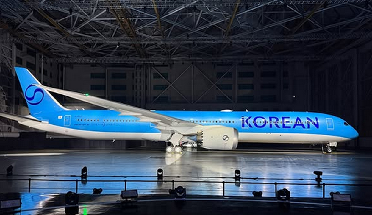
Korean Air has been making some buzz, unveiling its first brand refresh in three decades. And in doing so they win the “If It Ain’t Broke…” award for terrible decision-making.
The new look fails for two big reasons. First, it’s ugly. Or spiritless, maybe, is the better word. Second, there was no need for it; the scheme it replaces was among the industry’s best, a pleasant reprieve from the plague of all-white fuselages and lookalike swooshes.
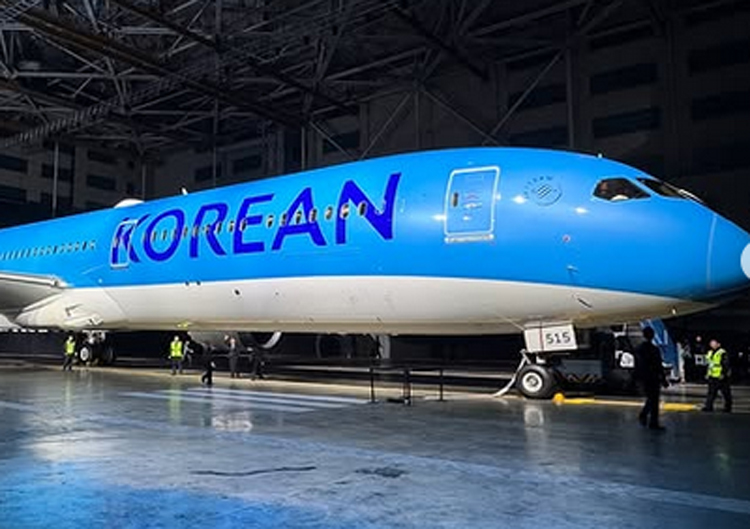
I don’t know which part irks me more: the boring typeface, the blank bottom, or the tail emblem, which is a neutered version of the one it replaces. The blue is pretty, but all in all it’s a livery without character. It looks like it was cooked up on a computer in about two minutes.
GRADE: D-plus
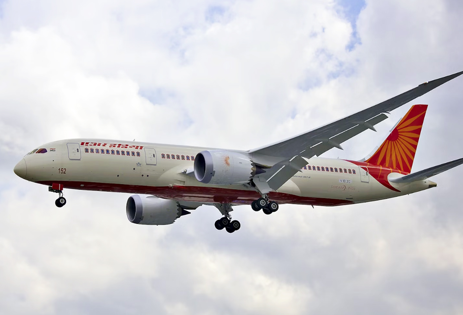
GOOFY GOLD
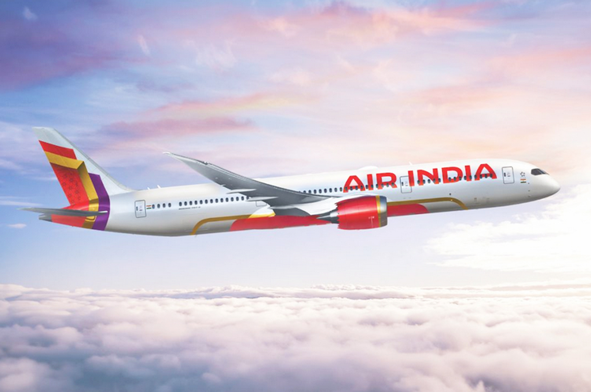
Air India was taken over not long about by the Tata Group. The new owners are expanding and hoping to establish the long-beleaguered carrier as a world-class brand. These sorts of reinventions are often accompanied, dangerously, by livery changes. To wit…
There’s a press release explaining all the meanings and symbolism here. It’s a brilliant self-parody. Someone asked ChatGPT to come up with a bullshit announcement full of pseudo-inspirational blather, and it happily obliged. “Purposeful and confident.” “Premium cues.” “Personality and storytelling.” It goes on like this.
Let’s keep it simpler. First of all, the lettering is too big. Billboard lettering is common these days, and Air India, like many others, crosses the line between assertive and overblown.
Then we have the tail. Where do we start? The airline describes this weird-looking thing as a “hero signature window frame.” Do we have any idea what this means? Heroes? Windows? What? I’m told the design is an evolution of the Rajasthani-style window decals that have heretofore been part of Air India’s livery for decades (do we dare call them iconic?). Possibly, but what most people will see is just a random, strangely angled pattern. The colors are pretty but the message is unintelligible. Neither does it work from a branding standpoint: it’s a pattern, not a logo, without any context or clarity.
The element that really wrecks it all, though, is the gold accenting at the bottom. Specifically, the way it detaches from the red and goes off on its own, fore and aft. The red field, with the Air India name across the lower fuselage, is an obvious jab at Emirates, whose planes are marked similarly, and whose domination of routes into India the Tatas are hoping to unseat. All well and good, but those gold brackets… it’s like they put the wrong numbers into the paint-sprayer. This alone knocks my grade from a potential C to a D-minus. “The gold frame detail adds storytelling and and premium cues,” according to Air India. No, it doesn’t. What it adds is a rather bizarre coup de grace.
A shame how Air India’s look has degraded over time, from the masterpiece red swoosh livery of the 1970s, with its beautiful Sagittarius logo, to this.
GRADE: D-minus
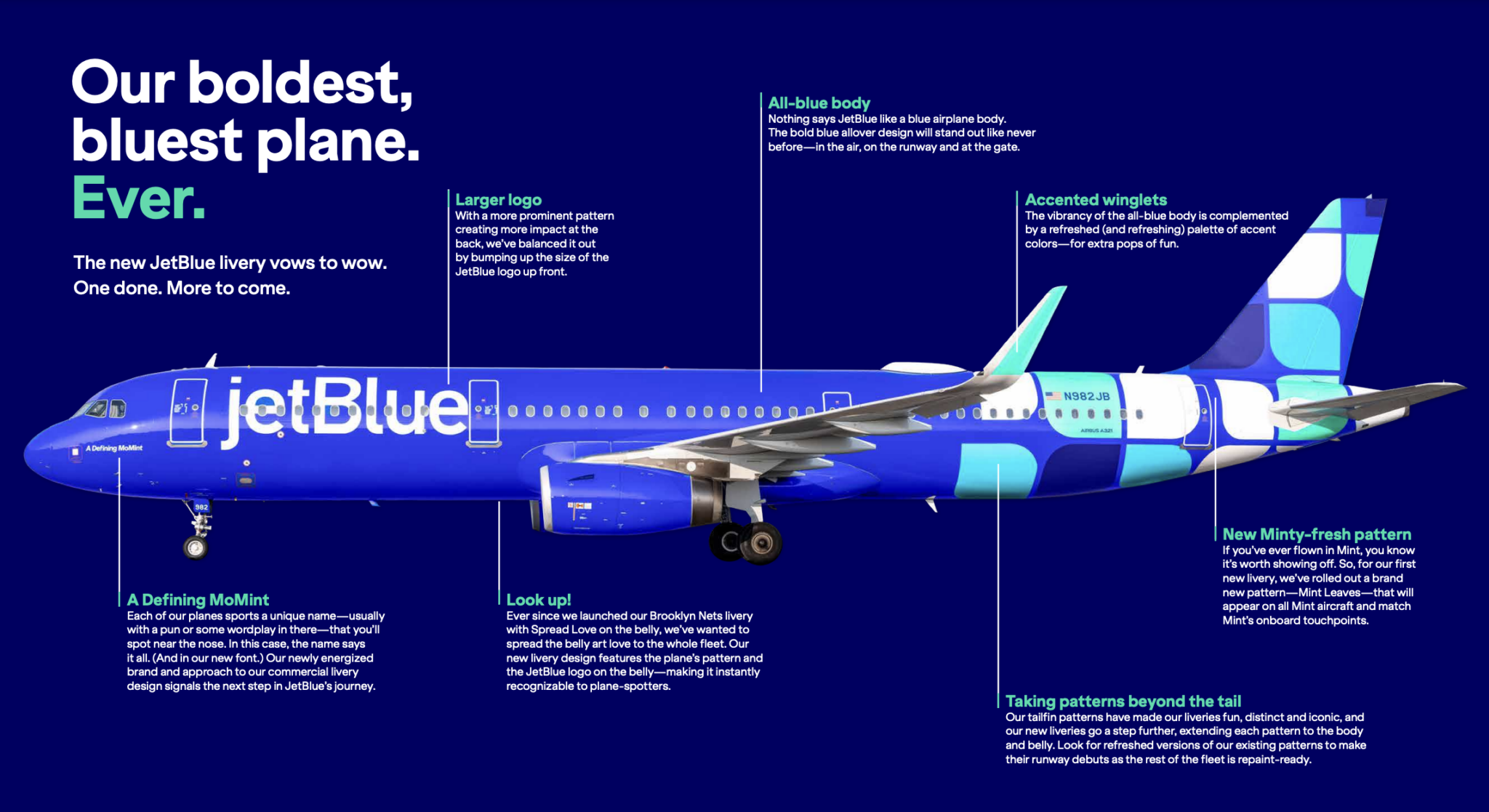
MINTY FRESH
JetBlue’s livery features a grab bag of different tail patterns. According to the airline, these designs are “fun,” “distinct,” and — here comes that word — “iconic.” The latest one is named “Mint Leaves,” and it celebrates jetBlue’s premium class, branded as Mint. All planes outfitted with Mint suites will feature this look, which uses a scattering of the round-cornered “leaves” that serve as the Mint logo.
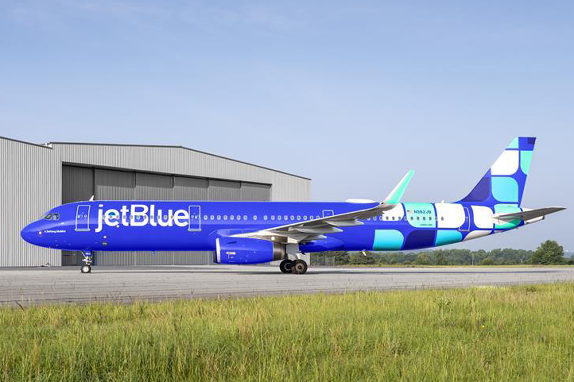
This is a nice idea, but it’s bound to be confusing to the average traveler, who has no idea what those little boxes represent. The Mint logo simply isn’t well-known enough. What most people will see is just a bunch of squares. And there are too many of them, top and bottom.
Up front, the oversized lettering is meant to balance out the heaviness of the tail, but it’s needlessly big and looks squeezed-in between the doors. The Southwest-style blue is too syrupy.
GRADE: C-minus
REALLY?
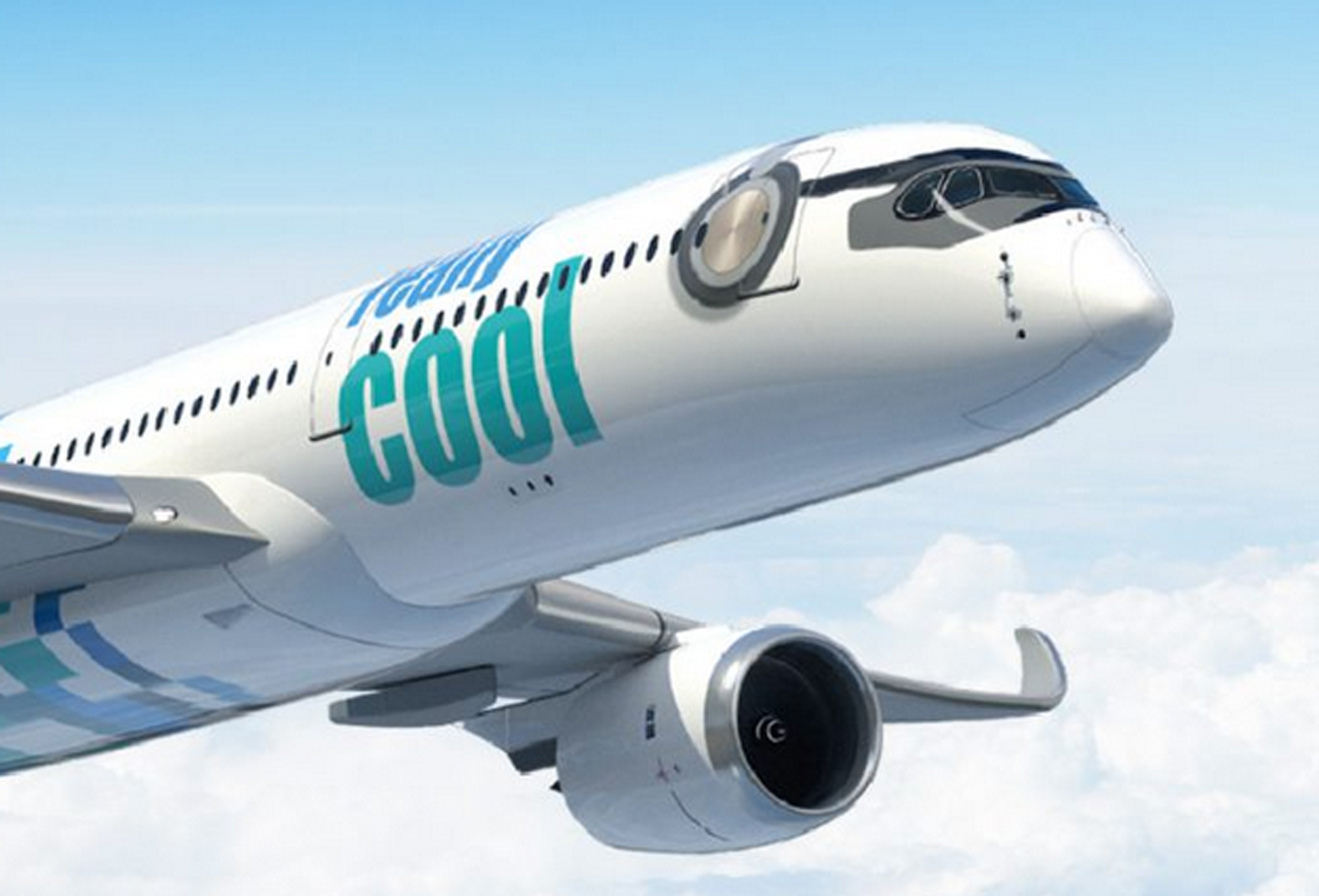
“Yesterday, our future was uncertain. Our economy in turmoil,” rumbles the home page. “Today, the dark clouds have passed. And we can take back to the skies. We were not ready for the turbulence that came before. Never again!” And with that we expect a grand crescendo, a sky-clearing crash of cymbals. Let the opening credits roll!
Welcome to Really Cool Airlines, a start-up out of Thailand that hopes to open routes around Asia using Airbus A350s. It should go without saying that any airline whose name requires an immediate set of parentheses to remind you that no, this isn’t a joke (this isn’t a joke), ought to maybe rethink its branding. But let’s save the name for another time. We shall defer, also, any exploration of the company’s business model, which has something to do with crypto and blockchains. (The carrier’s mastermind is Patee Sarasin, the same fellow who started Nok Air, a successful Thai LCC, so conceivably this could pan out.) To the livery…
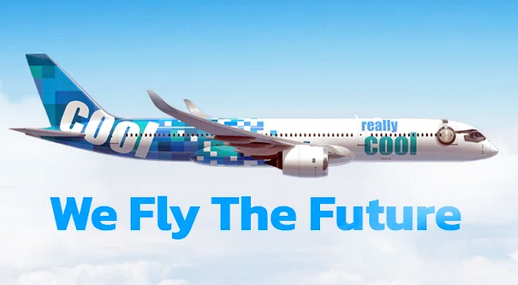
The plane appears to be wearing headphones. So, there’s that.
I’m getting an LCC vibe here. Not a cheap LCC vibe, like you feel with Spirit or Southwest, but a more sleek and sophisticated one. The colors are part of this. I don’t know about really cool, but they’re cool. What drags this one down is the back of the fuselage: the design is tail-heavy. There’s way too much going on back there. Go easier with all those blue and green squares (ditto for jetBlue, above) and let’s talk again.
GRADE: C-minus
DUBAI DO-OVER
If one airline didn’t need a re-fresh, it was Emirates. Can’t leave well enough alone, I guess. The kids have to put their art school degrees and fancy graphic design apps to use. So they took one of the boldest, cleanest, most distinctive liveries in the world and had to get all showy with it. Lo and behold, yet another overdone design fixated on motion and texture.
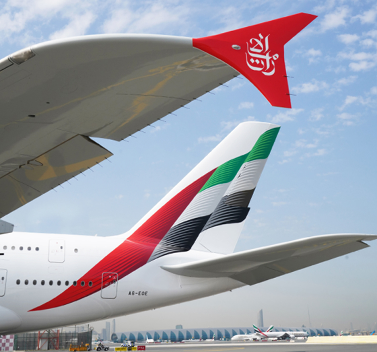
I don’t hate it. Truth be told, I like it, and if you insist it’s an improvement, I won’t argue. The basic blueprint — the Emirati flag — is still there, and it remains unmistakable. Just a little less so, because now it’s all wavy and scaly and even a little blurry. Identities are becoming less distinctive, not more, and sometimes it feels as if airline branding has been taken over by millennials trying to out-cool each other.
The red winglets are a great addition. The rest was unnecessary.
GRADE: B-plus
THE CONDOR BEACH TOWEL
Condor is a Frankfurt-based charter airline. The airline was set up in 1955 by Lufthansa, and for years its markings were handsomely reminiscent of that carrier’s: blue stripe, yellow tail, Lufthansa-esque condor logo. Later the Thomas Cook Group took control, and Condor adopted the group’s mostly inoffensive yellow and gray.
Today the airline is controlled by a European investment company, and in April, 2022, a bold new rebranding was unveiled, timed to coincide with delivery of Condor’s new Airbus A330-900s, which will replace a fleet of antique Boeing 767s. Each jet will feature a nose-to tail pattern of vertical candy stripes, in one of five colors. This, we are told, is to keep things more in synch with the leisure charter vibe: fun, friendly, easy, inexpensive and all that.
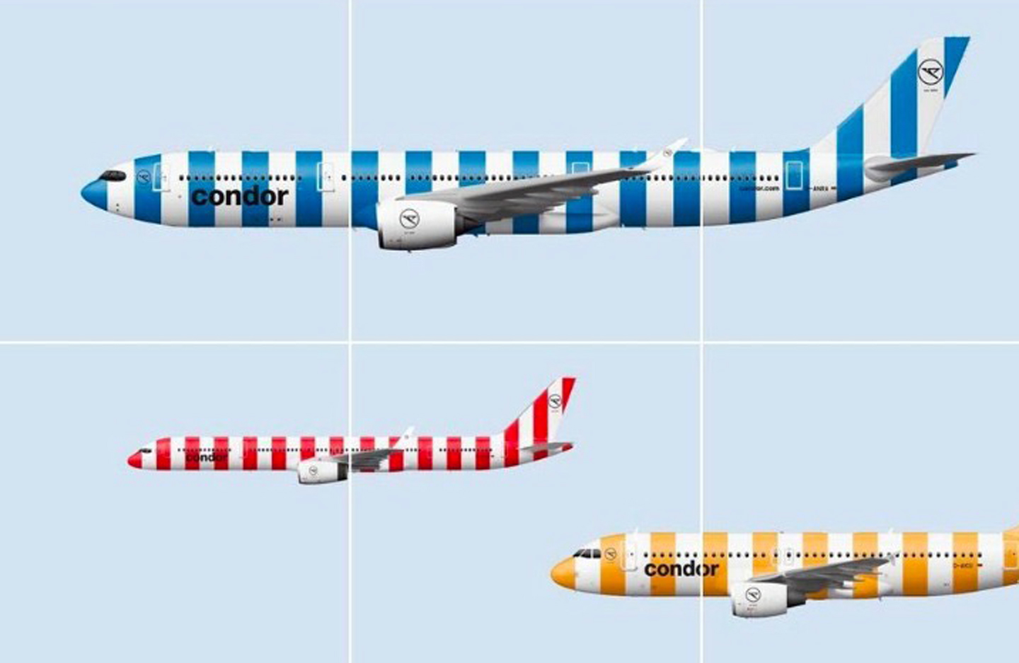
The main problem is, vertical stripes really don’t belong on a plane. The very shape of an airplane, in all its horizontal-ness, suggests motion, speed, and the traversing of distances. Vertical stripes suggest the opposite of that. The visual effect is one of negative motion, almost as if the plane is being held back and asked to stop.
Officially, according to the people who were paid to concoct this nonsense, the color representations go like this: blue for ocean; green for island; beige for beach, gold for sunshine, and red for “passion” — whatever that might mean. At least, for a change, there’s nothing here about the northern lights. I’m not seeing sunshine or passion. I’m seeing a picket fence, or maybe a couch cushion.
“Unmistakable,” is how Condor CEO Ralf Teckentrup describes it. And it certainly is — for the wrong reasons.
GRADE: F
CARIBBEAN CALAMITY
A hummingbird has long been the tail mascot for Trinidad-based Caribbean Airlines. For years the carrier used a photographic-style decal similar to the tails worn by Frontier. It was fetching. Here’s a picture I took one day at the airport in Georgetown, Guyana…
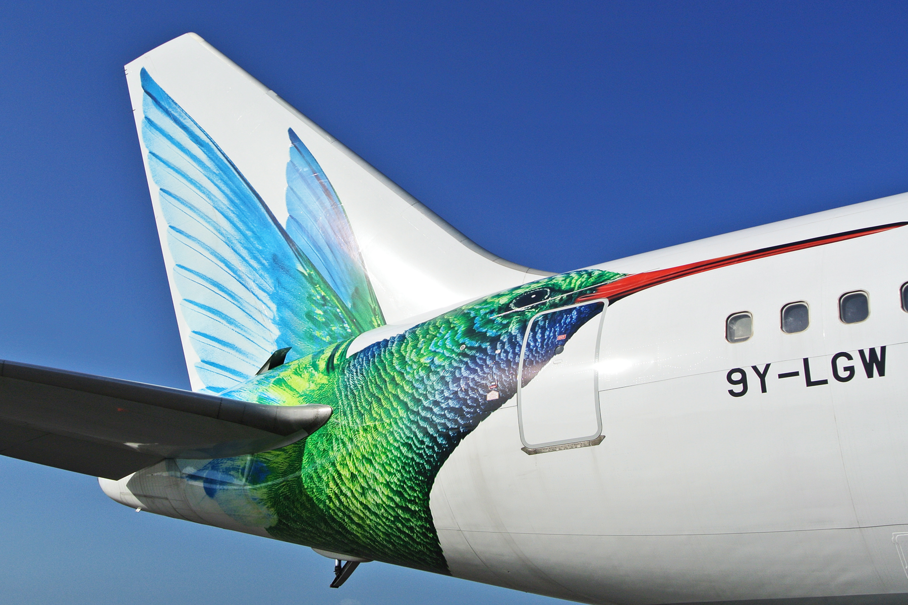
For reasons that can’t possibly be explained, this design has been made over into the abomination you see below. The updated magenta typeface (visible in the other links) is, in fact, an improvement. Nothing, however, can justify the psychedelic madness of the tail.
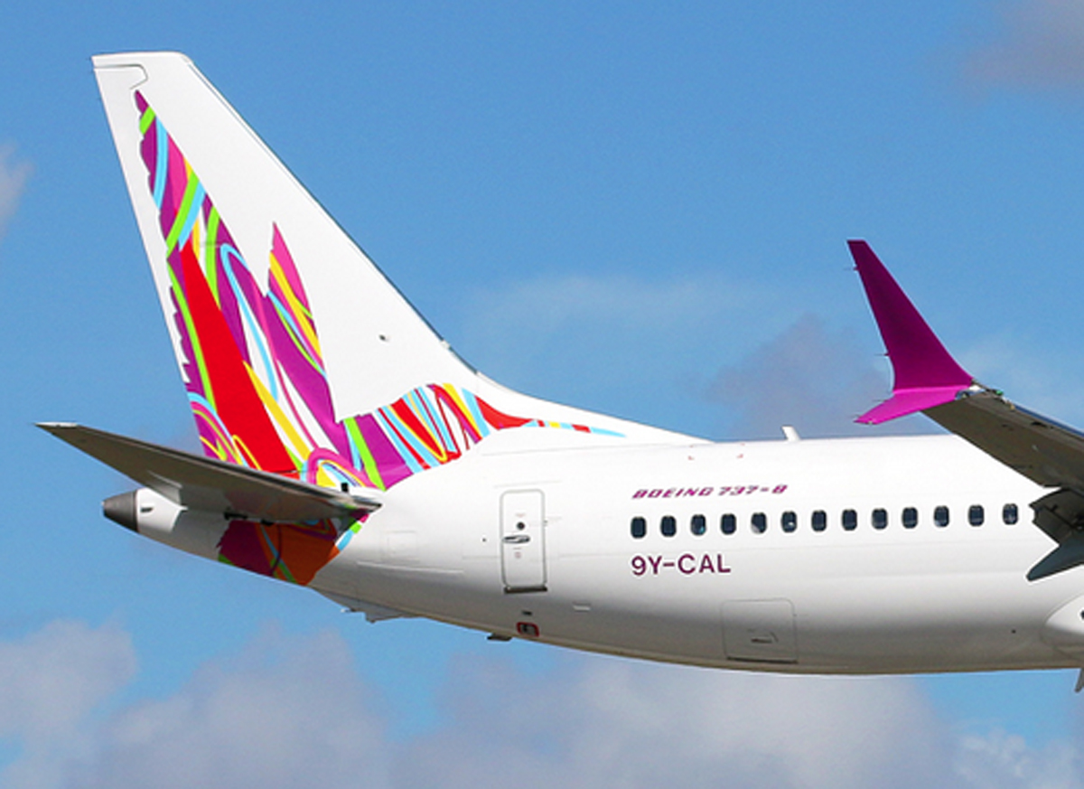
Caribbean is the successor to BWIA (British West Indies Airways), whose elegant livery and steel pan logo once graced the L-1011 TriStar. Talk about a devolution.
GRADE: F-minus
PRETTY IN PURPLE
Let’s ignore for a minute the question of whether we need another low-cost airline. Let’s also ignore the wisdom of operating 737s from the stubby runways at New Haven, Connecticut, one of Avelo Airlines’ hubs (the other is Burbank, where the runway isn’t much longer). Instead, let’s focus on their paintjob, which is rather pleasant.

The use of purple is unusual for an airline, and here it’s quite attractive. As is the typeface, which together with the engine nacelles and tail swoop, combine just right in a handsome, three-point balance.
This is one of those rare designs that works well even with a mostly bare fuselage. And unlike the looks of many LCCs, it’s not trying to be whimsical or amusing; it’s dignified.
I’m not sure the three-color, lightbulb filament tail was executed quite right. Maybe two colors instead of three, with thicker lines? It’s solid as a brand-mark, though, and it works.
GRADE: A-minus
UBERBLUE
This one, on the other hand. Were they having a hangar sale on blue paint? David Neelman is the founder of Breeze, which is opening a slew of routes from coast to coast, focusing mainly on secondary cities. Previously of jetBlue and Azul, blue has always been his thing. But come on, Dave, do you have to drown us in it, a light blue and a darker one?
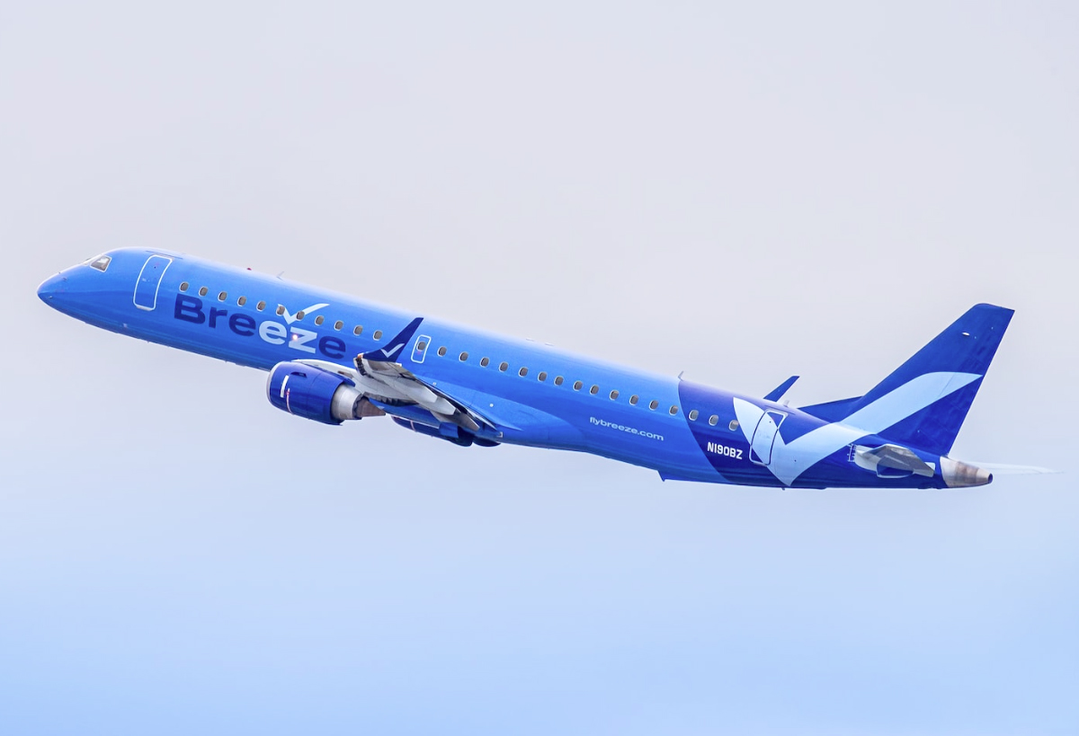
The checkmark motif is an effective one for an LCC — and affirmation of sorts, suggestive of ease and simplicity — but the rest of it is dead weight. Here’s a case where the fuselage isn’t painted white for a change, but probably should be.
GRADE: D
NORTHERN NONSENSE
Northern Pacific is a low-cost upstart out of Anchorage with plans to open routes within the western United States and to Asia. Behold their livery here.
Black is their go-to color. That’s not a bad thing, by itself, and we dig the raccoon-style shading around the cockpit. It’s a trendy flourish these days, but it’s cool. Can we stop there and award them a top grade? Alas, our survey of the wreckage must continue.
Let’s focus on that strange “N” logo. Except we can’t focus on it, because it’s vibrating uncontrollably. That’s not a shadow or a camera blur; that’s actually how it’s painted. Though maybe it’s better this way, seeing how, in its non-vibrating state, it resembles the logo for an amateur sports team.
On the engine nacelles, meanwhile, they’ve applied a completely different logo — a pair of offset thingies that remind us, painfully, of the American Airlines box-cutter. Then, up on the tail, we have yet another design. Isn’t that a black hole, or a special effect from “The Matrix”? The airline says its livery is meant to “evoke the natural beauty of Alaskan wilderness.” What I see here is a bending of time and space.
And sure, why not, go ahead and throw another “N” up in the corner, but this time make it turquoise. While you’re at it, paint the wingtips in turquoise too, because the northern lights or something.
What a garble of elements and patterns — a good example of a livery trying to out-clever itself at every turn.
GRADE: F-minus
SPANISH FLY FLOP
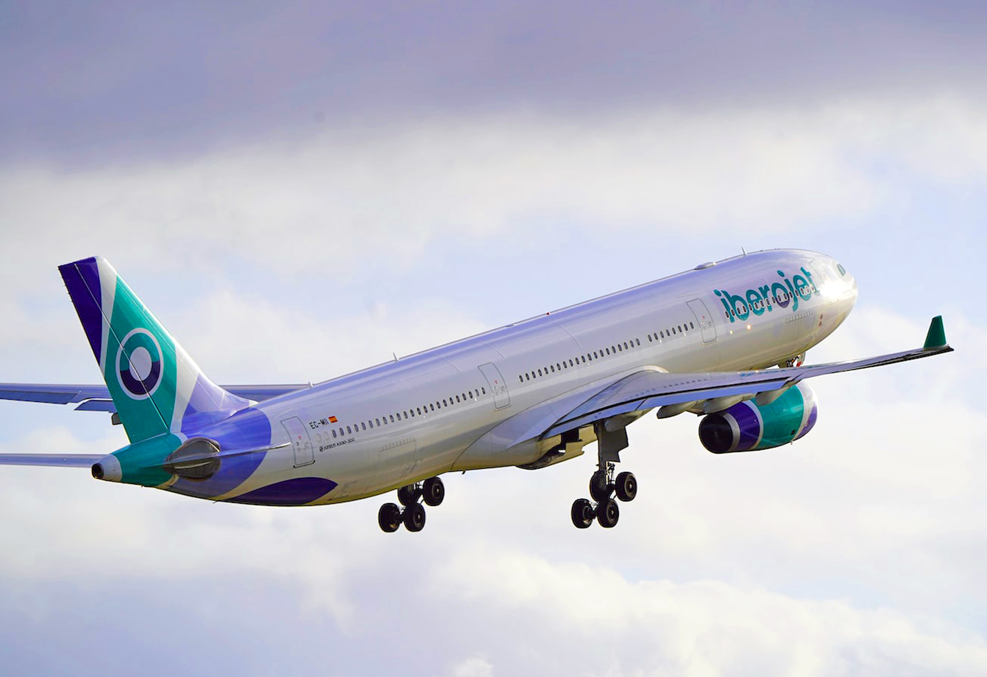
My plan is to start a Spanish charter carrier. Step one is to think up the stupidest name possible. I like “Iberojet,” as it sounds like it came from a third-grader. On the tail I want three bands. Mute the colors, and have that same third-grader do the painting so that the bands are warped and pinched, diverging/converging in bizarre random directions. If there’s any paint left over, add a navy blue arc to the underside of the aft fuselage. Do the same thing, more or less, on the engine nacelles, and then write “Iberojet” on the side. Use lowercase letters, because why not.
GRADE: F-minus
BOREAL BOREDOM
So, Icelandair has a new look, featuring, guess what, a Eurowhite body with blue titles. How novel.
The tail, though, is the exciting part, because each will boast one of five highlight colors apparently inspired by the people who make Sharpies. Wait, don’t tell me, the colors are meant to suggest… the northern lights! Which every smart tourist knows are best viewed in Finland or Norway, not Iceland.
Officially, according to a company press release, each of the accents “represents a different phenomena in Icelandic nature.” If true, they should include a gray, a black, and maybe a fiery volcanic red. What we get instead is lemon yellow, a magenta, a cyan blue. You could hunt around Iceland for a month and not see those colors. (Two additional colors are yet to debut. Surely they’ll be lovely.)
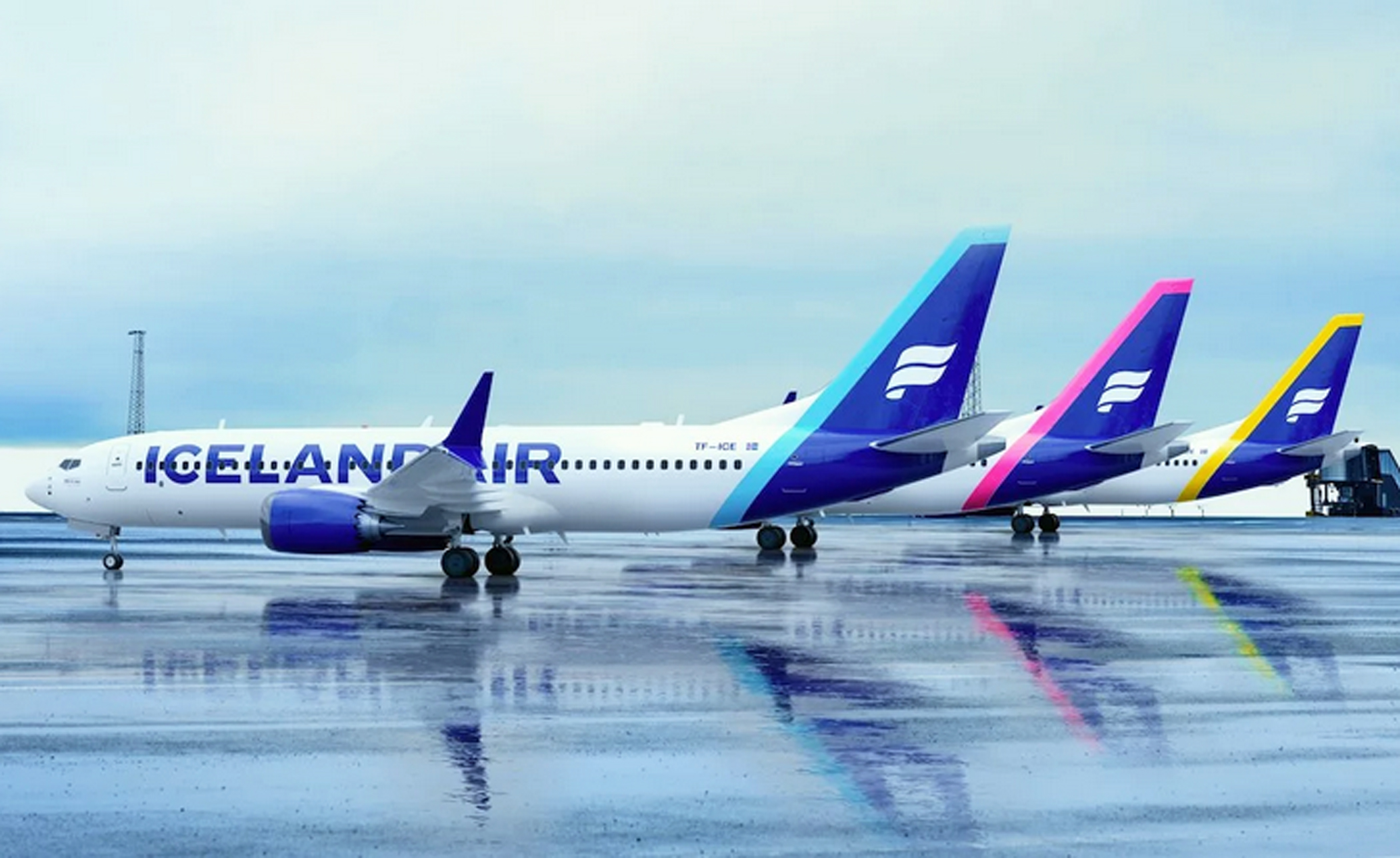
If they’d chosen only one accent color it’d be worse; the grab-bag keeps it lively, if nothing else. And when you really look at it, the problem is less the tail than the lettering. Sure, billboard-style lettering is meant to be big, but in this case it’s too big.
At least they’ve hung on to their logo, which for decades has been one of the most distinctive in the industry.
GRADE: D-plus
UNITED BLUES
After its merger with Continental Airlines in 2010, United came up with an amalgamation blending the United typeface with the Continental globe. Bland and ultra-corporate, it looked like something you’d see in a PowerPoint slide. A refresher was maybe inevitable. Unfortunately, they’ve gone way too far in the other direction. They’ve stayed with the 2010 template; except, now, they’ve sucked away whatever dignity it had.
We start with the “United” title, which has gone big. Big for big’s sake, unbalanced and oddly spaced, as if it were painted over some other name. The gold accenting is gone from the tail now, and the blue has been amped up, turning the old Continental globe into a fluorescent spider web. Is this the airline’s excuse for a logo? Do they even have a logo? It’s a tail that manages to be gaudy and boring at the same time.
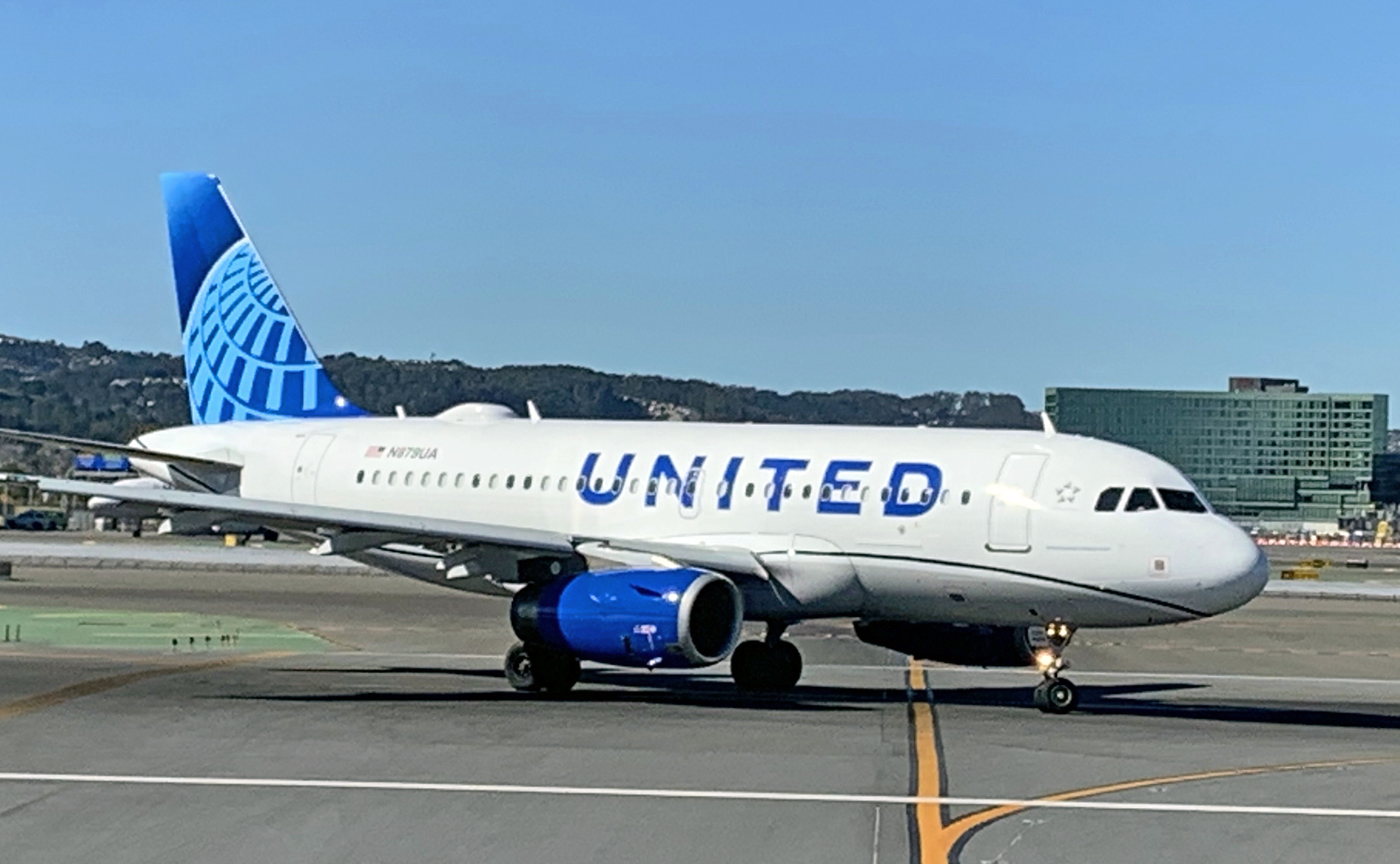
And, needless to say, you can’t have a livery these days without some annoying “in-motion” theme. United obliges with a mandatory curvy thing along the lower fuselage. Is it a worm? A garden hose? Worst of all it’s black.
Granted this isn’t as terrible as what American Airlines did a few years ago. It’s bold, I’ll give you that, and you can marvel in the simplicity of it. Or, you can call it what it is: an immature scheme that evokes the downmarket cast of a budget airline — hardly the look that a preeminent global carrier should hope to project.
GRADE: F
PHOTO CREDITS:
Alaska Airlines
Sam Chui (Korean Air)
Rocco Smet (Caribbean Airlines)
Daniel Shapiro/Unsplash (Breeze)
Jan Rosolino/Unsplash (Iberojet)
Patrick Smith (ITA)
Sam Chui (Korean Air)
Patrick Smith (United Airlines)


