

The Rolling Report Card
AS MY REGULARS know, critiquing airline liveries is my favorite thing in the world. Especially the ugly ones, which nowadays is pretty much all of them.
From now on, rather than grading them individually in separate articles, we’ll compile them here, one at a time. This post will act as a sort of rolling report card, updated with every new reveal.

Beginning next year, Alaska Airlines will launch flights to Iceland and the U.K. — the Seattle-based carrier’s latest foray into the long-haul realm. As part of the celebration, it’s painting up some 787s in a flashy new scheme. “Our new 787 exterior embodies Alaska’s transition to a global airline with beauty, grace and a nod to our heritage,” says the company CEO Ben Minicucci.
Color me bored. It’s not the ugliest thing I’ve ever seen, but the aurora theme is overdone (see Icelandair, below) and was all too predictable. As for the “heritage” invoked by Mr. Minicucci, the longstanding Alaska tail, starring the parka-wearing Inuk man, is a classic of American airline branding and should absolutely, no question, be up there for the 2026 route launches — an iconic emissary to the carrier’s newest outposts. Instead we get some neon nonsense. It looks like someone spilled anti-freeze across the back of the plane.

A few years back, ITA Airways became the Italian flag carrier, replacing the chronically troubled Alitalia, which had been in and out of solvency for decades. I wasn’t a fan of ITA’s livery. “The colors and styles are so mis-matched as to seem almost arbitrary,” I wrote in an earlier post. “The patterned tail motif reminds me of a doily, or the kind of tablecloth you’ll find in certain Italian restaurants.”
That part about the tail is still true, but overall the look has grown on me. One thing you don’t notice in most photographs is the beautiful iridescence of the blue. And that mis-matching I decried isn’t so; there’s a sly synchronicity to the colors.
That blue, it turns out, is formally known as “Savoy Blue,” or “Italian Blue,” and has been associated with Italian royalty since the Middle Ages. It’s also the traditional color of the Italian national sports teams.
Indeed there’s an Italian-ness to it all, helped along, of course, by the Tricolore striping along the rudder. (The doily patterning is subtle enough not to steal the show.) It’s stylish, tasteful, and culturally apropos. Yet simple at the same time, as any good branding should be. My apologies for missing it the first time.
My gripe is no longer with the uniform, it’s with the name. Annoyingly, they went and added “Airways” to the carrier’s moniker. “ITA,” just by itself, was smoother, simpler, and perfectly adequate. But no, they had to jam “Airways” in there, because apparently everyone is stupid and might forget it’s an airline. They’ve even painted it on the fuselage, in a smaller typeface below the main titles, throwing off the livery’s balance (hence my B-plus grade instead of an A).
Loosely translated, the carrier is now called “Italian Air Transport Airways.” And with or without the extra word, it lacks the poetry of the old “Alitalia.”
ITA’s radio call-sign is “Itaro,” which is kinda sexy and wouldn’t be bad as a name on its own.
Korean Air has been making some buzz, unveiling its first brand refresh in three decades. And in doing so they win the “If It Ain’t Broke…” award for terrible decision-making.
The new look fails for two big reasons. First, it’s ugly. Or spiritless, maybe, is the better word. Second, there was no need for it; the scheme it replaces was among the industry’s best, a pleasant reprieve from the plague of all-white fuselages and lookalike swooshes.
I don’t know which part irks me more: the boring typeface, the blank bottom, or the tail emblem, which is a neutered version of the one it replaces. The blue is pretty, but all in all it’s a livery without character. It looks like it was cooked up on a computer in about two minutes.
Air India was taken over not long about by the Tata Group. The new owners are expanding and hoping to establish the long-beleaguered carrier as a world-class brand. These sorts of reinventions are often accompanied, dangerously, by livery changes. To wit…
There’s a press release explaining all the meanings and symbolism here. It’s a brilliant self-parody. Someone asked ChatGPT to come up with a bullshit announcement full of pseudo-inspirational blather, and it happily obliged. “Purposeful and confident.” “Premium cues.” “Personality and storytelling.” It goes on like this.
Let’s keep it simpler. First of all, the lettering is too big. Billboard lettering is common these days, and Air India, like many others, crosses the line between assertive and overblown.
Then we have the tail. Where do we start? The airline describes this weird-looking thing as a “hero signature window frame.” Do we have any idea what this means? Heroes? Windows? What? I’m told the design is an evolution of the Rajasthani-style window decals that have heretofore been part of Air India’s livery for decades (do we dare call them iconic?). Possibly, but what most people will see is just a random, strangely angled pattern. The colors are pretty but the message is unintelligible. Neither does it work from a branding standpoint: it’s a pattern, not a logo, without any context or clarity.
The element that really wrecks it all, though, is the gold accenting at the bottom. Specifically, the way it detaches from the red and goes off on its own, fore and aft. The red field, with the Air India name across the lower fuselage, is an obvious jab at Emirates, whose planes are marked similarly, and whose domination of routes into India the Tatas are hoping to unseat. All well and good, but those gold brackets… it’s like they put the wrong numbers into the paint-sprayer. This alone knocks my grade from a potential C to a D-minus. “The gold frame detail adds storytelling and and premium cues,” according to Air India. No, it doesn’t. What it adds is a rather bizarre coup de grace.
A shame how Air India’s look has degraded over time, from the masterpiece red swoosh livery of the 1970s, with its beautiful Sagittarius logo, to this.
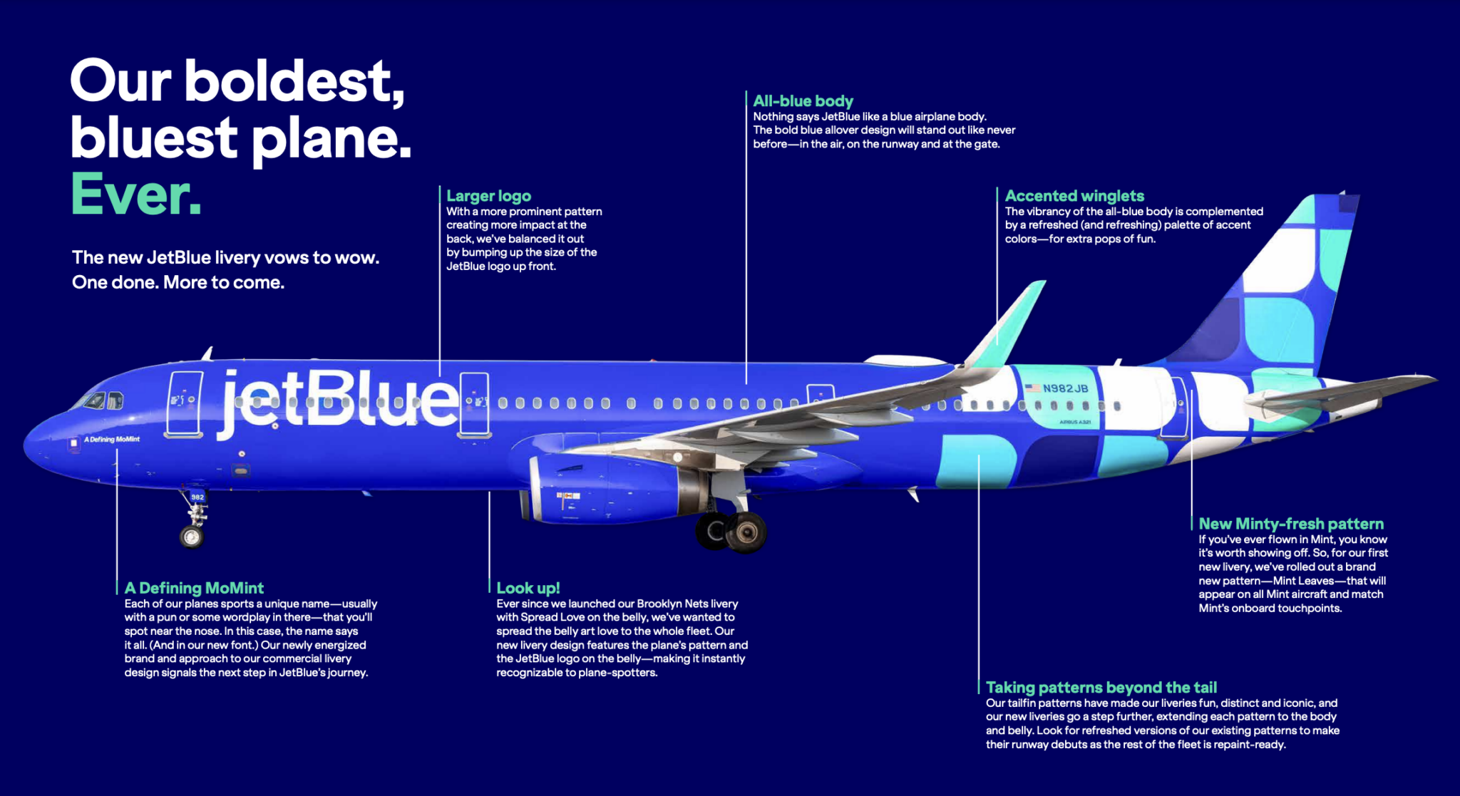
JetBlue’s livery features a grab bag of different tail patterns. According to the airline, these designs are “fun,” “distinct,” and — here comes that word — “iconic.” The latest one is named “Mint Leaves,” and it celebrates jetBlue’s premium class, branded as Mint. All planes outfitted with Mint suites will feature this look, which uses a scattering of the round-cornered “leaves” that serve as the Mint logo.
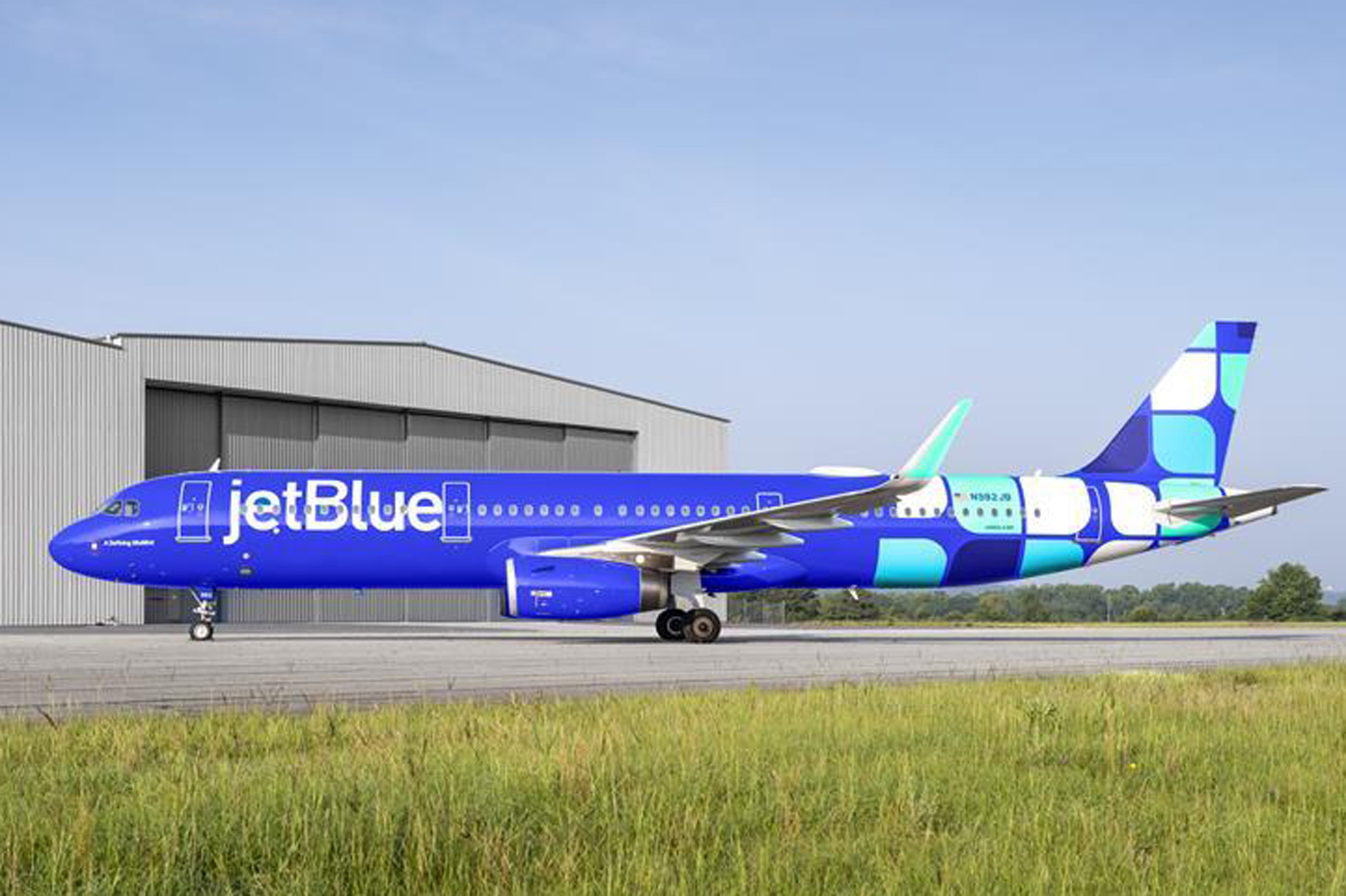
This is a nice idea, but it’s bound to be confusing to the average traveler, who has no idea what those little boxes represent. The Mint logo simply isn’t well-known enough. What most people will see is just a bunch of squares. And there are too many of them, top and bottom.
Up front, the oversized lettering is meant to balance out the heaviness of the tail, but it’s needlessly big and looks squeezed-in between the doors. The Southwest-style blue is too syrupy.
“Yesterday, our future was uncertain. Our economy in turmoil,” rumbles the home page. “Today, the dark clouds have passed. And we can take back to the skies. We were not ready for the turbulence that came before. Never again!” And with that we expect a grand crescendo, a sky-clearing crash of cymbals. Let the opening credits roll!
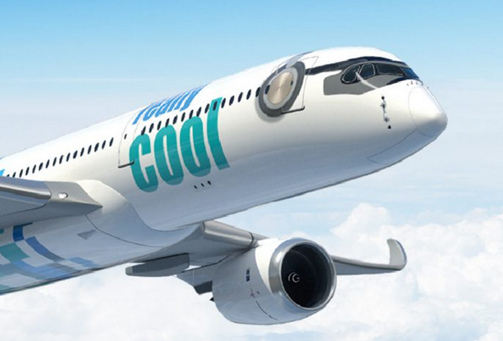
Welcome to Really Cool Airlines, a start-up out of Thailand that hopes to open routes around Asia using Airbus A350s. It should go without saying that any airline whose name requires an immediate set of parentheses to remind you that no, this isn’t a joke (this isn’t a joke), ought to maybe rethink its branding. But let’s save the name for another time. We shall defer, also, any exploration of the company’s business model, which has something to do with crypto and blockchains. (The carrier’s mastermind is Patee Sarasin, the same fellow who started Nok Air, a successful Thai LCC, so conceivably this could pan out.) To the livery…
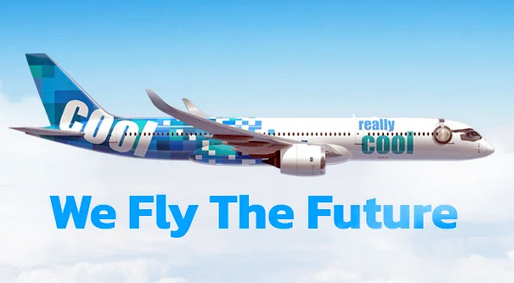
The plane appears to be wearing headphones. So, there’s that.
I’m getting an LCC vibe here. Not a cheap LCC vibe, like you feel with Spirit or Southwest, but a more sleek and sophisticated one. The colors are part of this. I don’t know about really cool, but they’re cool. What drags this one down is the back of the fuselage: the design is tail-heavy. There’s way too much going on back there. Go easier with all those blue and green squares (ditto for jetBlue, above) and let’s talk again.
If one airline didn’t need a re-fresh, it was Emirates. Can’t leave well enough alone, I guess. The kids have to put their art school degrees and fancy graphic design apps to use. So they took one of the boldest, cleanest, most distinctive liveries in the world and had to get all showy with it. Lo and behold, yet another overdone design fixated on motion and texture.
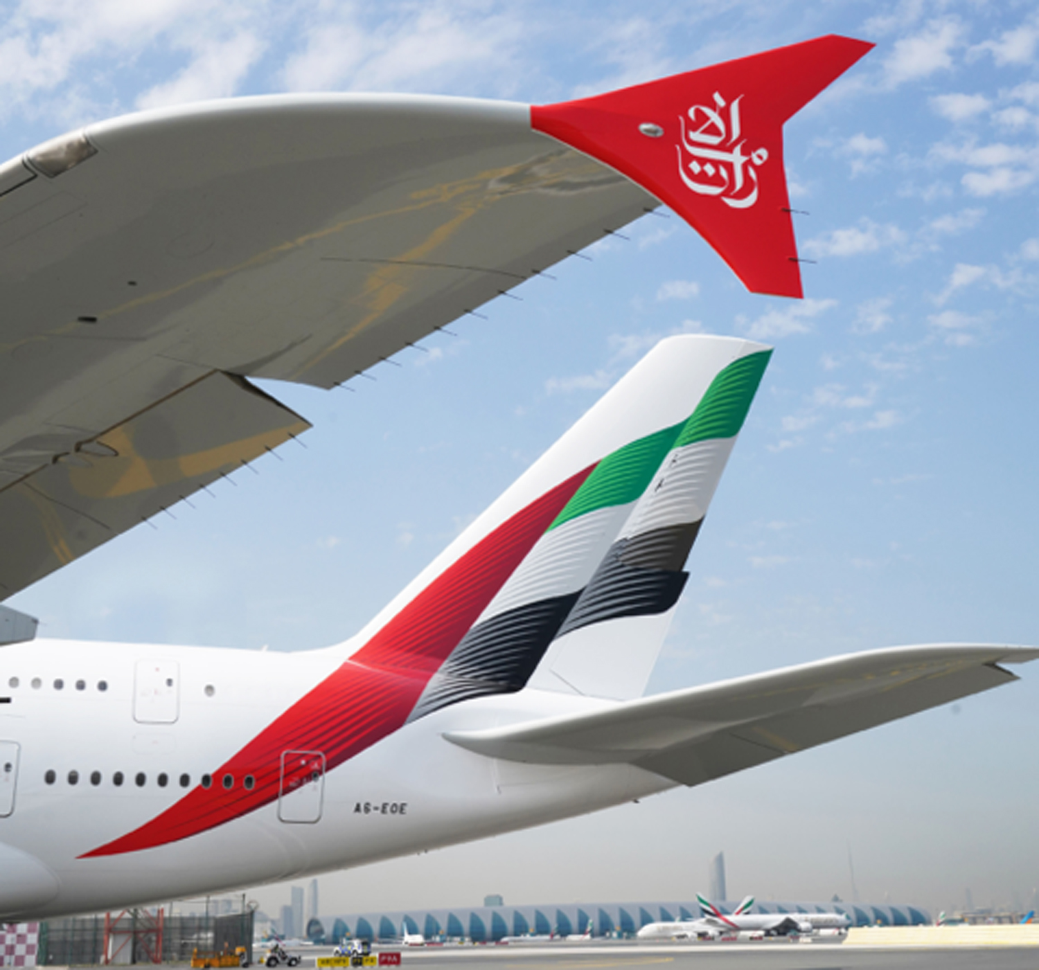
I don’t hate it. Truth be told, I like it, and if you insist it’s an improvement, I won’t argue. The basic blueprint — the Emirati flag — is still there, and it remains unmistakable. Just a little less so, because now it’s all wavy and scaly and even a little blurry. Identities are becoming less distinctive, not more, and sometimes it feels as if airline branding has been taken over by millennials trying to out-cool each other.
The red winglets are a great addition. The rest was unnecessary.
Condor is a Frankfurt-based charter airline. The airline was set up in 1955 by Lufthansa, and for years its markings were handsomely reminiscent of that carrier’s: blue stripe, yellow tail, Lufthansa-esque condor logo. Later the Thomas Cook Group took control, and Condor adopted the group’s mostly inoffensive yellow and gray.
Today the airline is controlled by a European investment company, and in April, 2022, a bold new rebranding was unveiled, timed to coincide with delivery of Condor’s new Airbus A330-900s, which will replace a fleet of antique Boeing 767s. Each jet will feature a nose-to tail pattern of vertical candy stripes, in one of five colors. This, we are told, is to keep things more in synch with the leisure charter vibe: fun, friendly, easy, inexpensive and all that.
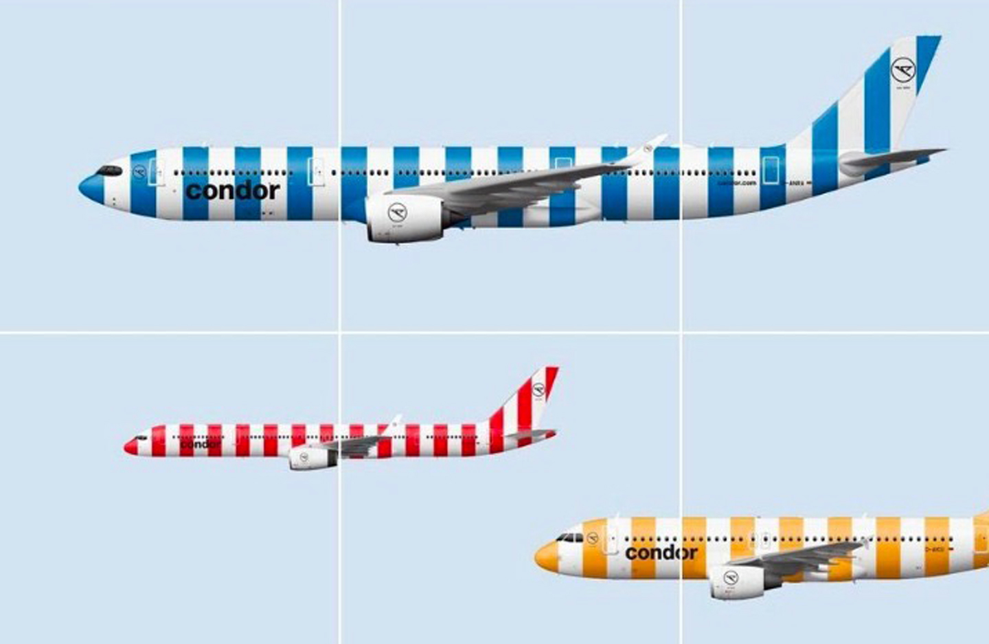
The main problem is, vertical stripes really don’t belong on a plane. The very shape of an airplane, in all its horizontal-ness, suggests motion, speed, and the traversing of distances. Vertical stripes suggest the opposite of that. The visual effect is one of negative motion, almost as if the plane is being held back and asked to stop.
Officially, according to the people who were paid to concoct this nonsense, the color representations go like this: blue for ocean; green for island; beige for beach, gold for sunshine, and red for “passion” — whatever that might mean. At least, for a change, there’s nothing here about the northern lights. I’m not seeing sunshine or passion. I’m seeing a picket fence, or maybe a couch cushion.
“Unmistakable,” is how Condor CEO Ralf Teckentrup describes it. And it certainly is — for the wrong reasons.
A hummingbird has long been the tail mascot for Trinidad-based Caribbean Airlines. For years the carrier used a photographic-style decal similar to the tails worn by Frontier. It was fetching. Here’s a picture I took one day at the airport in Georgetown, Guyana…
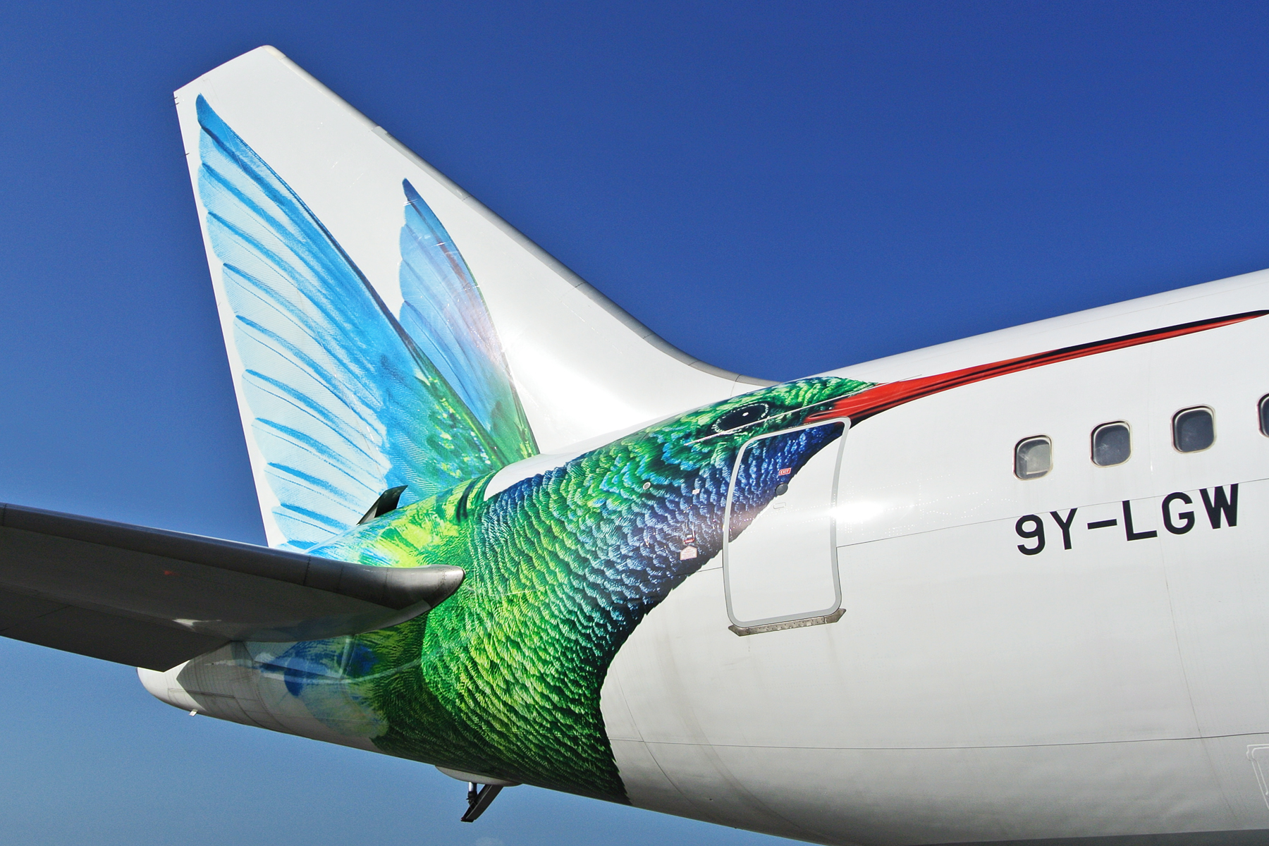
For reasons that can’t possibly be explained, this design has been made over into the abomination you see below. The updated magenta typeface (visible in the other links) is, in fact, an improvement. Nothing, however, can justify the psychedelic madness of the tail.
Caribbean is the successor to BWIA (British West Indies Airways), whose elegant livery and steel pan logo once graced the L-1011 TriStar. Talk about a devolution.
Let’s ignore for a minute the question of whether we need another low-cost airline. Let’s also ignore the wisdom of operating 737s from the stubby runways at New Haven, Connecticut, one of Avelo Airlines’ hubs (the other is Burbank, where the runway isn’t much longer). Instead, let’s focus on their paintjob, which is rather pleasant.

The use of purple is unusual for an airline, and here it’s quite attractive. As is the typeface, which together with the engine nacelles and tail swoop, combine just right in a handsome, three-point balance.
This is one of those rare designs that works well even with a mostly bare fuselage. And unlike the looks of many LCCs, it’s not trying to be whimsical or amusing; it’s dignified.
I’m not sure the three-color, lightbulb filament tail was executed quite right. Maybe two colors instead of three, with thicker lines? It’s solid as a brand-mark, though, and it works.
This one, on the other hand. Were they having a hangar sale on blue paint? David Neelman is the founder of Breeze, which is opening a slew of routes from coast to coast, focusing mainly on secondary cities. Previously of jetBlue and Azul, blue has always been his thing. But come on, Dave, do you have to drown us in it, a light blue and a darker one?
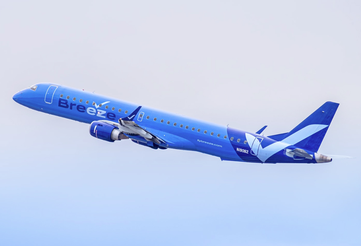
The checkmark motif is an effective one for an LCC — and affirmation of sorts, suggestive of ease and simplicity — but the rest of it is dead weight. Here’s a case where the fuselage isn’t painted white for a change, but probably should be.
Northern Pacific is a low-cost upstart out of Anchorage with plans to open routes within the western United States and to Asia. Behold their livery here.
Black is their go-to color. That’s not a bad thing, by itself, and we dig the raccoon-style shading around the cockpit. It’s a trendy flourish these days, but it’s cool. Can we stop there and award them a top grade? Alas, our survey of the wreckage must continue.
Let’s focus on that strange “N” logo. Except we can’t focus on it, because it’s vibrating uncontrollably. That’s not a shadow or a camera blur; that’s actually how it’s painted. Though maybe it’s better this way, seeing how, in its non-vibrating state, it resembles the logo for an amateur sports team.
On the engine nacelles, meanwhile, they’ve applied a completely different logo — a pair of offset thingies that remind us, painfully, of the American Airlines box-cutter. Then, up on the tail, we have yet another design. Isn’t that a black hole, or a special effect from “The Matrix”? The airline says its livery is meant to “evoke the natural beauty of Alaskan wilderness.” What I see here is a bending of time and space.
And sure, why not, go ahead and throw another “N” up in the corner, but this time make it turquoise. While you’re at it, paint the wingtips in turquoise too, because the northern lights or something.
What a garble of elements and patterns — a good example of a livery trying to out-clever itself at every turn.
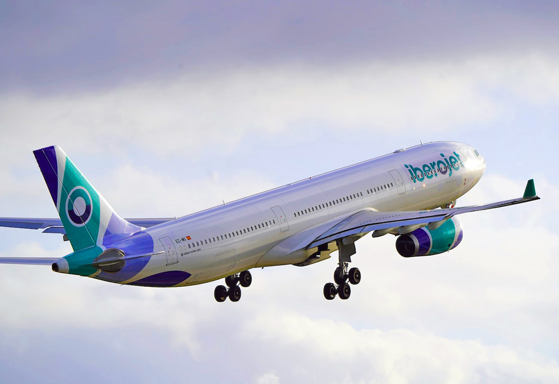
My plan is to start a Spanish charter carrier. Step one is to think up the stupidest name possible. I like “Iberojet,” as it sounds like it came from a third-grader. On the tail I want three bands. Mute the colors, and have that same third-grader do the painting so that the bands are warped and pinched, diverging/converging in bizarre random directions. If there’s any paint left over, add a navy blue arc to the underside of the aft fuselage. Do the same thing, more or less, on the engine nacelles, and then write “Iberojet” on the side. Use lowercase letters, because why not.
So, Icelandair has a new look, featuring, guess what, a Eurowhite body with blue titles. How novel.
The tail, though, is the exciting part, because each will boast one of five highlight colors apparently inspired by the people who make Sharpies. Wait, don’t tell me, the colors are meant to suggest… the northern lights! Which every smart tourist knows are best viewed in Finland or Norway, not Iceland.
Officially, according to a company press release, each of the accents “represents a different phenomena in Icelandic nature.” If true, they should include a gray, a black, and maybe a fiery volcanic red. What we get instead is lemon yellow, a magenta, a cyan blue. You could hunt around Iceland for a month and not see those colors. (Two additional colors are yet to debut. Surely they’ll be lovely.)
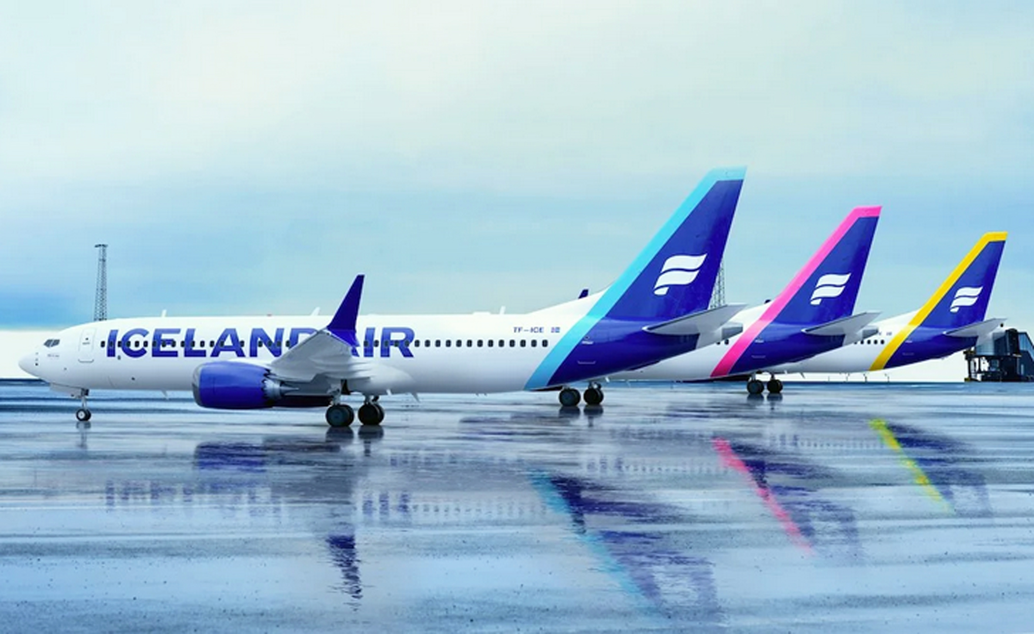
If they’d chosen only one accent color it’d be worse; the grab-bag keeps it lively, if nothing else. And when you really look at it, the problem is less the tail than the lettering. Sure, billboard-style lettering is meant to be big, but in this case it’s too big.
At least they’ve hung on to their logo, which for decades has been one of the most distinctive in the industry.
After its merger with Continental Airlines in 2010, United came up with an amalgamation blending the United typeface with the Continental globe. Bland and ultra-corporate, it looked like something you’d see in a PowerPoint slide. A refresher was maybe inevitable. Unfortunately, they’ve gone way too far in the other direction. They’ve stayed with the 2010 template; except, now, they’ve sucked away whatever dignity it had.
We start with the “United” title, which has gone big. Big for big’s sake, unbalanced and oddly spaced, as if it were painted over some other name. The gold accenting is gone from the tail now, and the blue has been amped up, turning the old Continental globe into a fluorescent spider web. Is this the airline’s excuse for a logo? Do they even have a logo? It’s a tail that manages to be gaudy and boring at the same time.
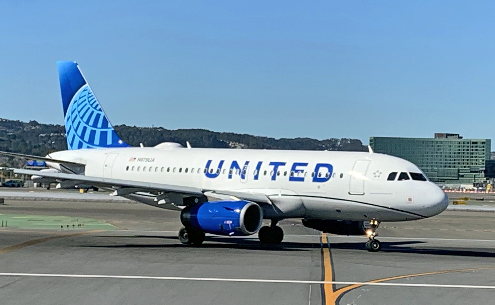
And, needless to say, you can’t have a livery these days without some annoying “in-motion” theme. United obliges with a mandatory curvy thing along the lower fuselage. Is it a worm? A garden hose? Worst of all it’s black.
Granted this isn’t as terrible as what American Airlines did a few years ago. It’s bold, I’ll give you that, and you can marvel in the simplicity of it. Or, you can call it what it is: an immature scheme that evokes the downmarket cast of a budget airline — hardly the look that a preeminent global carrier should hope to project.
PHOTO CREDITS:
Alaska Airlines
Sam Chui (Korean Air)
Rocco Smet (Caribbean Airlines)
Daniel Shapiro/Unsplash (Breeze)
Jan Rosolino/Unsplash (Iberojet)
Patrick Smith (ITA)
Sam Chui (Korean Air)
Patrick Smith (United Airlines)

Leave a Comment
Maximum 1500 characters. Watch your spelling and grammar. Poorly written posts will be deleted!
121 Responses to “The Rolling Report Card”
You are viewing newest comments first. Click to reverse order
Wow… I agree with some of these ratings, but most seem like some grumpy old person that wants the liveries from the olden days back. And may I remind you, not all of them were good either.
Regarding ITA: I’m a fan as well! The metallic blue fuselage is sleek and it goes well with the green, white, and red of the Italian flag. Admittedly, the flag is awkwardly placed way at the end of the tail, but the colors still work well. I also like how it’s still stereotypically “Italian” without just using the flag colors.
I’m not sure whether I prefer it to the Alitalia livery, but still, this one is great.
The new Alaska livery is nice, but Chester had a lot more character. As you say, Patrick, he definitely need to be in the tail of their 787’s. The shape of the cheatline and the way it blends into the tail is oddly similar to the (old) Caribbean Airlines hummingbird.
At the very least, there’s more color in the fuselage. Overall though, I’d say it’s a downgrade.
Re. Air India: it seems like India itself has been taken over by youngish Tech Bros. You can observe them in all airports around the world, with a laptop + backpack (a wheelie if they are a little older), and earphones. So it’s appropriate the press release might have been built with a little help from ChatGPT and the livery with Photoshop.
In what might be a major case of bone-headed stupidity, the acronym for “Italian Air Transport Airways (IATA) is the same as the much older acronym for the International Air Transport Association (IATA), the trade association for the world’s airlines, representing some 350 airlines over 80% of global air traffic. IATA was created to “support many areas of aviation activity and help formulate industry policy on critical aviation issues.” Duh!
Curious — why are most planes fully painted anyway? Doesn’t all that paint add extra weight? And make the plane more expensive to manufacture, maintain, and fly? I thought I’d read somewhere that so many old US warplanes were left in their metallic silver skins to reduce weight, and extend flying time or add speed?
Really?? How does “Really Cool” really not grade out at F-Infinity?? This is beyond my doubts the ugliest and stupidest looking airplane livery I’ve ever seen and part of me still doesn’t believe it’s not a huge gag.
I don’t hate the Alaska livery… in a vacuum, and therefore not deducting at least a full letter grade for ditching an iconic brand mascot, I think it has some cool things going for it. First, it isn’t jumping on the bandwagon of “massive airline name that looks like the airline wordmark is trying to eat the plane,” which I like. Second, while it does adopt “tail color block extends onto body” (the modern-day cheat line), the tapering and extension of the aurora pattern actually does echo a cheat line, which gives it a lot of charm. Third, the line is straight across the side of the plane! They should earn some extra points just for not making it wavy “to connote motion and global reach” or something. Finally, the colors look fresh and interesting without being garish, although that’s certainly a matter of taste. On the flipside, the markings on the nacelles look mismatched — a smaller version of the cheat line, tapering slightly toward the back of the nacelle would have looked much classier, or they could have just left them plain white, which would accentuate the fuselage design more. Now, I’ll admit that my grade is probably inflated because I’m what they call an “aurora sl*t,” but I’d give this livery a B-. Change the nacelles, and I’d up it to a B, but that’s the ceiling until they bring back the Inuit man.
To get away from bashing new liveries for a moment, what was the old KAL logo supposed to represent? Was it their version of JAL’s tsumaru (which kinda makes since considering how similar the two airlines’ logos were in the old days? As a kid, KAL’s logo always looked to me like a very broad-rimmed hat. 😁
Painting something the size of a 777 would appear to be a major expense. Do regularly flown airliners need repainting every so often, or is it done only after major weather impacts or flight milestones (such as a merger or sale of the aircraft itself)?
Conversely, does regular flight operation result in erosion of the skin of the aircraft?
Alaska’s trying to get rid of the Inuk on the tail again? I’m not buying for a minute that this design won’t be expanded to the entire fleet if nobody complains (or even if they do).
helps to put the link in! https://simpleflying.com/alaska-airlines-new-787-livery-london-iceland-flights/
Looks like Alaska is doing ‘stuff’ to their (hawaiian) 787s. I notice that the smiling eskimo is now … gone…
Those Condor planes look like they belong in jail. Come to think of it, the bozo who came up with that livery should also be in the slammer.
Your remark about “The kids have to put their art school degrees and fancy graphic design apps to use” in the Dubai piece really rings true, and not just in livery design. I see this sort of fingerprint of lack of knowledge in the computer systems of many companies, including Chase and Barclay’s Bank, amongst others. Systems that worked correctly for 20 years all of a sudden have errors and send mail out that bounces back to them. Why? Because someone’s nephew/niece, a recent IT school grad, is now in charge of some part of their IT system and just HAS to put his/her/their individual stamp on the system and don’t know how to test it before releasing it to the public, and we the customers have to spend hours talking to some rep who’s english is horrible, convincing they there’s nothing wrong with our email system, an email will only bounce back to the sender if it is mis-addressed. And said rep is full of apologies but can do nothing except to tell you to totally revise your email, which has been working flawlessly for 25 years. “when you don’t know what you are doing, blame someone else.”
Regarding the ITA livery, I believe the majority-blue color scheme also alludes to “Savoy Blue” (historically associated with the former Italian royal house), and is used by the majority of Italian national sports teams’ uniforms. There are certainly worse airline liveries out there!
Oh, please, oh please, airline livery design gooblins stay under the stairways and far away from KLM.
They already messed up KLM by adding that stupid dippity-do thing at the nose, where the blue dips down below the window line. Ugly and completely unnecessary.
Patrick, I’m old enough to remember, and like, the names Trans Canada Airlines (TCA) and British Overseas Airway Corporation (BOAC). Hell, I remember when EXXON was ESSO. In the immortal words of Don Ameche in an extremely under-rated movie ” things change.”
I hadn’t realized KLM had absorbed Korean. Oh well.
Patrick, what do you think about Ryanair livery?
I honestly hate the new livery. Livery was fine before Asiana merger. As a Korean myself, I hate it, looks similar to KLM now.
The Korean Air livery looks less like branding and more like something to let you know what country it is based in. It looks like branding for an airline that is trying to pretend it is a commercial airline when, as everyone knows, it is simply a charter airline owned by the shadier aspects of a government.
Am I the only one to think that the new Korean livery is very close to KLM’s?
Agree with Patrick, Korean’s was one of the most recognizable out there and very reassuring in its own sort of way.
I recently espied a beige striped Condor jet, and a few weeks later a blue striped version, both at CDG. They are shockingly ugly designs. Interestingly I had to look quite hard as we taxied by to figure out which airline. Unlike so many others with huge plumped up names on fuselages these days, it was much less obvious who these abominations belonged to.
What’s with all the jumbo-sized lettering on the fuselage these days? Is it for people like me who forget to put on their glasses, so the airline can make sure I get on the right plane? 🙂
Socks. Condor airplanes now look like flying knee-high girls’ socks.
I. …LIKE the Northern Pacific! The name isn’t huge and blocky, but understated and classy. The rest is _meh_ but is saved by the timeless, beautiful lines of the B757.
Painting vertical stripes on a jet suggests something other than a beach towel (the Condor condom?). This looks like an airline run by Jeffrey Epstein. What happened to the elegance of the Tsurumaru that graced JAL for 3 decades, or the distinctiveness of Air India’s individual window highlights (inspired by the Taj Mahal), or the Northwest N with an arrow pointing in the obvious direction? All lost to the design equivalent of Comic Sans.
The new Korean Air livery falls into the category of “at least it’s not Eurowhite”, which means that, sure, it’s distinctive but I don’t quite like it.
On one hand, I like the 2 different shades of blue, and it maybe looks a bit sleeker than the previous livery. On the other, the simplified font, the monocolored Yin-Yang, and the removal of the gray cheatline make this livery a “sterilized “version of the previous one. It’s like KE management sat down and had a meeting on how to deliberately suck the life out of their livery.
Also, the slightly darker (but still light) shade of blue and tapered line remind me of KLM and Neos.
Overall, I’d say I like this livery, but it’s a shell of what it used to be.
Every time a new livery is announced, I say to myself, “oh, oh…what is Patrick Smith going to think about this one?!” Inevitably, I know what the answer will be as we have very similar (high quality) tastes! The Korean re-do is yet another abomination in the world of airline livery design. I cannot believe people get paid big bucks for putting out this continuum of marketing rubbish. Me thinks this losing streak has to end sometime!
I think all new paint jobs on aircraft should contain a cigarette-style health warning describing the carbon footprint of the aircraft. Then the Airline logo if there is room. We don’t really care what the plane looks like as long as it lands intact and on time at the correct airport with our bags aboard.
Personally, the United Airlines livery feels very nice. In fact, I think some of the Chinese airlines are also very good, but some of the airlines are a little retro, I hope the author can evaluate for the Chinese local airlines!
THe new Condor airline livery looks appropriate for a law enforcement or prisoner transport airline. Maybe the new livery for USA JPATS or if the Correctional Service Canada were to buy a couple aircraft for prisoner transfers. Paint them with vertical stripes, strong evocation of prison bars good for the criminal justice system but not for vacation airlines.
As always, an enjoyable read and I’m with you on nearly every assesment.
Condor. A grade of F is generous. It is … disturbing… and I don’t think it is an exaggeration to say it could be triggering or psychologically hazardous. I had too google it to see if it was something they actually went through with or if they only had it in the planning stages. They actually have done it.
Interested in your comments on Drukair’s livery. That tail is really wonderful and evocative of Bhutan.
Love this rolling commentary. Would you consider adding photos of the original/earlier liveries to each entry? The direct compare-and-contrast would really drive home your points.
The new Air India livery is a huge step back. While I like the red and gold, overall this livery is loud, tacky, and cartoonish. The titles in particular look like they were drawn by a child using markers.
The previous AI livery was actually one of my favorite modern/present-day schemes. The colors were elegant, and there were several elements that made it distinctive, such as the window frames (I’m sad to see them go), underbelly, and that swoop under the tail.
The 1970s livery was even better. The shape of the cheatline made it look a lot more elegant, and for some reason I really liked the hyphenated Air-India titles.
Oh, and speaking of Air India, I can’t be the only who thinks that it & SpiceJet have very similar branding. The SpiceJet livery in particular looks like a watered-down version of the outgoing Air India livery.
Some of the colors are nice combinations on some of these liveries, but the overall designs just aren’t doing it. Less is more. The JetBlue livery looks like something from an early 2000s Orbitz gum commercial. It seems like every airline is going with those large billboard letters down the side. To me, it really cheapens the look and definitely gives that discount airline look.
Patrick, I am usually in sync about your thoughts on airline branding. But I have to disagree with your D- assessment of the new Air India livery. I think this “rebrand/refresh” deserves an F (if I could give it a Z, I would). Most of this is due to the fact the the old AI livery (think 747-200 version) was so incredibly beautiful.
I too saw the PR piece that accompanied the new branding announcement and I could not make heads nor tails of what the heck they meant…and I like to think I am a somewhat intelligent being.
As I wrote on another comment board: “Airline branding over the last 15 years or so has become an exercise akin to child play. This branding ‘refresh’ is so juvenile in its execution it’s beyond comprehension. For me the “Palace in the Sky” approach was stately and represented the essence of India so very well. The homogenous muck that these well paid branding companies spew forth is getting ridiculous.”
May the old AI livery rest in peace; perhaps your resurrection will be forthcoming to save us from this new branding creation.
ok boomer I am with you 100 on these except you are way to kind with Really Cool Airlines. Since every idiot is walking around with headphones my plane has to wear them too? I’d prefer Really Competent Airlines any day.
Also American Delta and United all deserve an F
You were the first person I thought of when seeing this abomination. It’s like someone got drunk on Holi and threw up on the plane. I agree that AI needed a refresh and the color palette itself is good… but it’s as iconic as an Etsy knockoff.
The first thing you did after seeing a the new Air India livery was to ask myself “what does Patrick think?” I’m glad you did an article on it. The whole concept of the new livery is confusing. I really wish they had the classic archer logo or some modernized variation of it. I agree that the lettering is too big – twice as big as it needs to be. Not subtle at all. Having said that, I’m really glad they haven’t gone the route of painting rings around the fuselage like some European carriers. That’s truly hideous.
Air India’s former livery smelled of dust and mold, just like their interiors. It did however have classic elements to it, reminding the viewer that this is an airline that didn’t always suck and in fact used to be quite respected, even if that was before many of us were born.
Tata Group could have left the paint job alone for now and focus on making AI suck less. Or they could have done a subtle update of the classic livery to bring it into the current century while turning its echoes of past glory into promises of improvement ahead (this time for real, we promise). Or they could have appropriated Vistara’s far superior livery, changing the name. But no, in the face of so many better ideas, Tata Group said hold my beer and paid FutureBrand we may never know how much for this abomination that is as ugly as it is off-brand.
F. F for the fire that this needs to be burned with.
United looks awful. It says don’t get too excited about your trip, we’re not. I suppose many of these fails are a result of “design-by-committee” …there are professional talented designers in the world, but that would be too easy.
JetBlue’s livery is pretty much namesake which is why it’s a bit hard to totally hate on it.
It just feels too oversized and too leisure-like. Isn’t that what Moxy was for, I mean, Breeze? Personally would’ve kept the current livery a little bit longer up until a type is retired or new type introduced (I guess, now is the time then…). Midwest had a nice, deep blue that would’ve resonated better with JetBlue’s reputation, in my opinion.
Also enough of the millenial bashing: this one likes classy designs too. You can bash gen Z all you want though!
I went to the Northern Pacific website and I gotta say, I like the design. Their business model is mysterious to me, but that’s a different issue. Couldn’t agree more about United. The design is plain incompetent and squanders United’s biggest legacy and advantage: it’s status as a solid representative of the USA across generations.(I did fly on a United 737 MAX last week, and the interior was nice.) A special shoutout to Southwest: I live on the flight path to AUS for planes coming from the western US. Planes pass by at around 7,000 feet, and they’re ugly even from that distance.
I saw an American Airlines plane at LaGuardia last week that had green paint (no red or blue). Now I wish I’d taken a picture.
Regarding Emirates, I agree that it’s unecessary, and I think it’s (in general) a more garish version of the old livery thanks to the wavy textured tail and larger titles. On the other hand, the red winglets & removal of those “Emirates.com” titles are clear improvements. However, the old livery was pretty good and I never felt the need for larger titles or a 3-D tail.
Really Cool is, without a doubt, distinctive. It looks a bit “cheap” (the blocks are pretty…cool though), which is fitting for the brand. My only complaint is the nose area. The way the cockpit windows are connected to the headphones could me a bit more well-done.
During a recent trip to Australia, I was looking out of the window during taxiing and I saw a plane sporting the Rex Airlines livery. At first I thought someone had sprayed some particularly inept graffiti on it, but when I realised it was intentional, I immediately thought of you.
(Example picture: https://library.avsim.net/sendfile.php?Location=AVSIM&Proto=file&ImageID=498235)
What do you think about the new ZIPAIR Tokyo livery and logo? It’s kind of like Condor’s livery but it uses horizontal lines. I personally like what they did with the tail and it is definitely an improvement over the original one with the “Z” which they decided to do away with because it was a symbol supporting the Russian invasion of Ukraine.
Photo of new ZIPAIR Tokyo livery: https://www.airliners.net/photo/ZIPAIR-Tokyo/Boeing-787-8-Dreamliner/7157639
What do you think about Flair Airlines livery.
Daniel asks what Condor cockpit and cabin crew make of the new livery. Doubt we’ll ever know. They wouldn’t dare.
That Master Geek flugsnug has just posted a video with a good look at it.
Also has the new Air Malta livery. I quite like it, but would make that blue black instead. Or just leave it white.
https://www.youtube.com/watch?v=XSU6reOUJfE&ab_channel=flugsnug
How come no rating for the Delta livery?
Because it’s been around so long. The livery updates in the post are recent. But I’ve graded Delta in earlier posts. It’s in my book, too, as part of the critique in chapter seven. I think I gave it a B-plus or an A-minus. It’s easily the best of the bigger U.S. carriers.
Hello Patrick and thanks for the livery update. I woukd regard the Emirates make-over as ‘fine’ insofar as it’s a pretty cautious update of an already decent design. Condor is, however, just awful, for the reasons you state. I’d be embarrassed to fly in an aircraft with such a horrible livery. I wonder what Conor flight and cabin crew make of it?
Excellent analysis of livery design. Change for the sake of change generates confusion, not confidence.
Emirates: The A380 is one pig that needs just tons of lipstick. Hard to see what one could do to soften that particular blow.
Condor: Saw it with my own eyes a few weeks ago. Didn’t help. The new livery certainly makes a statement though, & that statement is: the circus is in town.
Caribbean: “For reasons that can’t possibly be explained…” Wait, let me try: a bad acid trip?
Pretty in purple: Love purple. The British airline flybe had something similar before it recently went under, surely for the last time. Shame.
https://en.wikipedia.org/wiki/Flybe_(1979%E2%80%932020)#/media/File:Flybe_ATR_72-500_(EI-REM)_@_MAN,_June_2016_(02).jpg
“My plan is to start a Spanish charter carrier”
If I ever started one I’d call it mystupidairlinenamefly.com
Yeah, Icelandair ditched that fantastic AuroraBorealis livery for this. Incredible.
However, I will say that having different-coloured planes is something I like. But neither Icelandair nor Condor has grasped how to do it. Braniff understood.
There is so much wrong with the United livery it is hard to know where to start. For an airline that had two distinctive liverys in the 1960s (the red/white/blue with a touch of gold seen in the Hawaii Five-0 titles) and the 1970s (the Saul Bass tulip and the wide colored stripes) todays livery as you say is both busy and boring at the same time. Frankly I wouldn’t keep any of it, it is way, way past time to ditch the Continental logo and either bring back the tulip or some updated version of the red/white/blue look United used from the ’40s to the ’60s. Anything would be an improvement though!
I doubt that given their current troubles that we will ever see Northern Pacific flying for long but if they do stick around the best thing they could do is ditch the fuzzy “N”. Without it the livery would actually look pretty good I think. By the way to me the “N” evokes the ’70s NBC logo and should be as well received (everyone hated the NBC logo at the time).
Lot’s of fun. You made me laugh several times. The new Carribean Airlines hummingbird evoked a “Say, what?” reaction.
I disagree with you about a couple of those liveries, though. I liked the Emirates wavy flag. I’d probably give them A-minus. I also enjoyed the tail livery on Icelandic. Although I have to admit that part of that is just because there are three planes with different tail-stripes lined up next to each other. You’re certainly right about the oversized lettering.
Overall: thanks, you made my day.
The Condor Beach Towel look was truly terrible. My eyes are still bleeding.
Unrelated to aviation, but have you seen the new Carnival Jubilee paint job? The swooshy thing may actually look good here.
What about Cargolux? Perhaps cargo is a sub-genre. Boxes on the tail seems pretty good — iconic, but blue-nose a bit much.
Boxes, so it’s apropos, and the design itself is elegantly simple.
Reminds me of how much I miss the old UPS logo with the box and string.
The new Caribbean Airlines livery is indeed awful. While it might look a bit cleaner (that old hummingbird tail always looked grainy), it has a lot less character and soul. The font is forgettable and as you say, the hummingbird is psychedelic and definitely not as fetching. Plus, the livery looks a lot more monochromatic and less lively.
However, I wouldn’t give it an F-minus. As awful as it is, it isn’t completely banal, at least not as much as Lufthansa/LOT/TAROM/Air Premia with their extremely corporate shade of blue, Air Europa for its lack of individuality, or Iberia/Aer Lingus for looking extremely generic. The reason I placed UX in a different category than IB/EI is because the latter two at least have interesting colors and/or represent their country, however banally. Air Europa looks like it could be from anywhere and has no character. We’ve seen those colors and typeface a million times before.
Sorry for my rant. Anyway, to the point, I’d give it a C or D. Once again, it’s lacking in character compared to the previous scheme, but it still has a semblance of originality.
Patrick, what do you think of Sun Country’s December 2018 livery?
https://www.airliners.net/photo/Sun-Country-Airlines/Boeing-737-83N/6263517
Personally, I like the added orange, but leaving the rear fuselage white makes the plane look unbalanced. I suppose that you’re not a fan of that orange swoosh.
My first thought at seeing Condor’s new livery was to wonder if it had been purchased by a candy company. If Southwest became known for handing out bags of peanuts, Condor can be the candy cane airline.
As to some of the other new additions, why is it so hard for graphic artists to keep the tail colors on the tail? I’m convinced that some airline hired a graphic artist whose hand slipped just before the presentation to the airline’s board. Rather than fix it, someone said, “just go with it”, the board bought it, and a trend was born.
Is it just me, or is the logo on the Icelandair tail reminiscent of the logo for Air Florida?
The Condor planes are wearing PJs.
That Condor paint is so horrifying that I wondered if it was a delayed April Fool’s Day joke on your part, or maybe some sort of disastrous glitch in my monitor’s rendering engine. No such luck. I have thought you too harsh on some liveries, awarding an “F-” to something that I would mark as a bland “C;” for this one, “F-” would be far too generous.
The only flight the Condor livery represents is a prison break. It doesn’t give confidence at all that it will even stay in the air.
I think livery designers all over the world owe a debt of gratitude to Condor, because nothing any of them can possibly come up with can be any uglier than this monstrosity.
I think your criticism is right… but it still feels a little bit grumpy. I mean, sure, the vertical striping fails any consensus idea of what makes a good logo. But it’s truly unique and whimsical. I’ll be happy to see one of these candycanes amid all the generic swoosh-on-whites on an apron some day.
Condor should have painted the entire plane in each color. 2022 version of Braniff’s Flying Colors of the 70s. Spirit should do the same. Add blue, green and red to the yellow livery.
Scrolling down the site I come to think of candy bars. It’s amazing how far the infantilisation in design has come these days.
There are a lot of annoying examples. See Thailand’s Nok Air.
For some reason, Condor’s vertical stripes make me think of a snake shedding its skin.
Regarding the Condor livery, I think you were too generous. If anything deserves an F minus, this does.
@Tom regarding the Battleship Grey livery. What do you mean almost? It’s one of my favorite liveries-so elegant and professional. It’s also my favorite on the Queen of the Skies.
But then again, my favorite livery of all time is Northwest’s Bowling Shoe, my favorite liveries of today are Qatar & ANZ’s All Blacks, and I love Bare-Metal schemes, so I guess I have a thing for darker liveries.
The Condor livery…um, stands out. I like it for those reasons, but otherwise it’s hideous. I’ll give it an F. But it’s a different F from a livery like China Eatsern’s, which is boring and dull. This one, at least, is interesting.
On second thought, I’ll give it an F+.
Also, I agree that it looks sort of like it’s restricting the plane.
OMG. This wasn’t an April Fool joke about Condor.
The Condor livery is like some sort of Bizzaro version of the 1970s Braniff flying colors livery. About the only good thing I can say about it is that it could potentially reduce the likelihood of inflight collisions as it will stand out from any background.
Ermmm. The Condor thing, are we absolutely sure that’s not an April Fool’s day joke? *Please*, let it be an April Fool’s day joke.
When I first saw this blog and the Condor livery, I thought that maybe this was just a belated April Fool’s Day post. Judging from your description of Condor’s new marketing theme, they’ve hired people who used to work for Crayola, packaging boxes of crayons.
I think you were a little to “e-z” on Breeze (forgive the pun, I couldn’t resist). Highlighting the letters “e” and “z” is hokey, and the checkmark on the tail doesn’t look like a checkmark unless it’s viewed directly from the side. Wrapped around the aft fuselage as it is, it looks more like a huge seagull collided with the plane in flight.
As for United’s latest mess…it almost makes me wish they’d bring back the gray battleship livery!
I was wondering what your take would be on this. The new font is horrible, but it’s sad in this current aviation livery era when I thought, “Welp, at least it ain’t Eurowhite.” I actually hate it, but as long as the American wing logo experiment is still flying, it’s still Not the Worst ™.
Infuriatingly, they could have done a forward motion candy striping that could be a whole lot of fun. Concrete companies sometimes play with this concept on their mixer trucks. They could bring the playfulness of Braniff back, but all Condor was inspired by was their couch cushions.
Can’t wait for this to be updated with Condor’s new livery. It’s hideous!
https://www.flightradar24.com/blog/condor-unveils-bold-new-livery/
Oh dear me…would love to know your thoughts on this one!
https://aeronewsglobal.com/video-condor-unveils-new-livery-and-brand-identity/
Sorry, I clicked “Submit” ahead of time on that last one. Continuing on …
Iberojet: As I was saying, Evelop’s logo was pretty nice, but Iberojet now has something more generic and less eye-catching. As for the colors, they are ugly! Purple and green? Really? Grade: F
Northern Pacific: From afar, this livery is quite attractive, very crisp and elegant, especially on the beauty that is the 757 (I’m glad that they’re using these instead of the A321. I suppose it’s due to the 757’s superior performance). But, up close, this livery is a mess. There’s the vibrating N, a copy of AA’s horrendous logo, blue N, GMST on the tail, and blue winglets. With all these logos, how are they going to create a solid brand image? Grade: A if viewed from afar, F if viewed up close.
Breeze: Well, it’s a bold livery, and I like it, but it’s too tail-heavy. Grade: A- or B.
Avelo: I like it, and I agree with all your points. I’ll give it an A.
Some of my thoughts:
United: I quite like the shade of blue that they use, and overall this isn’t a bad livery. However it’s too monochromatic. Grade: B
Icelandair: Wow, those titles are large. I like the differently colored tails, but without yellow, this livery looks like it’s missing something. The previous one was better. Grade: C
Iberojet: I’ve seen a few of their A350’s at Madrid, both under the Iberojet and previous Evelop brand. I actually quite liked Evelop’s exclamation point logo
Put one of the retro liveries on all their planes. Nearly all are better than anything their using now.
Require the Regional operator’s titles be the dominant lettering on the side of the plane with the major’s in small print under the cockpit.
Ignoring the livery for a second, the Avelo route map https://www.aveloair.com/destinations Two disconnected hubs, but the Burbank hub routes have a smaller hub-ish in LAS. However, there are no flights from Vegas to Burbank. Strange.
Breeze’s livery is pretty bad, the two-tone blue is horrendous, I think you were too easy on them with the D.
Any thoughts on the SAS livery refresh?
This time with the link
https://www.sunshinecoastnews.com.au/2022/02/15/low-cost-airline-to-call-coast-home/
I think I know the reaction to this potential start up.
@Carlos Si,
Yes, that’s the one I mean. I’m glad I’m not alone.
And yes, I think it would go well with one of those suits with quite big shoulder pads that gets steadily narrower toward the ankles. And some slicked-back hair.
Patrick, what do you think of Air Transat new livery
@Bruce Ah you mean the “battleship livery”. I really liked it too. Very 90s look, very “big bucks, million dollar suit” look, /I/ would say. Dark colors do that.
I might be alone in this, but I liked United’s grey-and-blue livery with the white writing. In Hong Kong and London, theirs were the only planes I’d see with this sort of reversed-out colouring for the writing. In London especially, where there were so many BA planes, this similar-but-different colour scheme looked kind of cool.
“we dig the raccoon-style shading around the cockpit”
—-
I wonder about this.
The A350 and A330neo have black cockpit window frames, giving that raccoon-style shading by default.
I’ve noticed a couple of LCCs painting similar shading around the cockpits on older planes, as is the case here – I believe Northern Pacific’s one plane is pushing 30 years old.
Might airlines be doing this just to make people think they’re flying bigger, more modern aircraft?
I must admit that, even though the shape of the nose is wrong, that raccoon shading initially made me think this Northern Pacific 757 might be an A350.
I chuckled and agreed with most everything in this fine article, save one: this new “Air Florida meets Sharpie pen” (courtesy of an earlier comment) livery looks awful On the other hand, the one it replaces looked pretty good. Yes, it was an evolution toward that boring-as-hell Eurowhite body/tail swoosh livery. But, with the gold on navy blue rendition of that awesome logo, the old Icelandair livery looked good. This new one looks like crap. It looks cheap and cheesy. Frankly, I hate it more than the Northern Pacific mess and way more than United’s new livery (which I’m ok with – perhaps it’s nice shade of blue).
All in all, pretty much any livery from 1950-2000 is better than most any livery today. Bring back the cheatline!
I agree that the 1960s United mainliner paint scheme was one of the best. The product inside was top notch quality as well, I would go as far as calling it elegant on their long haul flights. My father was a United DC-8 pilot until July 1968 so that alone made me a fan but even objectively their livery was one of the best ever. My biggest thrill was flying to Hawaii a couple of weeks before my dad retired on a flight that he was the captain!
I dunno, but that capital “N” rendered in a blurry gray looks for all the world as if it were smoke residue…
The funny thing about Icelandair’s highlight colors, which are supposed to represent “phenomena in Icelandic nature,” are really just the cyan, mangenta, and yellow of CMYK color separations, the standard for printing presses and desktop publishing software. It’s as if the choice was made by some P.R. employee plugging away at Adobe InDesign or QuarkXPress; they’re about as much a part of “nature” as Kinko’s Copies.
There’s an airline in there? With that N, thought it was an ad for Nespresso.
Forgot to mention – the old 1960s UNITED logo was a thing of beauty – I always got a charge out of seeing a UNITED DC-8 at Atlanta. One of my earliest plane memories is the roar of a departing UNITED jet from the end of the runway at LAX when I was a wee child – belching smoke and creating an absolutely wonderful racket. I was dismayed when they changed to a boring serif font that looked like the cover of a self-help book, then made it even worse with that garish theme that resembled a MARTA city bus! Argh! Truly sublime to ridiculous!
Behold
https://avgeekery.com/watch-uniteds-brand-new-dc-8-jet-mainliner-starred-in-this-hollywood-quality-film/
-drl
I’m glad there is another design obsessive in the world! The best comment you ever made – the American logo was like “a drywall knife slicing through a shower curtain” 🙂
Don’t get me started on football uniforms!
-drl
Dang that’s harsh.
Laughed hard at “bending of time and space”. I admit their livery is very inconsistent, but I forgive it for being “ok” and not a major degradation of a previous livery.
Icelandair yeah; smaller titles. Also what if they got rid of the stripe and instead had the logo painted that same color, but “zoomed in” a little (kind of how United’s 2004 livery did with their logo). Definitely a more impressionate tail that way.
United’s I give more credit. I understand the disdain for the gradient but it’s not the end of the world. They could have painted the tail a lot darker (like battleship did) and make the globe darker than that fluorscent blue.
Personally I think United works well with the big titles as its logo is the freaking world, and they offer “worldwide service” (no pun intended). Why not have wide titles?
Also a lot of their branding does have those “curves”. They should’ve painted it a more obvious blue.
Let’s see, a “survey of the wreckage,” a “box-cutter” logo . . . that livery is really a *ground zero* of bad design, amiright?
My first reaction to the Northern Pacific logo — the one on the tail— was “Netscape”. I almost missed the one on the forward fuselage because I was so fascinated with the mess farther back. The only Alaskan image it “evokes” for me is that of a giant oil spill.
I’m also wondering why a company named Icelandic uses a logo that looks more like the old Frontier logo. As for United, please PLEASE bring back your old “tulip” logo. Having the CO disco ball on the tail makes about as much sense as McDonald’s using the Wendy’s logo in place of their golden arches!
Looks like that may be a 757 in the second picture, seeing their fleet. Just looked a little stretched thinner for some reason in the exposure, or my eyes were just baffled by the vibrating seizure font.
Ohhhh man Northern Pacific *almost* had a really cool livery and has blown it into something horrible. That closer up picture of the “N” on the smaller regional jet was hurting my eyes, you should post a disclaimer for people that scrolling down may cause a seizure haha. Whew, that’s the worst “font” of any livery yet.
But…just think of what could have been. Take the black-gold tail minus the turquoise N and stop the paint at the bottom of the tail. Then put a black and gold cheatline along the windows and leave just the smaller “Northern Pacific” lettering. Keep the engine nacelle plain black with nothing else. Now that would be a very regal looking livery.
Great thread/post here, love it. Thanks!
I am not loving the billboard style of titles for any airline – if I want to see billboards, I’ll drive on Rte 95 and look for the “South of the Border” billboards for a 100 miles in each direction.
United should just buy the Pan Am logo and slap that beautiful blue meatball on their tails. One of the best liveries of them all was that on the early version of Pan Am’s 747s…the Pan Am titles were really small, but made that 747 even bigger looking!
“raccoon-style shading around the cockpit.” I love it.
With Icelandair inaugurating RDU in May, my fingers were crossed that they’d surprise us with Hekla Aurora, the most beautiful 757 in the sky. Sadly, we’re probably going to get the Sharpie-meets-Air Florida MAX instead.
The Continented globe at least looks like a black light poster up close, which I kinda like. It’s grown on me. The wavy-ma-bob is purple, FWIW.
Northern Pacific gets a little bit of a pass because they will be flying only 757s, the best looking airliner ever built! 😉
Yeah that’s fair.
Five colors? I thought it was only 3 (unless you mean the white and standard blue). Indeed it could’ve been more interesting if they had a little more variety or paint. We get that “Braniff effect” (Mexicana did the same too). It could be tweaked quite a bit. Maybe add the color to the engines and winglets too, and yeah, shrink the titles.
I think only a few carriers can really sport the big titles. With PanAm, you just got that sense of “worldwide service” (no pun intended) and hence the wide titles fit. Icelandair? Nah. American nah. United? Maybe.
It’s five, according to the airline. The photo shows only three of them.
Wow, i didn’t expect you to like it, flipping Brett Snyder hated it.
Will they keep those special liveries
A shame they lost the bright yellow engines which added a touch of colour to the old livery. Maybe they should have matched the colour of the engines to the flash on the tail to brighten it all up.
I actually liked the old Icelandair livery better. It had that nice (straight) divide between the plain Eurowhite top from the blue bottom of the plane and a solid blue tail. This one seems more boring and less distinct…ie if you couldn’t read the GIGANTIC block letters you’d have no idea what airline it is, but if you couldn’t read the smaller Icelandair letters on the previous livery you could pick it out.
The only thing that would have made the previous livery better was a blue or blue+yellow cheatline(s) along the windows.
Nothing beats Eastern’s livery, the best of the best, RIP.
You’re a tough grader, though I agree with your views on all points. The “giant letters engulfing the windows” thing is so last decade. I really like the Easter basket of tails though.