September 11, 2025
MY MOST VIVID MEMORY of September 11th, 2001, is my memory of a cockroach.
It was one of the biggest roaches I’ve ever seen — copper-colored and bullet-shaped, the length of my little finger — and it came crawling across the platform of the Government Center subway station at 7:00 a.m., as I stood there waiting for the train that would take me to Logan Airport. It scampered, stopped, then zigged and zagged, in that deliberate yet utterly directionless way of insects, its footsteps so heavy I swear that I could hear them, click-click-click on the greasy concrete.
It portended everything, this giant subway cockroach. Or it portended nothing. And as it came closer I drew my foot back — my right foot, I remember with absolute clarity — and nudged it, gently, off the platform and down into the dark and filthy space alongside the tracks, where it disappeared more or less instantly into the shadows and detritus.
This is how we remember things.
Once on the train, I would chat briefly with a United Airlines flight attendant, whose name I never got, and who maybe, possibly — I’ll never know for certain — was headed to work aboard the doomed United flight 175.
I was on my way to Orlando, where I’d be picking up a work assignment later that afternoon. My airplane would lift off only seconds after American’s flight 11, the first of the two jets to hit the twin towers. I had watched the silver Boeing back away from gate 25 at Logan’s terminal B and begin to taxi. United 175 would launch a few minutes later. My plane was in-between.
In an old briefcase here in this room, I still have my boarding pass from that morning. It shows me assigned to seat 11D, on the aisle, but there were empty seats and I slid over the window.
Elevens were wild that day. On the 11th day of the month, flight 11 would collide with the World Trade Center, two buildings that shaped an enormous “11” in the Manhattan sky. I looked down from row 11.
But there was nothing to see, yet. I recall an almost uncannily clear view of Manhattan, taking note, as I always do, of that graceful little bend that the island makes — the way it turns eastbound just below Midtown. There was no smoke, no fire. I was just a few minutes — a matter of seconds, maybe — too soon.
A short time later, about halfway to Florida, we started descending. Because of a “security issue,” our captain told us, we, along with many other airplanes, would be diverting immediately. Pilots are polished pros when it comes to dishing out euphemisms, and this little gem would be the most laughable understatement I’ve ever heard a comrade utter.
Our new destination was Charleston, South Carolina.
A bomb threat had been called in. That was my hunch. My worry wasn’t of war and smoldering devastation. My worry was being late for work. It wasn’t until I joined a crowd of passengers in Charleston, clustered around a TV in a concourse restaurant, that I learned what was going on.
And there I am. I’m watching the video of the second airplane, shot from the ground in a kind of twenty-first century Zapruder film. The picture swings left and picks up the United 767 moving swiftly. This is flight 175. The plane rocks, lifts its nose, and, like a charging, very angry bull making a run at a fear-frozen matador, drives itself into the very center of the south tower. The airplane vanishes. For a fraction of a second there is no falling debris, no smoke, no fire, no movement. Then, from within, you see the white-hot explosion and spewing expulsion of fire and matter.
And then, a bit later, the collapse. And this is the important part. Because to me, had the airplanes crashed, blown up, and reduced the upper halves of those buildings to burned-out hulks, the whole event would nonetheless have clung to the realm of believability. Had the towers not actually fallen, I suspect our September 11 hangover, which rages to this day, might not have been so prolonged. It was the collapse — the groaning implosions and the pyroclastic tornadoes whipping through the canyons of lower Manhattan — that catapulted the event from ordinary disaster to historical infamy.
As I stand awestruck in this shithole airport restaurant in South Carolina, the television shows the towers of the World Trade Center. They are not just afire, not just shedding debris and pouring out oil-black smoke. They are falling down. The sight of those ugly, magnificent towers, collapsing onto themselves, is the most sublimely terrifying thing I have ever seen.
Then I would go to a motel and spend the night. The next morning I’d rent a car and drive all the way home to Boston.
This is how we remember things.
And pilots, like fire fighters, police officers, and everyone else whose professions had been implicated, had no choice but to take things, well, personally. Four on-duty airline crews were victims, including eight pilots. John Ogonowski comes to mind, the good-guy captain of American 11. Of the thousands of people victimized that day, Captain Ogonowski was figuratively, if not literally, the first of them. He lived in my home state; his funeral made the front pages, where he was eulogized for his philanthropic work with local Cambodian immigrants.
Maybe it’s melodramatic to say I felt a bond or kinship with these eight men, but it’s something like that. What they went through, these eight colleagues on the very front edge of the attacks, the very men whose airplanes would be stolen and weaponized, is something I can’t fathom yet, at the same time, I can imagine and visualize all too chillingly.
And yes, in the ten-second bursts it took the towers to fall, I knew something about the business of flying planes would be different forever. I just wasn’t sure what it would be.
Fast-forward. It’s hyperbole to speak of the world having been “changed forever” that day. I’m conservative and skeptical when it comes to these things. History is bigger than us. Try to take the long view, even if, all these years on, the dominos haven’t stopped falling. Heck, tens of millions of people died in World War Two — tens of thousands at a time, as the incendiaries rained down over Europe and Japan. A hundred thousand bodies one night in Tokyo alone.
Sure, things are different now. Albeit for reasons we don’t always own up to. I have to say, I’m discouraged — or should that be encouraged? — because more than any “clash of civilizations,” the real and lasting legacy of Mohamed Atta and his henchmen has been something more mundane: tedium.
Think about it. The long lines, the searches and pat-downs, the litany of rules and protocols we’re forced to follow — all this meaningless pomp in the name of security. Of modern life’s many rituals, few are marinated in boredom as much as air travel. “Flying” is what we call it. How misleading. We don’t fly so much as we sit and stand around for interminable amounts of time.
And most distressing of all, we seem to be okay with this. There’s the real legacy of September 11th. The terrorists have won, goes the refrain, and perhaps that’s true. It isn’t quite what they hoped to win, but they’ve won it nevertheless.
The irony that nobody talks about is that the hijackers’ ability to pull off the 2001 attacks so spectacularly had almost nothing to do with airport security in the first damn place. And none of the measures we see on the concourse today would have kept them from succeeding. I’ve made this point many times, but never have I seen or heard it acknowledged elsewhere.
As conventional wisdom has it, the terrorists exploited a weakness in airport security by smuggling boxcutters onto the airplanes. But conventional wisdom is wrong. What the men actually exploited was a weakness in our mindset — a set of presumptions based on the decades-long track record of hijackings and how they were expected to unfold: diversions to Beirut or Havana, with hostage negotiations and standoffs.
The presence of boxcutters was merely incidental — particularly when coupled with the bluff of having a bomb. The men could have used knives fashioned from plastic, broken bottles wrapped with tape, or any of a thousand other improvised tools. The only weapon that mattered was the intangible one: the element of surprise. So long as they didn’t chicken out, they were all but guaranteed to succeed.
For a number of reasons, just the opposite is true today. The hijack paradigm was changed forever even before the first of the Twin Towers had dropped to the ground, when the passengers of United 93 realized what was happening and fought back. That element of surprise was no longer a useful device. Hijackers today would face not only an armored cockpit, but also a planeload of people convinced they’re about to die. It’s hard to imagine a terrorist, be it with a boxcutter or a bomb, making it two steps up the aisle without being pummeled. It’s equally hard to imagine that organized groups would be willing to expend valuable resources on a scheme with such a high likelihood of failure.
In spite of this reality, we are apparently content spending billions of taxpayer dollars and untold hours of labor in a delusional attempt to thwart an attack that has already happened and cannot happen again. Guards paw through our luggage in a hunt for what are effectively harmless items: hobby knives, scissors, screwdrivers. Meanwhile, even a child knows that a lethal implement can be crafted out of virtually anything, from a ballpoint pen to a shattered first class dinner plate.
And so on.
A September 11th post isn’t anything I’ve looked forward to, and I’m wary of the maudlin sentimentalizing and over-the-top coverage this anniversary brings each year. But something needs to be said, and so here it is. After all, nothing in my lifetime had a more profound effect on air travel than the events of that Tuesday morning twenty-three years ago.
At least until COVID-19 came along.
As the pandemic played out, it was interesting to notice the eerie parallels with September 11th and the ensuing “war on terror.”
Both crises were born of legitimately dangerous circumstances, but quickly became twisted by politics and hysteria. Curiously, this seems to have happened in opposite ways: After the 2001 attacks, it was mostly people on the right who bought into the hype and fear; who saw terrorists around every corner and were willing to sign off on things like the Patriot Act, TSA, the Iraq War, and so forth. Left-leaning people resisted. With COVID, it was left-leaning people who were more fearful and pessimistic, while those on the right advocate for a softer, more laissez-faire approach.
Why the difference? I suspect it’s because people who lean right are more naturally drawn to responses involving power and conflict; going after enemies, seeking revenge, etc. — all the things that came into play after September 11th. The pandemic, on the other hand, centered on concepts like compassion and “saving people.”
Both crises have mostly receded, thankfully. But one of the crucial takeaways, in both instances, was witnessing how, when people are afraid, they’ll quickly adapt to almost anything, including ways of life that are unproductive or harmful.
Just as the virus will stay with us, chronic and endemic, so will terrorism. There may have been, and may still be, a “war on terror,” but there will never be an end of terrorism.
How we live within this reality defines us for the long term. We can do so sensibly, or by waging a ruinously expensive, self-destructive battle with no conceivable end.
About the photos:
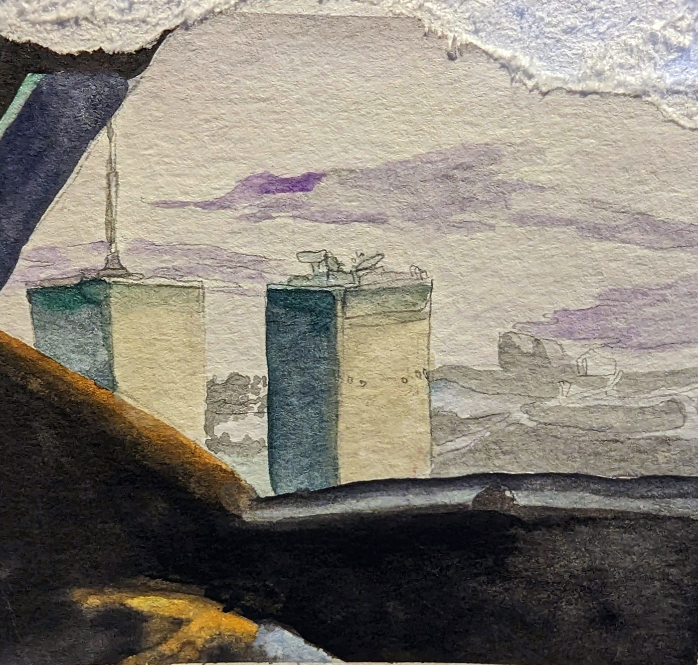
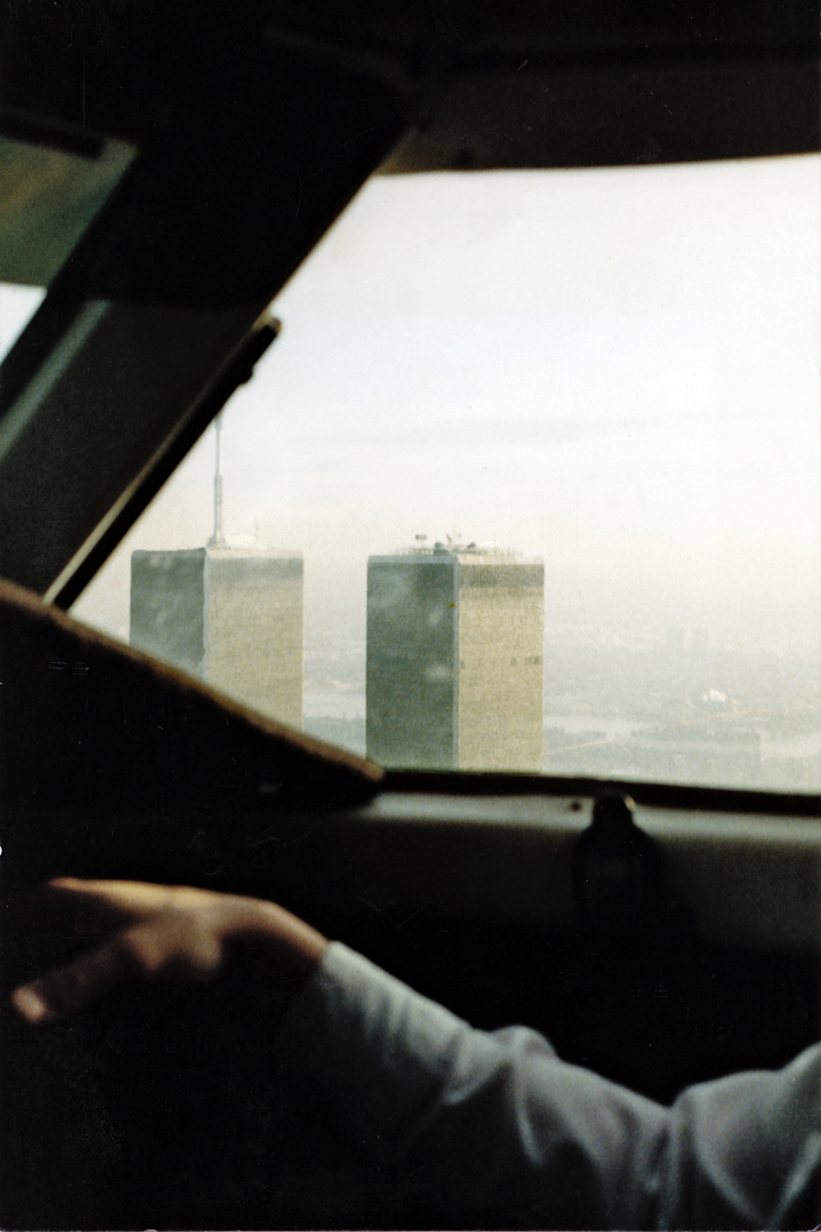
The picture at the top was taken by the author from the cockpit of a 19-seater in 1994.
The second picture is a watercolor rendition of the same, painted by Julianna Harhay, the daughter of Michael Harhay, a pilot for United Airlines. That is Michael’s arm in the first photo.
An earlier version of this essay appears in chapter six of COCKPIT CONFIDENTIAL.
Related Stories:
CONSPIRACY NATION
AIRPORT SECURITY IN THE NEW CENTURY