IT WAS DECEMBER 30th, 1984, and Hüsker Dü were in from Minnesota again. They’d just wrapped up a show at a small auditorium in Concord, Massachusetts, and a small group of us were backstage talking to guitarist Bob Mould and drummer Grant Hart — the band’s co-vocalists and songwriters. A brand new album was due to hit the stores in only a week or two, and we all wanted to know: what was it going to sound like?
Zen Arcade had come out that past summer, and the indie rock world was still trying to absorb it. “Experimental” isn’t quite the right word, but Zen had played fast and loose with the boundaries of what punk rock, for lack of a better term, was supposed to sound like, bringing in acoustic guitar, piano, and a range of psychedelic effects. The upcoming project, it stood to reason, would take things ever further, would it not? Somebody — maybe it was me — brought this up.
“No way!” laughed Hart.
“Not at all,” added Mould. “This album is more like Land Speed Record than Zen Arcade!”
Land Speed, from way back in 1981, was a thrashy collection of hardcore songs played at nearly supersonic speed. Mould was being tongue-in-cheek — the album wouldn’t sound anything like Land Speed — but just the same he was dropping a hint: this wouldn’t be a record for the squeamish.
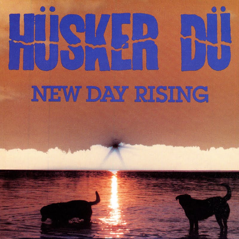
It was called New Day Rising — a remarkable fifteen-song LP that would wake the country from its winter freeze in January of ’85. There is nothing subtle or subdued about this album. There are no touchy-feely instrumentals, no acoustic time-outs — enjoyable as those things were on Zen. Sure, the melodies and catchy choruses are there beneath it all, in typical Hüsker fashion, but New Day Rising is power from start to finish; forty fearless minutes of ferocious exuberance.
I’m not going to argue that Zen Arcade isn’t the better or more important album. It’s all the things the pundits have called it from the start: monumental, groundbreaking, a reevaluation of everything we thought punk rock could or should be. It’s a masterpiece. But almost too much of one, moody and broody at times, and a little too — what’s the way to put it? — serious. New Day is the brasher and looser album, with Mould and Hart clearing out the pipes, with nothing left to prove and absolutely hitting their strides. It is, if nothing else, the most supremely confident-sounding album of all time.
And it’s made all the more so through a daring, some might say controversial sound mix. There’s a very particular sound to this album — a treble-heavy mix that is like nothing before or since, in which every song is enveloped in a fuzzy, fizzing, needles-pegged curtain of sound. Many people — including the band members themselves, reportedly — have always rued this peculiar mix, but to me it’s the ideal vehicle for the group’s sound. Here is the “Hüsker buzz,” as I call it, naked and cranked to eleven. (What I wouldn’t give to hear some of the cuts from Zen Arcade or Flip Your Wig remixed like this.) The style is “hot” in soundboard lingo, but to me it has a crystalline, sub-zero quality: it sounds like ice. The songs are as melodically solid as any top-40 hits of the time, but all whipped up in a great Minnesota blizzard.

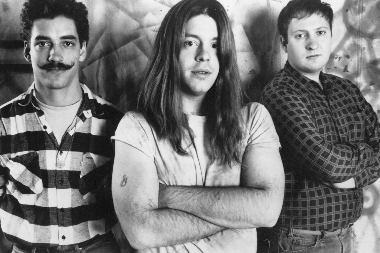
Greg Norton, Grant Hart, and Bob Mould, in 1984.
Photo by Naomi Petersen.
First time listeners will know exactly what I mean within the first ten seconds of the title cut. “New Day Rising,” the song, begins with a lead-in of anxious drumming — Hart pounding away, as if to say “Let’s this this fucking thing started!” — and then comes the crescendo, a guitar-blast washing over you in a huge squalling wave: equally furious and melodic; chaotic yet strangely orchestral. It’s a breathtaking opening and the perfect pace-setter for the rest of the record. (Robert “Addicted to Love” Palmer once found it a compelling enough song to cover.)
Next up Hart’s “Girl Who Lives on Heaven Hill.” There’s something sour and vaguely out of tune about this song that for years I could never get past. Until one day it hit me: it’s supposed to be like that. Hart takes the all the nicety and sing-songy pleasures of “It’s Not Funny Anymore” or “Pink Turns to Blue” — songs that are almost too easy to like — and twists and bends and sets fire to it. Then, between the second and third stanzas, Mould comes in with a guitar solo that tears the rest of it — along with your eardrums — to pieces. It’s a haunting, mesmerizing, and a little bit frightening three minutes.
The third cut is Mould’s “I Apologize.” This is arguably the best song he ever wrote, perhaps outclassed only by the “Eight Miles High” cover, or “Chartered Trips” from side one of Zen Arcade. Here is the song Green Day and its ilk only wish they could have made: poppy and powerful, but without the slightest hint of heavy metal pretension. And is it just me, or you can you almost hear Michael Stipe singing this one? The chorus is uncannily infectious in the style of old REM songs of the same era. It’s as if you took a song like “South Central Rain” and split every atom of it: all that sweet Georgia lilac exploded into a sort of nuclear ice storm. (Putting Hüsker Dü and REM in the same sentence might seem incongruous, but it’s not by accident that they once toured together.) Listen to “I Apologize” here. Don’t skip the final fifteen seconds, and play it loud.
Further along is one of the great sleepers in the Hüsker Dü canon: Mould’s “Perfect Example.” This is the record’s only true “slow” moment — the band’s idea of a tearjerker. It closes out side one, sung by Mould in a kind of passive-aggressive whisper, with Hart (barefoot no doubt, as he always played) double-thumping the bass drum in perfect synchronicity to a human heartbeat. The song clashes to a close on the word “perfect.” Had the album ended right there, already it’d be a classic. Except that’s only the first side.
Although only two of the cuts are his, Grant Hart effectively owns side two. This is by virtue of “Terms of Psychic Warfare” and “Books About UFOs,” both of which are unforgettable. Listen to “Terms of Psychic Warfare” here, with its signature bass riff and beautifully cascading vocals.
The better one, though, is “Books About UFO.” Equal parts deafening, frenetic, melodic and catchy, the track is backed with piano. From any other band, in any other context, this effect would probably sound gimmicky. Not so here. Indeed, it’s almost as if this song were written for piano from the start. “For all the speed and clamor of their music,” the music journalist Michael Azerrad once wrote, “Hüsker Dü was perhaps the first post-hardcore band of its generation to write songs that could withstand the classic acid test of being played on acoustic guitar.” That’s an excellent point, but the heck with that, I want to hear Grant playing an all piano version of “Books About UFOs.”
“I’d also recorded a slide guitar on ‘Girl Who lives on Heaven Hill,'” Grant Hart remembers. “But when I showed up after that session, Spot [the album’s co-engineer] and Bob issued an ultimatum: either the piano goes from ‘UFOs’ or the guitar goes from ‘Heaven Hill.’ After stating my case, which was ‘what does one have to do with the other?’ I relented and said if one had to go, let it be the slide guitar.
Probably the right decision. “UFOs” is one of the most furiously pretty, and downright interesting songs you’ll ever hear.
Norton, Hart, and Mould.
Photo by Daniel Corrigan.
To the end, Hart, who passed away in 2016, held some strong resentment against the way Spot, who’d been sent to Minneapolis from Los Angeles by SST Records to oversee the project, handled his duties. Spot shared the engineering tasks with the band members and their longtime collaborator Steve Fjelstad, but as Hart once explained it, “SST decided that we were not to be the masters of our own destiny, and sent Spot to babysit/spy/sabotage our record. He did not give Steve Fjelstad the respect he deserved, treating him as an assistant.””Another thing I remember,” said Hart, “was not being allowed to make my own choices as far as re-doing vocals that I thought I could better. On ‘Heaven Hill’ you could hear the sound of some lumber, that had in been in the booth during remodeling, falling to the floor!”
Well, all of that aside, it’s tough to have too much issue with the finished product.
The album comes to an end with the charging, spiraling, sonic immolation of Bob Mould’s “Plans I Make.” Fasten your seatbelts for this one. It’s not the jammy, psychedelic marathon of “Reoccurring Dreams,” the 14-minute instrumental that closes Zen Arcade, but it’s a wringer, an earsplitter that, when it finally crunches to its conclusion, leaves the listener with no choice but to sit spellbound for a time.
If it seems like only yesterday that I was writing about the 30th anniversary of Zen Arcade, which had been released in June of 1984. It’s fascinating testament to Hüsker Dü’s talent and tireless work ethic that two such brilliant albums could have been released within a mere seven months of each other. And these were bookended, I should add, by two other highly impressive records — Metal Circus and Flip Your Wig, from October of ’83 and September of ’85 respectively. A spectacular four-record punch in a span of under two years.
And if forced to choose, I’d say New Day Rising sits the pinnacle of that run. This is Hüsker Dü at the very apex of its career, and one of the finest moments in the whole history of what used to be called underground rock.

Meanwhile, unless I’ve missed something, none of the big music magazines or websites gave New Day so much as a mention on its 20th, 15th, or 30th birthdays. For that matter, do younger music fans have any sense of what the 1980s truly were like? This was the richest and most innovative period in the whole history of independent music, but rarely is it acknowledged as such. As popular culture has it, serious rock music skipped the 80s entirely. When pundits do take the decade seriously, we tend to see the same names over and over. It’s both frustrating and unjustified that Hüsker Dü never developed the same posthumous cachet that others of their era did. Like the Replacements, for example, or Sonic Youth. Hüsker Dü could run circles around either of those two, but never became “cool” in quite the same way.
I suppose it’s due to a total absence of what you might call sex appeal? To say that Hüsker Dü never cultivated any sort of image, in the usual manner of rock bands, is putting it mildly. For one, they never looked the part. These were big, sweaty, chain-smoking guys who, it often seemed, hadn’t shaved or showered in a while. Norton, trimmest and most dapper of the threesome, wore a handlebar mustache many years before such things were trendy among hipsters. It wasn’t cool; it was odd. And not until their eighth and final album that the band include a photo of itself on an album cover (the scratched-out images on Zen Arcade notwithstanding).
This modesty, for lack of a better description, was for some of us a part of what made Hüsker Dü so special. But it has hurt them, I think, in the long run.
The idea that the Replacements (much as I loved their debut album, which I consider the best garage-rock record of all time, and which includes a shout-out called “Somethin’to Dü”) were in any way a better or more influential band than Hüsker Dü is too absurd to entertain. Meanwhile the beatification of Sonic Youth, maybe the most overrated outfit of the last forty years, goes on and on. Not long ago Kim Gordon got a profile in the New Yorker. I’m still waiting for one of the writers there to devote a story to Bob Mould.
Or better yet, to Grant Hart. Twenty-five years, more or less, that’s how long it took me, to realize that it was Grant, not Bob, who was the more indispensable songwriter and who leaves the richer legacy. In the old days it was trendy to claim that Grant was the real genius behind Hüsker Dü. You’d be at a party and some asshole would say, “Those guys would be nothing without that drummer.” I’d always scoff that off. The mechanics of the band, for one, made it difficult to accept: Grant was the drummer, after all, and drummers are never the stars. And there was Bob, right at the front of the stage with that iconic Flying-V. But those assholes were on to something.
That shouldn’t be an insult to Mould. Not any more than saying Lennon was a better songwriter than McCartney. Both were brilliant. But when I flip through the Hüsker canon, I can’t help giving Hart the edge. There’s a soulfulness to his songs sets them apart. They’re not necessarily “better” so much as they resonate in a different and deeper way. On New Day Rising, Mould gave us “I Apologize” and “Celebrated Summer.” But Hart gave us “Terms of Psychic Warfare” and “Books About UFOs.” On earlier records it was “It’s Not Funny Anymore,” “Diane,” “Pink Turns to Blue,” the list goes on. Hart’s “She’s a Woman (And Now He is a Man”) from the often intolerable Warehouse album is, to me, a classic sleeper and the most under-appreciated Hüsker song of them all.
His solo work, too, was at least as robust as that of Mould. Songs like “The Main” and “The Last Days of Pompeii” are as good or better than anything Mould has given us post-Hüsker. But while Mould went on to some notoriety and commercial success, Hart labored in comparative obscurity. This was always irritating and unfair.
But Grant, maybe, was all right with this. “I have always based my movements on those of fugitives or criminals,” he once said to me. “The less attention you attract, the freer you remain! I wish to be an artist, not a celebrity.”
Related Story:
Now and Zen. The Greatest Album of All Time Turns 40