





August 12, 2026. The Tsurumaru in August.
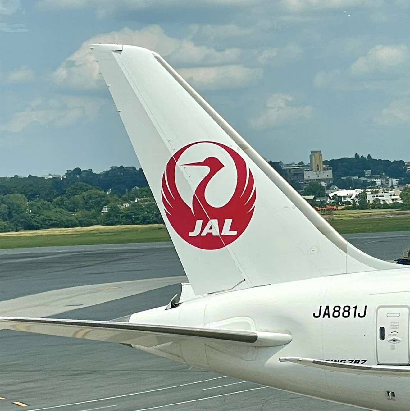
Whenever I catch sight of the Tsurumaru — the Japan Airlines (JAL) insignia — I stop and marvel. There could hardly be a more perfect logo. “Iconic” is about the most overused word in our language, but here it’s suitable. It’s the single greatest logo in aviation, past or present.
It’s not just the grace and symmetry. It’s the dual symbolism: based on a centuries-old Japanese family crest, the circle forms a pattern of the crane and the Rising Sun, both of which have deep significance in Japan.
Ironically, the mark was conceived in 1959 by an American named Jerry Huff, the creative director of Botsford, Constantine and Gardner, a San Francisco-based design firm.
And we nearly lost it. In 2002 JAL decided on an identity overhaul and replaced the Tsurumaru with a boring swoosh-mark and a hideous “rising splotch” oozing across the tails of its planes.
Thankfully, in 2011, in what was perhaps the wisest decision in corporate branding history, the crane was brought back.
I hate to bring it up, but what got me thinking about all of this is today’s date. Today is the 41st anniversary of the JAL flight 123 catastrophe, the Boeing 747 that crashed outside Tokyo on August 12th, 1985, killing 520 people.
The crash was blamed on a faulty bulkhead repair, and the airline’s reputation was shattered. It took a generation to recover. Thus the Tsurumaru is a mark of endurance, too.
Photo by the author.