Unexpected Pleasures at a Terminal Near You.
WITH SCATTERED EXCEPTIONS, airports don’t have a whole lot going for them. They’re noisy, dirty, poorly laid out, and just generally hostile to passengers. As my regular readers are well aware, I’ve made this point in numerous prior posts — perhaps too many times.
Now, so that I’m not always harping on the negative, here’s something different. “Hidden Airport” is a semi-regular feature highlighting little-known spots of unexpected pleasantness.
ALL PHOTOS BY THE AUTHOR
— SCHIPHOL UNDERGROUND
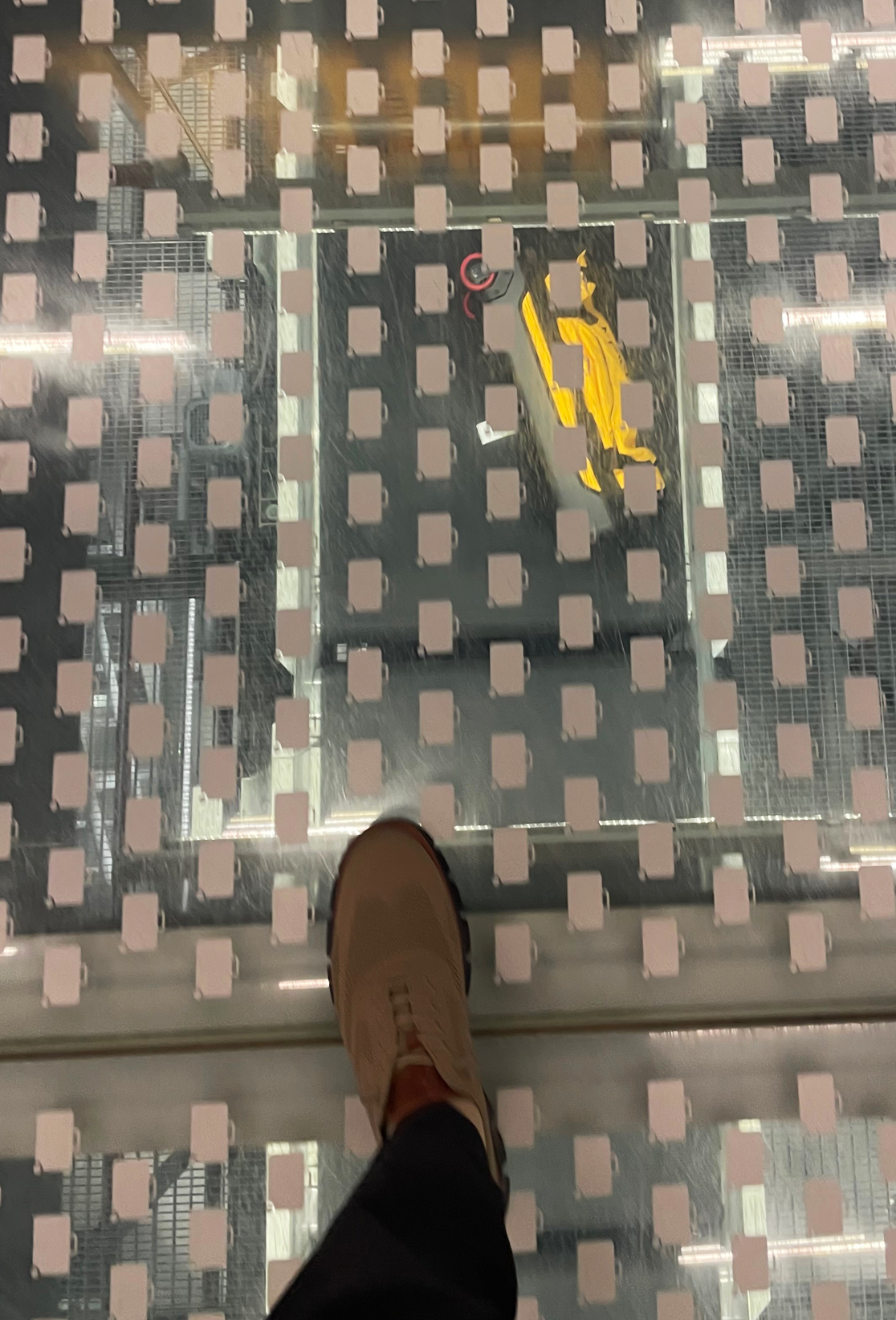
In the central departure hall in Amsterdam, there’s a cutaway in the floor laid over with glass. About fifteen feet long, it’s sort of like the sections of sidewalk you’ll find in certain cities, beneath which pedestrians can look down at ancient ruins. In this case, you’re looking down into a section of the airport’s luggage transfer system. As you walk along, you can see suitcases shuttling forth on the conveyors beneath you.
It’s nothing elaborate, and the no-slip stickers blot out too much of the view. But it’s the sort of quirky, flyer-friendly gesture Schiphol Airport is famous for, and it helps give the terminal some charm.
— RETRO BOS
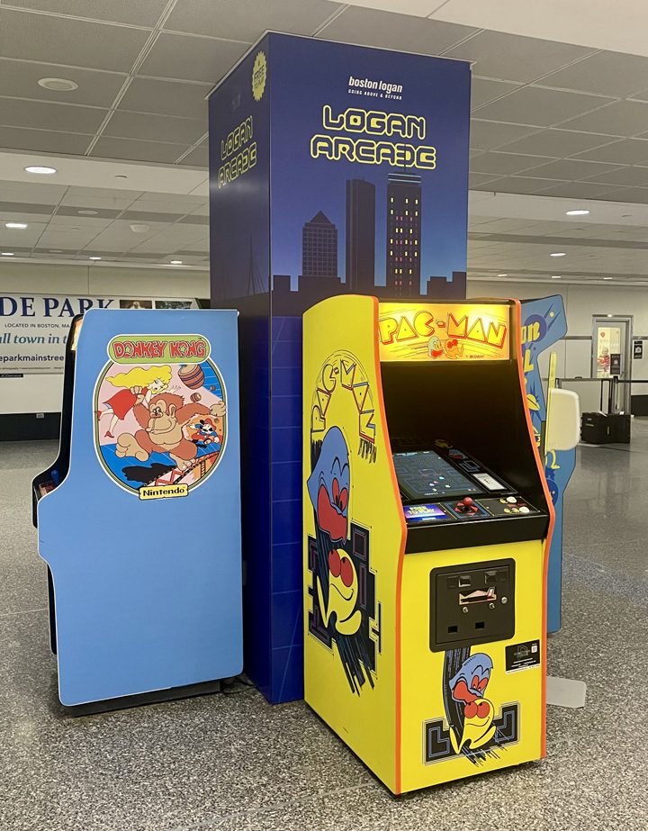
I don’t know if this is permanent or not, but in baggage claim at Boston’s terminal A they’ve set up this vintage arcade with 1980s-era video games. Gen-Xers can relive their younger days with some Pac-Man and Donkey Kong.
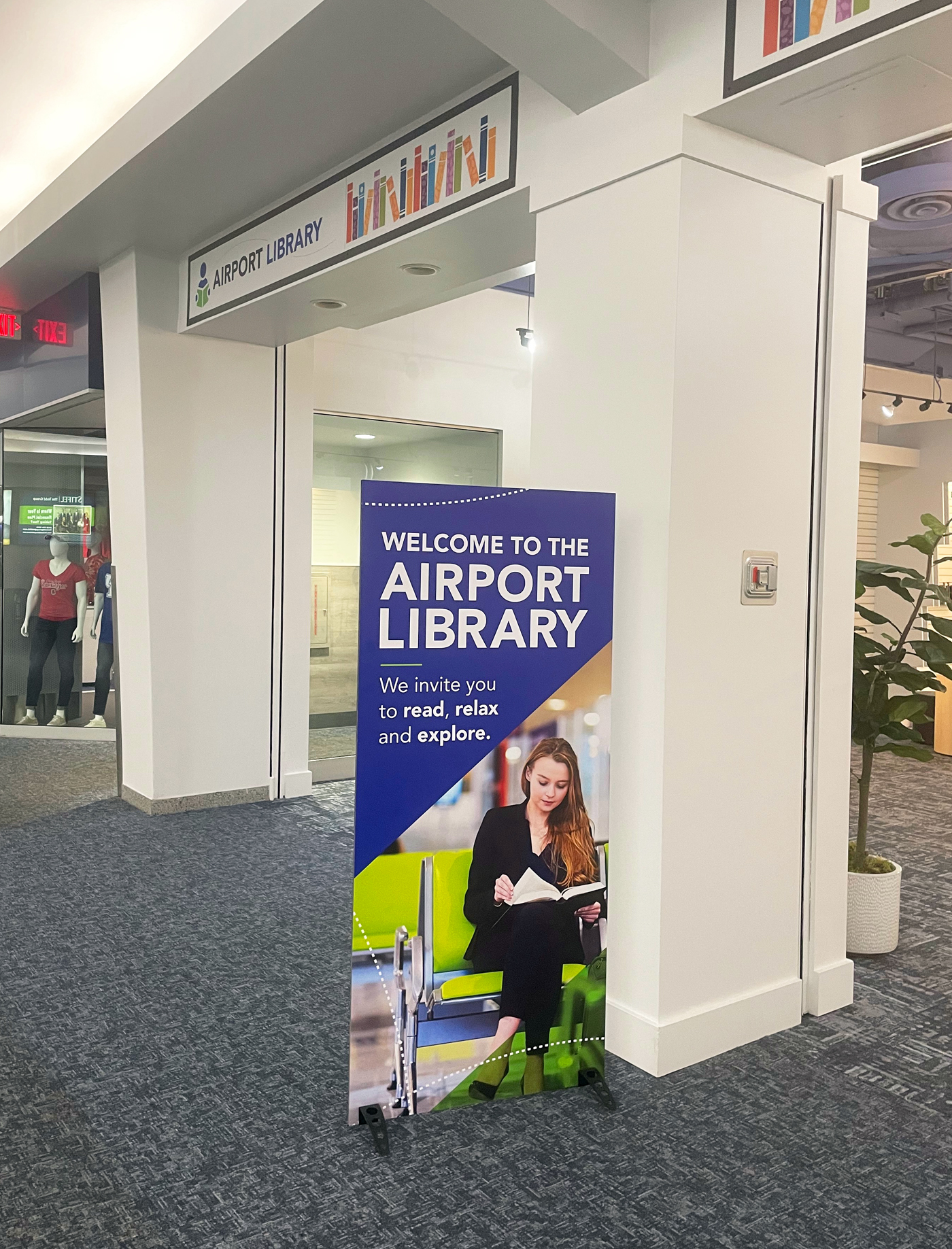
— Vonnegut at KIND
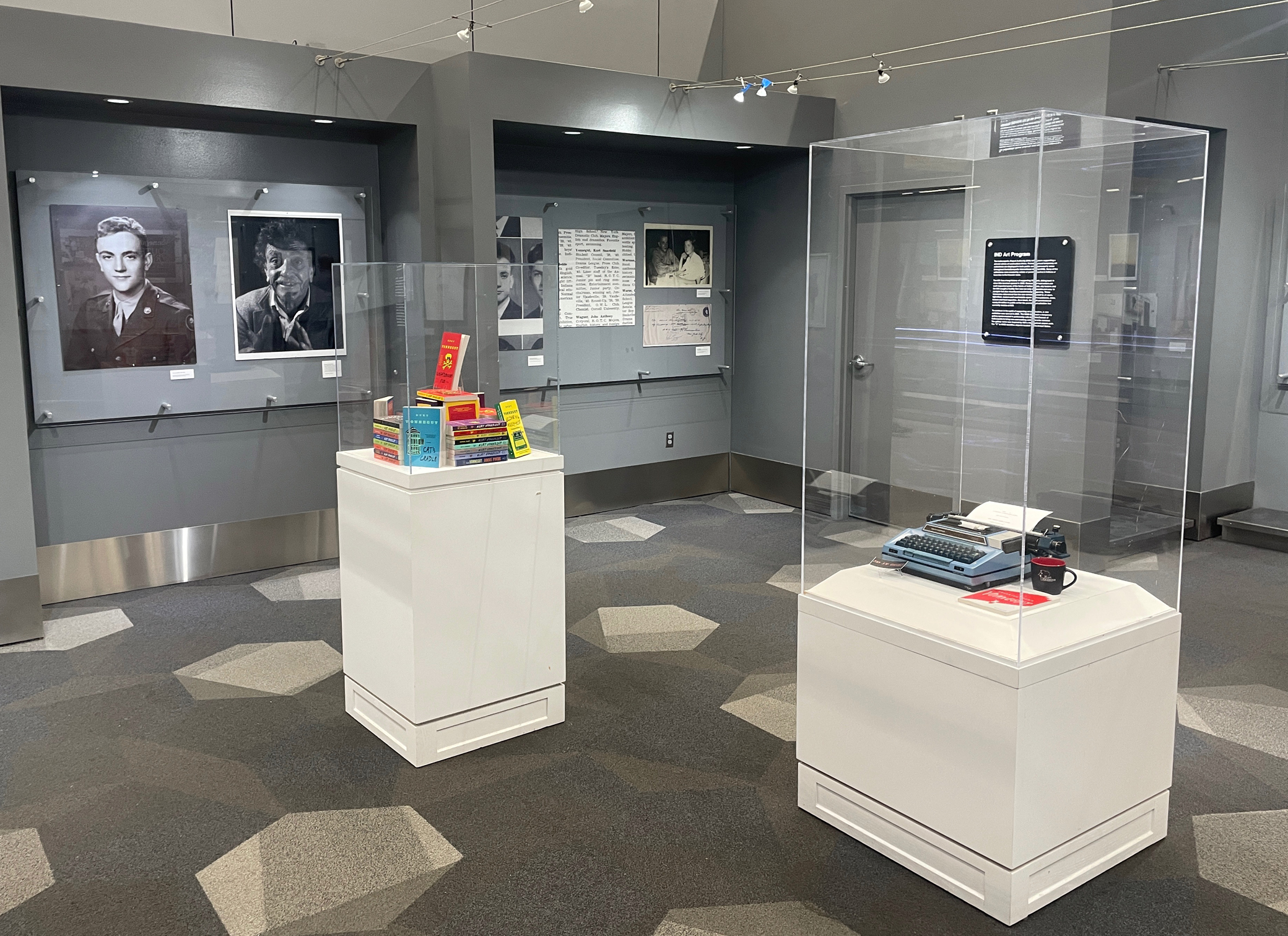
I wrote about the KIND Gallery in Indianapolis once before (scroll down). It’s time for a revisit, now that they’ve got an installation honoring the city’s favorite literary son, Kurt Vonnegut.
It’s funny how this happened: I was walking along the concourse towards my gate, and I said to myself: They should have something about Vonnegut here at the airport. Twenty seconds later I saw the KIND Gallery and its new exhibit.

There are books, of course, a typewriter (the significance of which is unclear), photos, and some of the author’s sketches.
This is a big one for me. I had long-time infatuation with Vonnegut’s work, beginning in my teens and running into my early 20s. I think I’ve read everything he published. Just a few months ago I re-read “Jailbird,” my favorite of his novels.
— FROM IDLEWILD TO JFK
No sooner did I write about the 100th anniversary presentation at Boston-Logan (see below), when I came across a similar setup at JFK. “From Idlewild to JFK” is a collage of photos following the history of the airport we all love to hate.
Kennedy is a dysfunctional mess half the time, and most of its architectural highlights have been demolished, but it’s nonetheless the most historically significant airport in the nation, if not the world, and this exhibit hits the bullet points: Saarinen’s TWA’s terminal, the Worldport, Pan Am 707s, the Concorde.
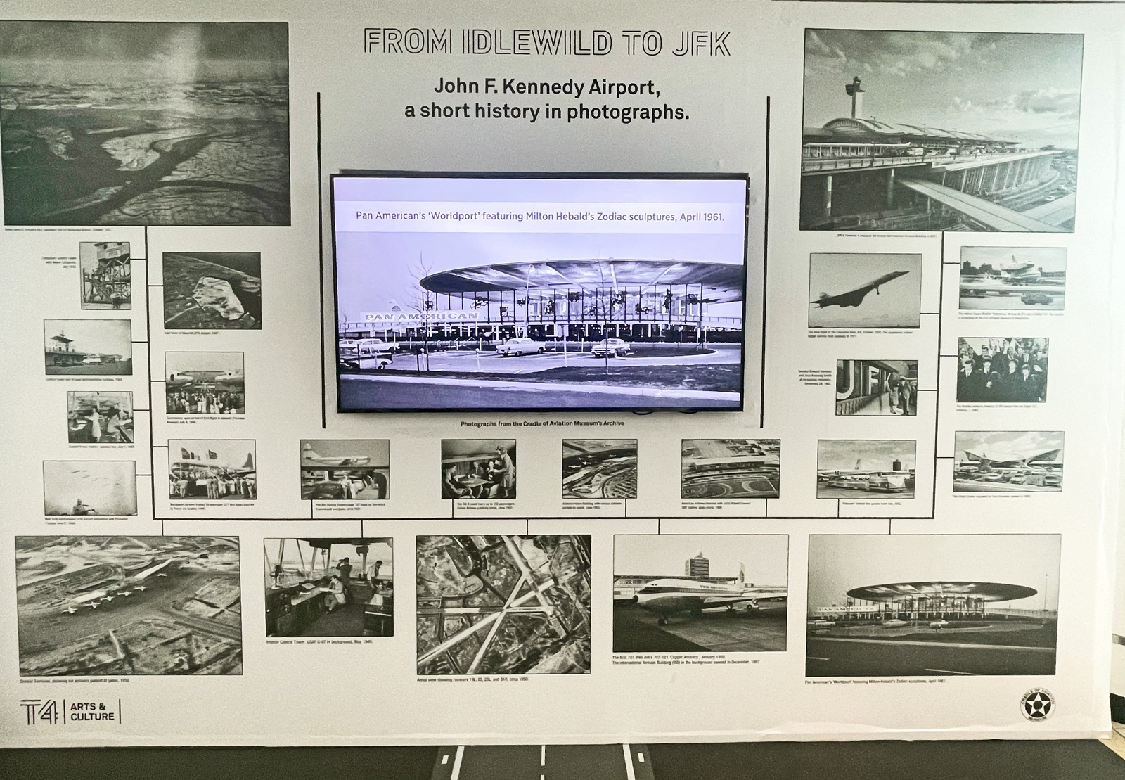
The whole thing is a bit half-assed, frankly. The airport deserves more than just a temporary gateside exhibit with a wall’s worth of black-and-white photos, and much is ignored (how is there no mention of I.M Pei’s famous “Sundrome” terminal?).
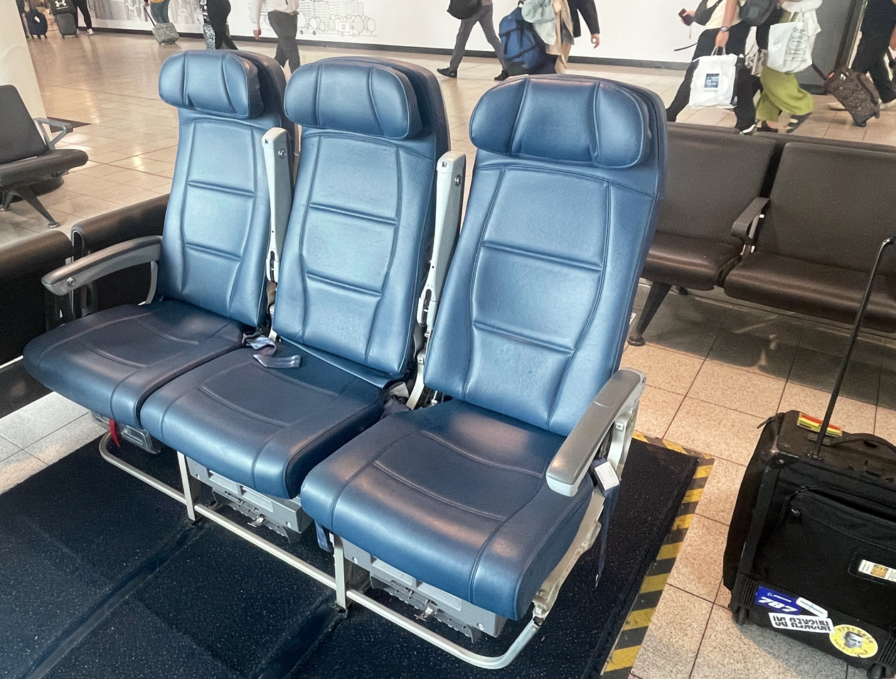
But it’s better than nothing, and a welcome distraction in the otherwise boring terminal 4. It’s over near the A gates. Have a seat in one of the economy class chairs and relax for a few.
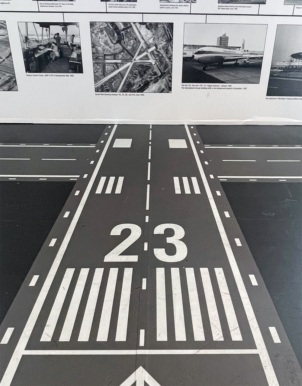
The runway graphics on the floor are cute, I guess. Except there’s no runway 23 at JFK.
— GREEN BAY GAME
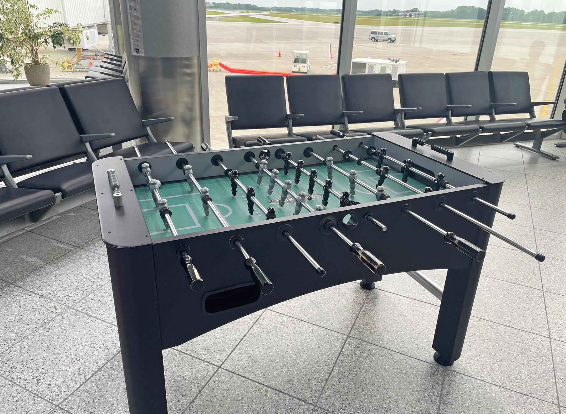
I discovered this foosball setup near gate B2 at the pleasant little airport in Green Bay, Wisconsin.
I suppose it could get a little rowdy, but on the morning I was there a couple of kids were quietly knocking the ball back and forth.
Foosball is table soccer, which seems anathema in NFL-obsessed Green Bay (I was taking the Packers to Denver on a charter flight), but what the heck. It’s a welcoming, low-tech, old-school sort of distraction you don’t find much at airports anymore.
— HISTORICAL LOGAN
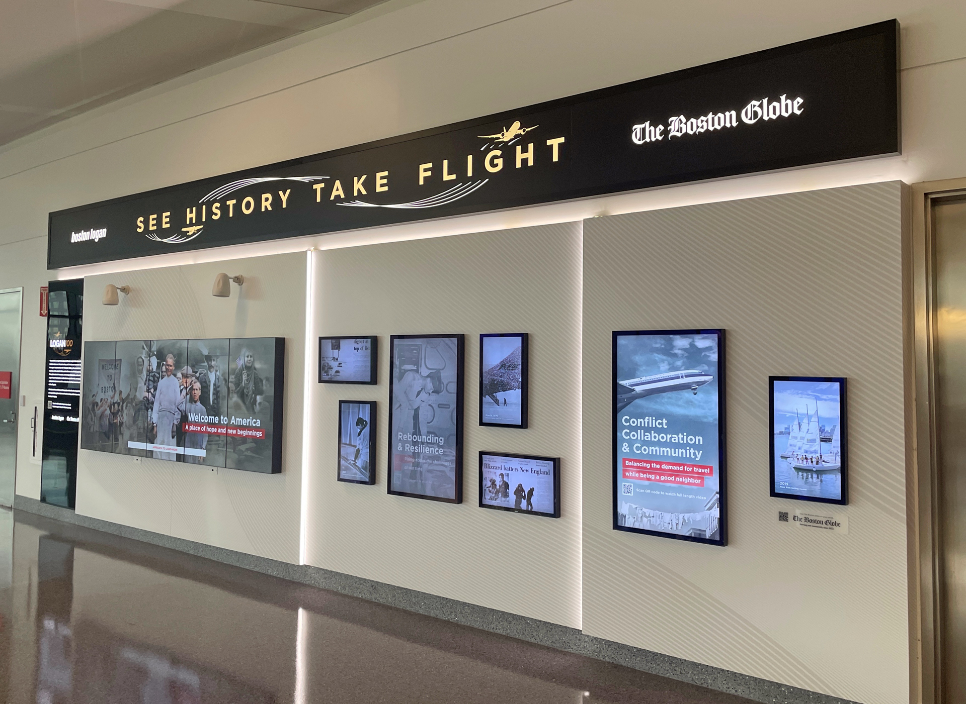
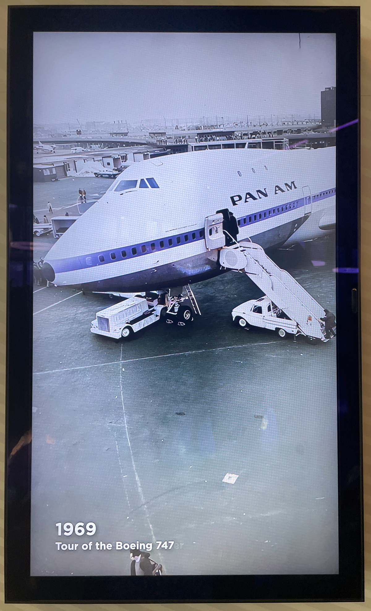
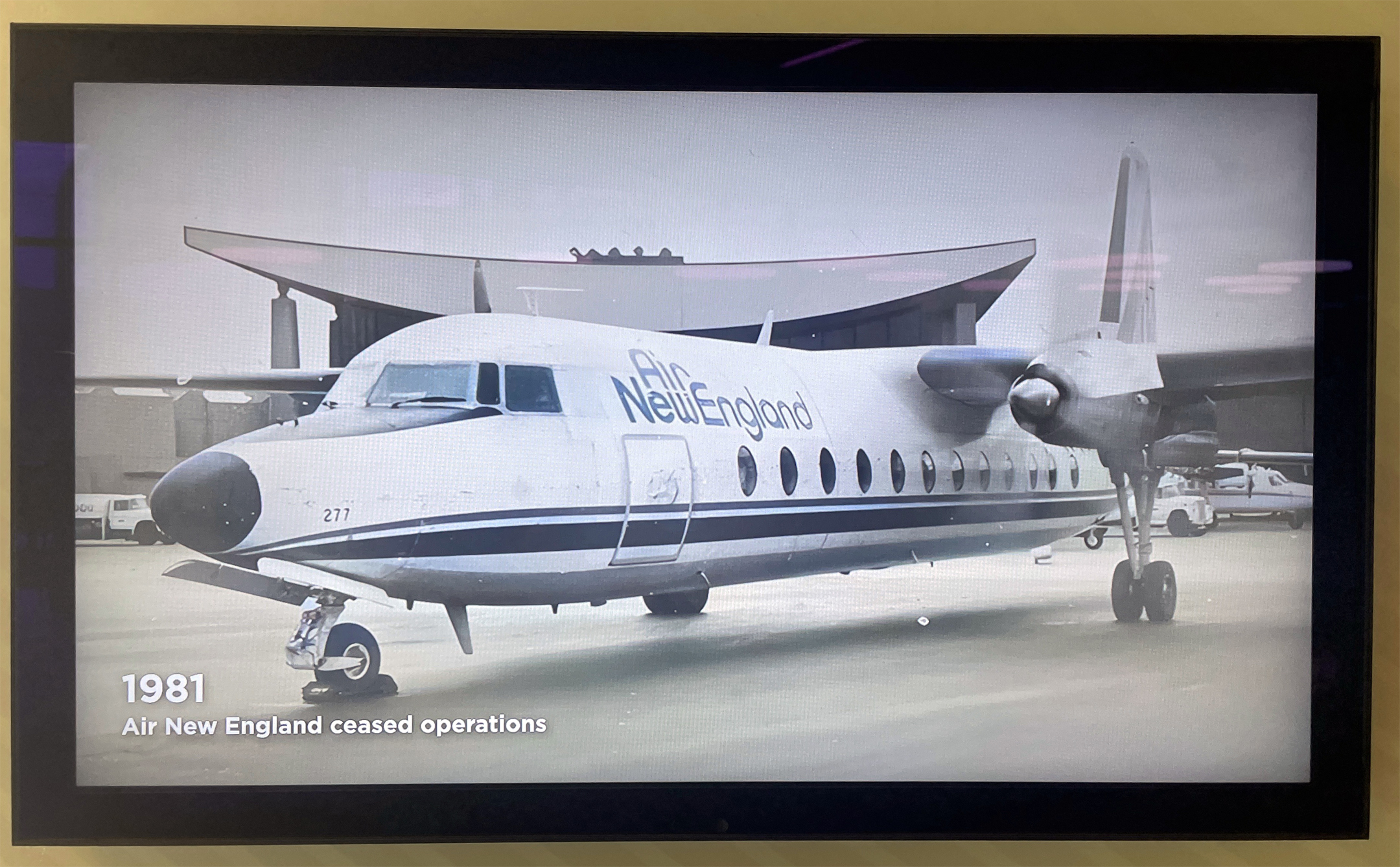
In terminal E at Boston’s Logan International, near the new security checkpoint, is an exhibit called “Logan 100,” commemorating the airport’s centennial. It’s a collaboration between Massport and the Boston Globe.
We Bostonians take a unusual civic pride in our little airport. More than a mere gateway, Logan is a part of the city. It’s a vibe you can feel as the seven LCD screens sequence through a century’s worth of archival photos, showcasing the people, planes, and events that helped shape Boston over the last century: VIP arrivals (The Beatles, Muhammad Ali), airlines that have come and gone (Northeast, Air New England), and the unforgettable headlines (the Blizzard of ’78, the arrival of Pope John Paul II in 1979).
What’s not here are Logan’s more infamous moments. The Delta and Eastern crashes, for example, or the World Airways incident in 1982. But that’s to be expected, I guess.
If you’re flying out, take a few minutes to stop by. You don’t need to be an airline nerd to appreciate the pictures.
Congrats to Massport and the Globe for having the good sense to come up with this. Now, if you’d please turn off those unbearable promotional PAs that blare in the connector walkway between A and E.
— BANGKOK GREEN
The new concourse at Bangkok’s Suvarnabhumi Airport has opened. A short train ride connects it to the main terminal. The gates are designated with “S,” for satellite.
In one of the more peculiar flourishes I’ve seen at an airport, several of the gateside waiting areas include a wide section laid with artificial grass. I’m not entirely sure what the intent is, but I like it.

Do with it what you will: sprawl out and relax; let your bratty kids run around. If you’ve got your clubs, maybe practice your swing. I laid down for a few minutes and stretched.
You don’t see a lot of green in airports, and the effect is strangely pleasant and refreshing — even if it’s fake. I think they should go one better and install some plants or small trees along the perimeter.
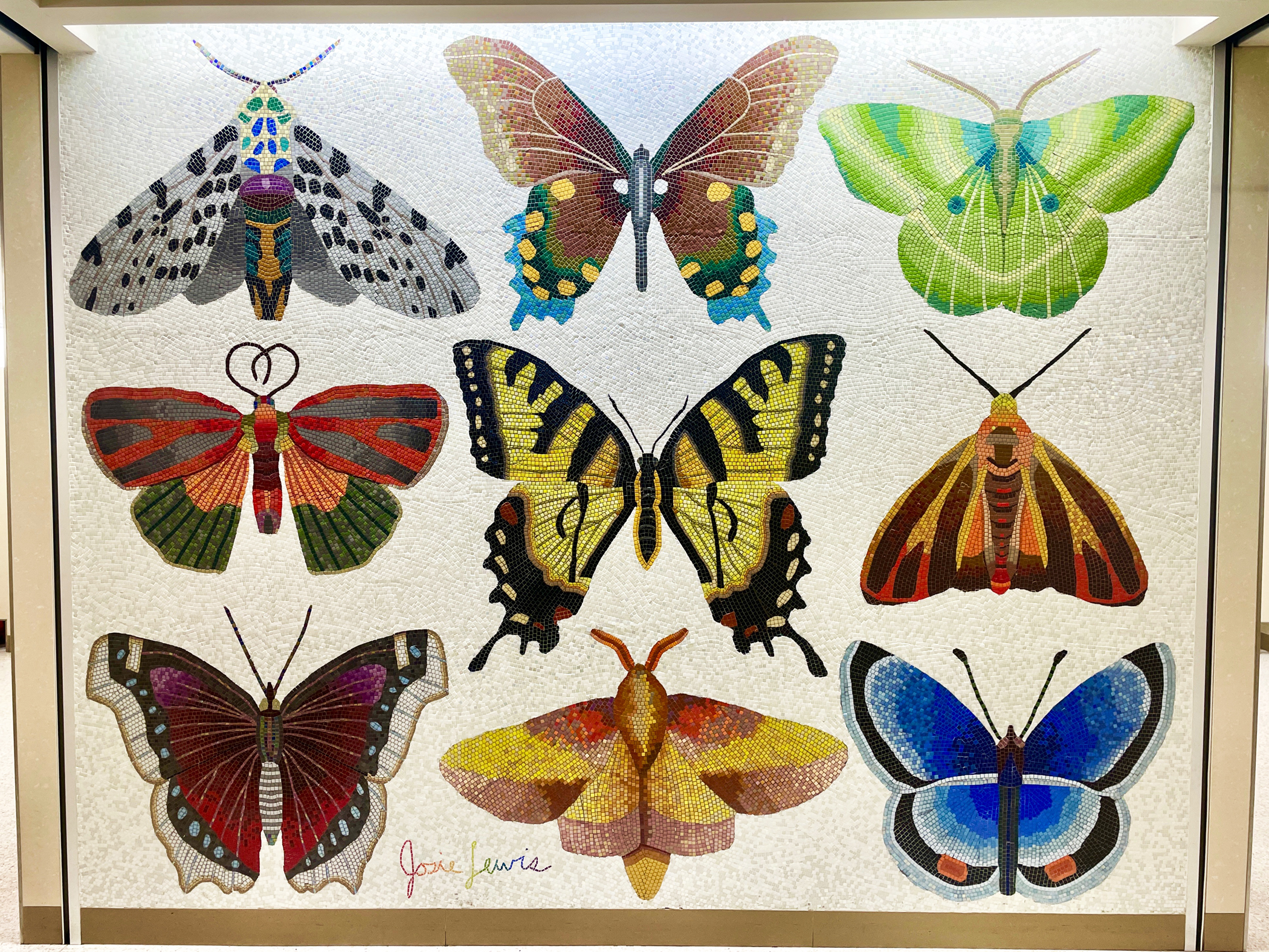
— MSPee BREAK
Yes, it’s a mosaic in the vestibule of an airport men’s room. Minneapolis-St. Paul, concourse F. The artist is Josie Lewis, who presumably is this person. (She may or may not have a similar installation in the nearby women’s bathroom. For obvious reasons I didn’t check. Maybe a reader can report back.)
It feels wasted, maybe, to have such a pretty work of art in such an easy-to-miss space, where the only people who see it are rushing to take a whiz. On the other hand, aesthetic non-sequitirs like this can be charming, popping up where you least expect them. It’s aviation-themed, too, if that’s not too much of a stretch.
— NORFOLK SPECIAL
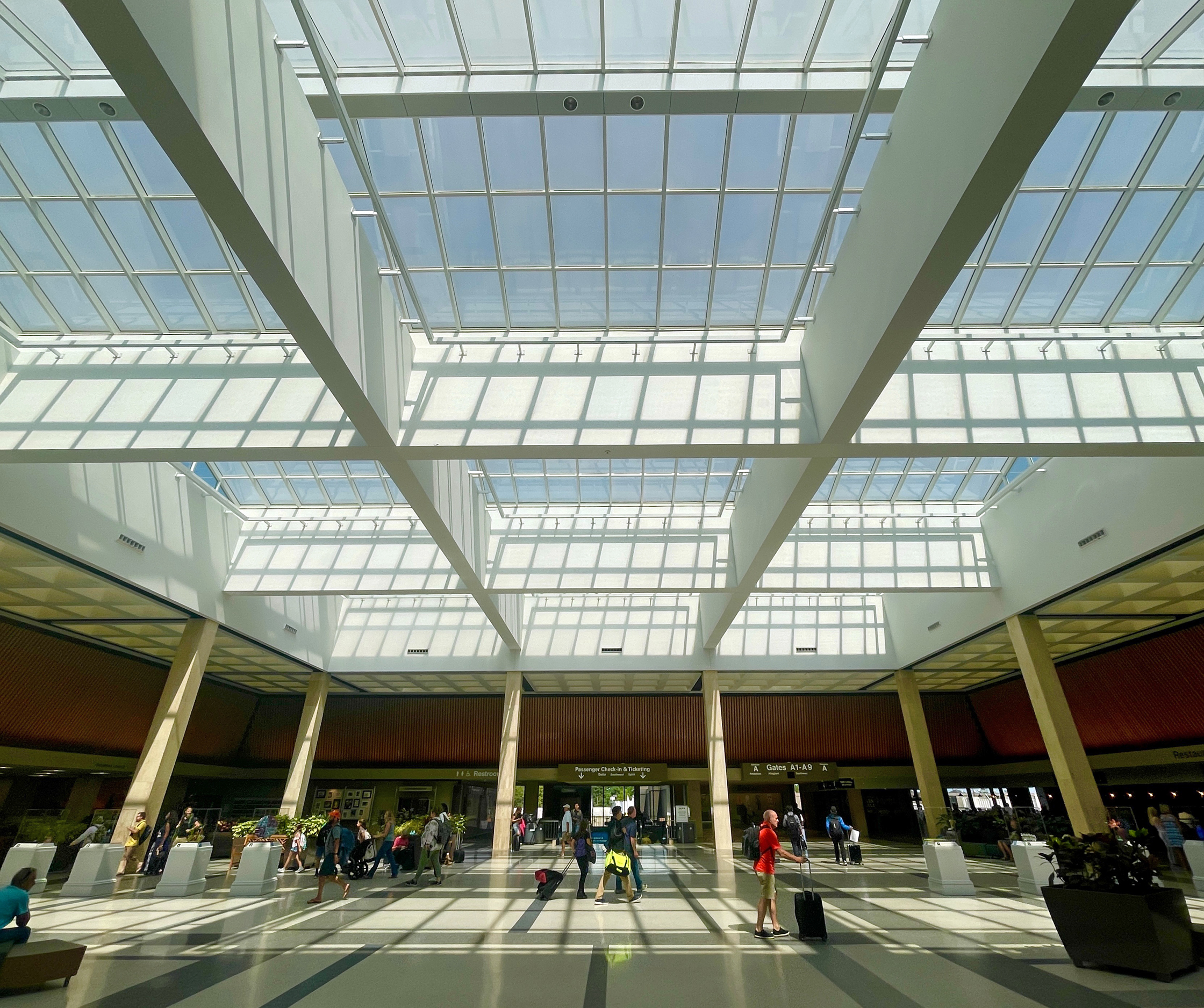
This one isn’t so hidden. Indeed it’s the entire main terminal of the airport in Norfolk, Virginia.
I’ve always been fond of ORF, and was happy to find myself there on a layover recently, for the first time in at least a dozen years. We love the clean, almost Scandinavian-style architecture, the unencumbered spaciousness, the skylights. I was able to get two great photos; one evening and one daytime, from more or less the same vantage point.
U.S. airports can be dreadful. Sometimes it’s the smaller ones that set themselves apart. Norfolk is a great example.
— CHAIRLESS IN BOSTON
This one is an almost. It’s a squander.
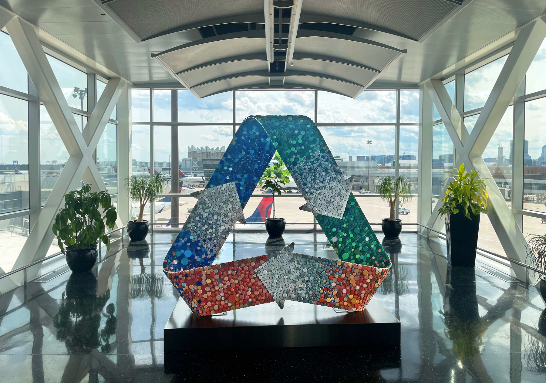
Where we are is Boston, at the south end of the pedestrian bridge connecting terminals A, E, and the central garage, just at the top of the escalator. This tucked-away alcove, right at the end, is a sunny, quiet spot out of range of the loudspeakers, with great views of the tarmac and the skyline beyond. It’s a perfect little spot. Except, there’s nowhere to sit. A hideaway like this needs to be savored. We dig the bottlcap sculpture, don’t get me wrong, but why are there no chairs?
The pedestrian bridge, in place for about twenty years now, was a welcome addition to Logan and architecturally handsome, the floor inlaid fetchingly with sea life mosaics created by Somerville artist Jane Goldman. But if you’re making the walk, the experience is ruined by a constant bombardment of public address announcements. What could be a relaxing six-minute stroll is spoiled by a tape-loop of needless “Welcome to Boston” promotions and parking instructions. This alcove offers a relaxing escape, but without a place to sit it’s easily overlooked.
Note to Massport: Chairs. Get some chairs. And turn off the bloody PAs while you’re at it.
— CINCINNATI READING ROOM
Cincinnati International (CVG) isn’t as as bustling as it once was, with Delta drawing down service after its merger with Northwest. But it’s a fairly busy airport and a pleasant one at that. And over on concourse B you’ll find this little library of sorts.
It’s more of a book swap than a proper library; you’re free to abscond with the title of your choice, or exchange your half-read copy of “Our Country Friends” for something better. Or drop into that funky chair and peruse a few chapters of some shitty crime thriller.
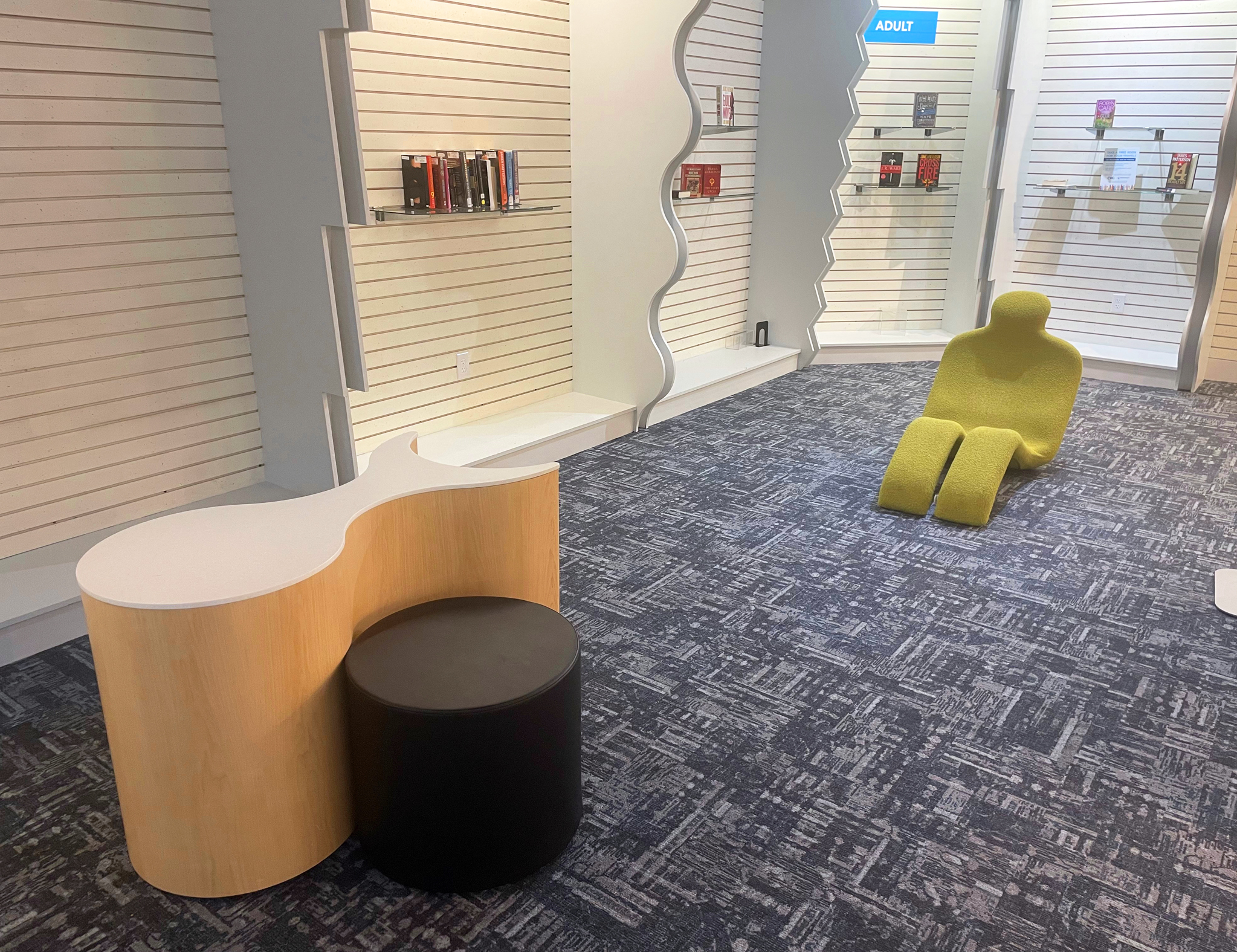
I have to say, the pickings were pretty dismal on the day I dropped by. And it feels a little ad-hoc: we wonder if this isn’t just a place-holder standing in for some unrented retail space, soon to be yet another overlit shop selling magazines and phone chargers. Possibly, but we like the idea, and for the time being it’s a peaceful nook to steal away in.
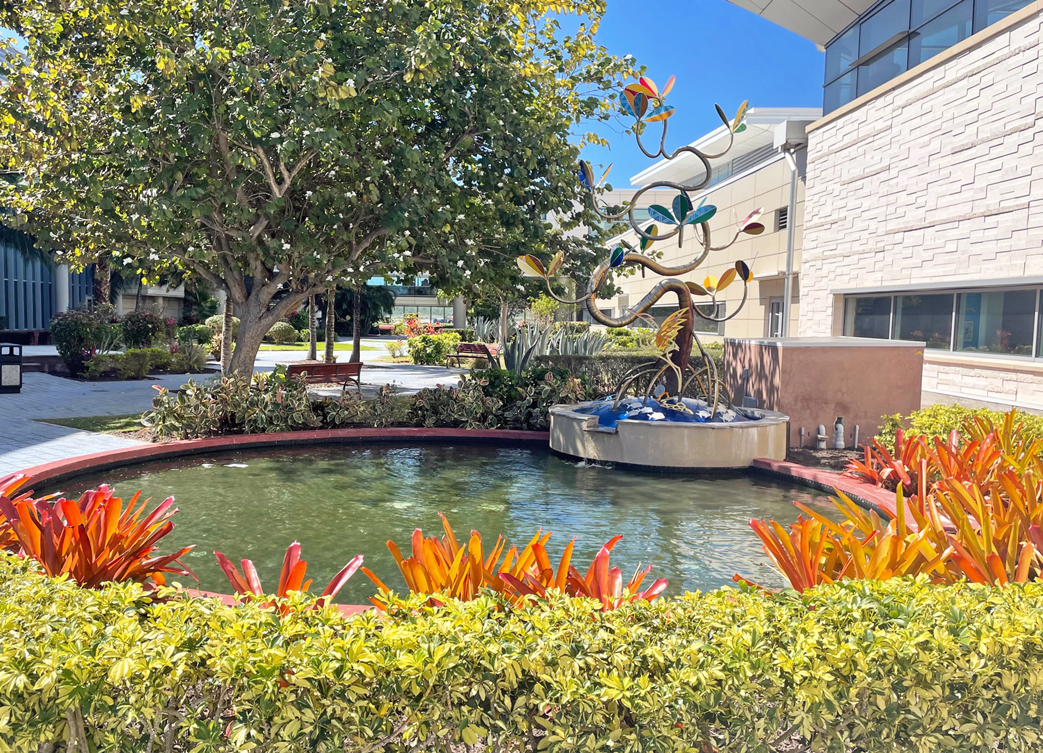
— BAHAMA CHILL
Nassau’s Lynden Pindling International Airport, in the Bahamas, doesn’t give you much to write home about. It’s an unpleasant complex of noisy kids, dirty fast food joints and hour-long security lines. But just outside, in a space between the domestic and international departure halls, you’ll find this sunny oasis of greenery and water.
We had three hours between flights, and this was the perfect spot to wait things out. No children, no crowds, no racket save for the sound of birds (which, I discovered, is piped in through a speaker). There are shady spots with benches, and the free airport wifi signal is strong enough to stream on.
You can sit inside at a greasy table at KFC, or you can sit here.
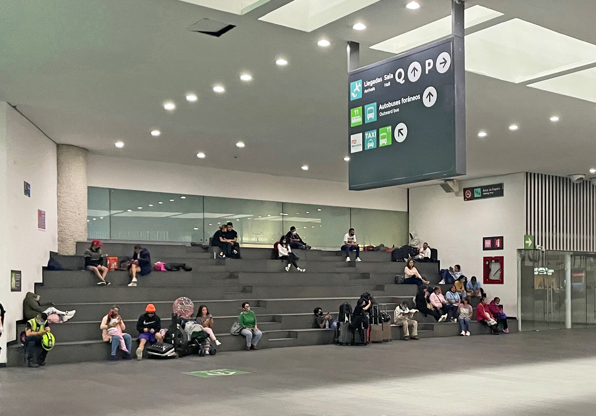
— BLEACHER FEATURE
A vast, overcrowded echo chamber of concrete, Mexico City’s terminal two is one of the least enjoyable airport buildings around. Downstairs in the arrivals lobby, however, set back against the rear wall, is one of the most creative and idiosyncratic features I know of: a set of bleachers, seven benches tall and about fifty feet wide, where family and friends can wait for passengers to emerge from the customs hall.
Arrivals lobbies are often a chaotic scrum of jockeying and shoving, people calling out names and craning their necks. From the bleachers, you have a clear view across the crowd, and can easily pick out your mom, your son, or your mistress without having to wade into the mob.
Here’s a low-tech idea that saves space, is eminently helpful, and costs almost nothing. Why have I not seen this anywhere else in the world?
— GATESIDE GRAFFITI
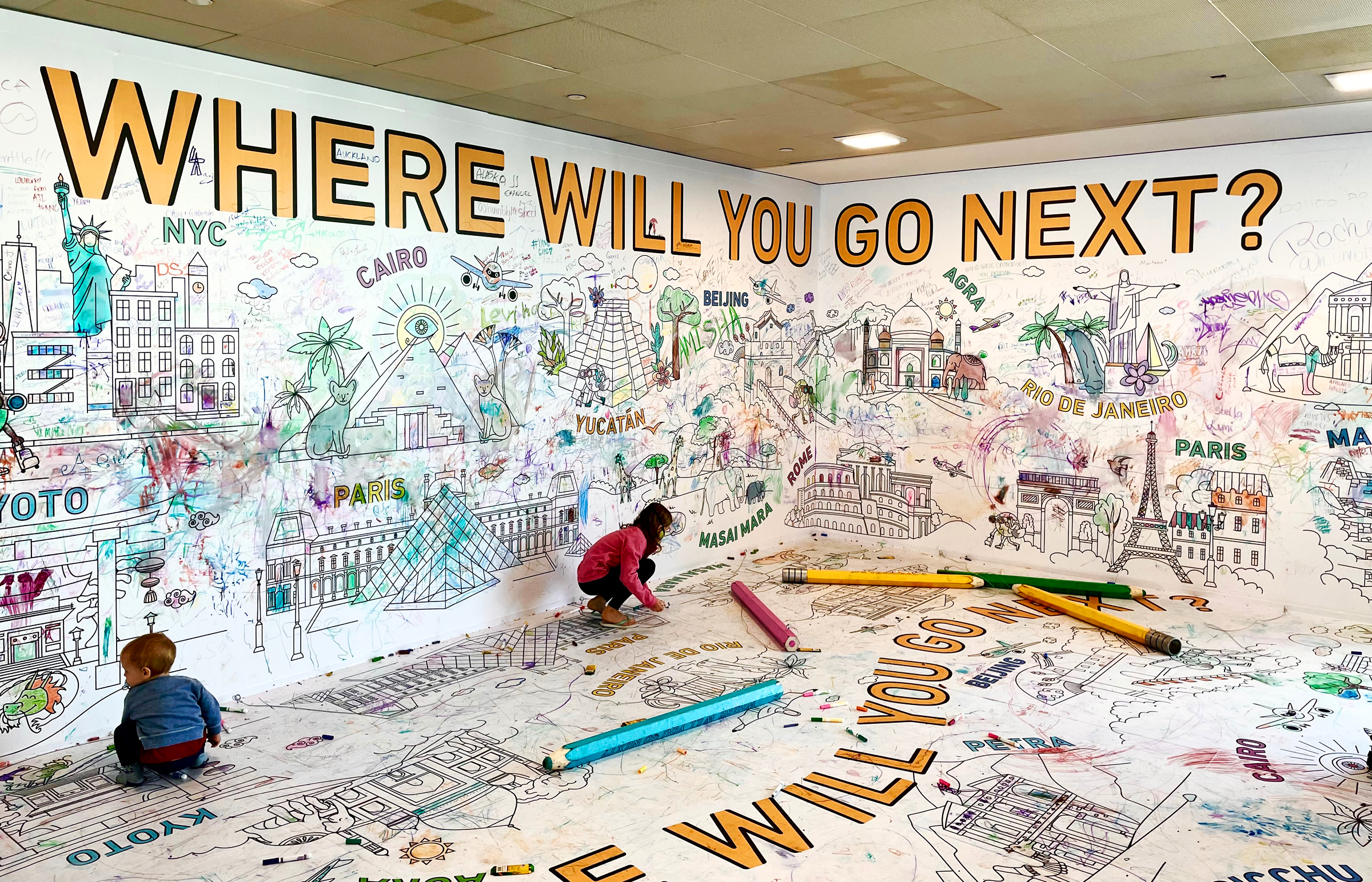
Terminal Four at Kennedy Airport isn’t the most passenger-friendly building, but it has its spots, including the famous Calder mobile dangling from the departure hall ceiling (see below). Now, in the B concourse close to gate 25, you can enjoy this interactive wall mural. It was put in place last summer, presumably as a sort of post-pandemic morale booster for travelers.
It looks like most people just scribble their autograph, but some leave the names of whatever far-flung destinations they’re headed to — or wish they were headed to. You might get your clothes dirty, but grab a giant pencil and jump in there. Give us a “Bayonne, New Jersey,” or a “Smolensk.”
— INDY KIND
Indianapolis International is the rare gem among U.S. airports. It’s spacious, clean, and splashed with natural light. Best of all, and unlike almost every other airport in the country, it’s remarkably quiet. According to Airports Council International, IND is the Best Airport in North America, and the readers of Conde Nast Traveler have dittoed that sentiment multiple times.
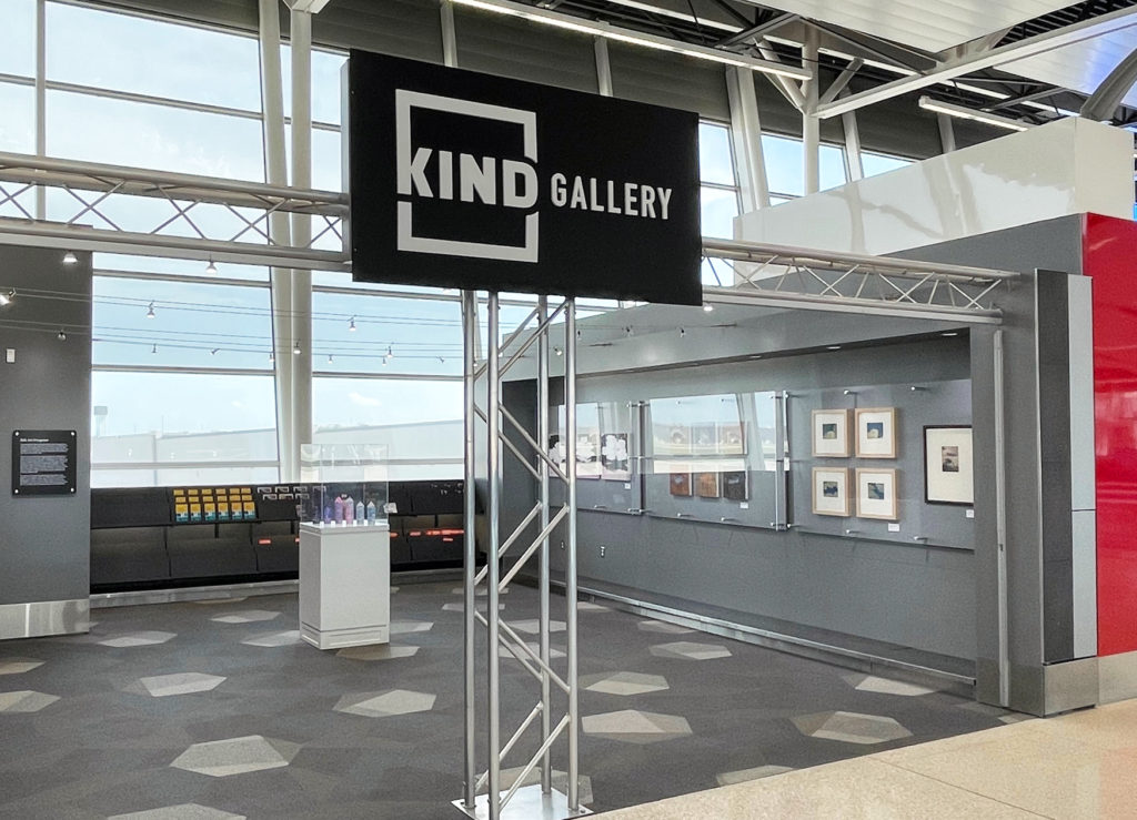
Tucked into the A concourse, between gates 14 and 16, is the KIND Gallery. Created in partnership with the city’s Arts Council, it showcases the works of Hoosier artists. The gallery is neither large nor — depending on your tastes in art — particularly breathtaking. But it’s exactly what it should be: an engaging and relaxing little sneak-away spot. My favorite of the current installation is “Cloud Study 1-4,” a four-frame series of cloudscapes by an artist named Kipp Normand.
What do we do at airports? We kill time. And here’s a way to do it that’s a little more fulfilling than staring at your phone or browsing the magazine kiosk.
And about that name, “KIND.” Chances are you’re familiar with the three-letter identifiers for airports, Indy’s being IND. What you probably didn’t know, however, is that airports also have four-letter identifiers. These are assigned by ICAO and used for navigation and other technical purposes. Airports in the United States simply add the letter “K” to the existing three-letter code. KLAX, for example. Or KBOS or KSFO or KMCO. Or, in this case, KIND.
— KENNEDY CALDER
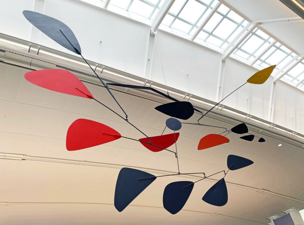
The next time you’re on the check-in level of terminal 4 at Kennedy Airport, look up. Suspended from the ceiling near the western end of the building is a sculpture constructed of balanced aluminum arms and trapezoidal panels. This is “.125,” the famous mobile made by Alexander Calder in 1957, back when JFK was still known as Idlewild Airport.
At 45 feet long, it’s supposedly the fourth-largest mobile in the world. For years it hung in the arrivals hall of the old Terminal 4, better known as the IAB (International Arrivals Building). Later it was moved to the departure level when the terminal was rebuilt. “People think monuments should come out of the ground, never out of the ceiling,” said Calder. “But mobiles can be monumental too.” The name “.125” comes from the gauge of its aluminum elements. What it evokes is, I suppose, in the eye of the beholder. One can detect a certain flight motif, though to me it looks more like a fish.
This wasn’t Calder’s only aviation-related project. In the 1970s he hand-painted two airplanes for Braniff Airways, including a Boeing 727 for the Bicentennial.
— UNDERGROUND ATLANTA
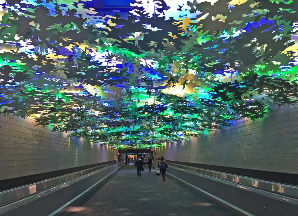
The Hartsfield-Jackson International Airport has its negatives, to be sure. The low ceilings, beeping electric carts and endless public address announcements make the place noisy and claustrophobic. Many of the windows are inexplicably covered over, and the airport’s skinny escalators were apparently designed before the invention of luggage. On the other hand, ATL’s simple layout — essentially six rectangular concourses sequenced one after the other — makes for fast and easy connections. It’s one of the most efficient places anywhere to change planes.
The neatest thing about it, though, is the underground connector tunnel. This is where you go to catch the inter-terminal train, but the better choice is to walk it. (If, like me, you purchased a Garmin Vivofit and have become obsessed with step-counting, note that it takes sixteen minutes and 1800 steps to cover the tunnel’s full walkable length.)
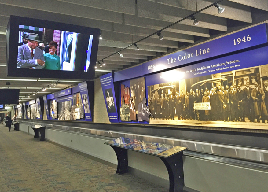
Along the way you’ll pass a series of art and photography installations. Between concourses B and C, is an excellent, museum-quality multimedia exhibit on the history Georgia’s capital. You could easily spend a half-hour here. My favorite section, though, is the forest canopy ceiling in the tunnel between concourses A and B. This installation, made of multicolor, laser-cut aluminum panels is the work of artist Steve Waldeck. Described as a “450-foot multisensory walk through a simulated Georgia forest,” it features an audio backdrop of dozens of native birds and insects.
What a welcome change it is, listening to the calls of sandhill cranes and blue herons instead of some idiotic TSA directive. It takes only two or three minutes to pass beneath the length of it, but these are about the most relaxing (if a bit psychedelic) two or three minutes to be found at an airport.
— The 9/11 MEMORIAL AT BOSTON-LOGAN
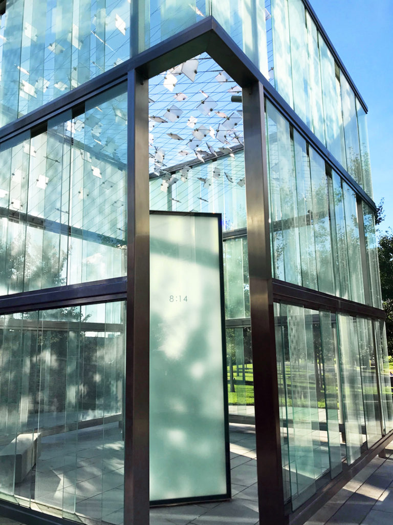
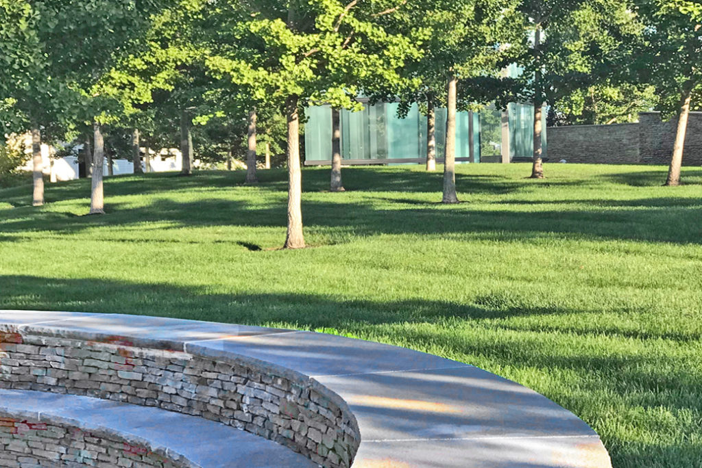
The idea of building a memorial to the 2001 terror attacks, at the very airport from which two of the four hijacked planes departed from, ran a fine line between commemorative and tasteless. It needed to be done just right. What they came up with is superb, and ought to serve as a model for such memorials everywhere.
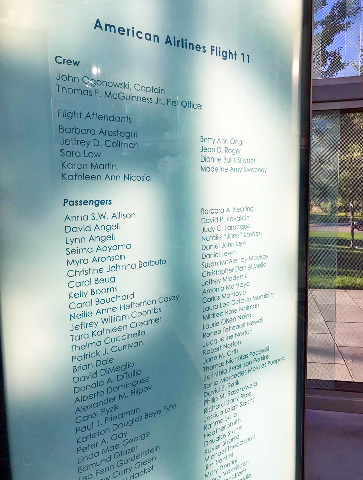
Reached along an ascending pathway that twists upward amidst grass and trees, the main structure is a sort of open-topped glass chapel, inside of which are two vertical slabs, one for each of the two aircraft that struck the World Trade Center — and mimicking the shapes, one can’t help noticing, of the twin towers themselves — engraved with the names of the passengers and crew. There’s one for American’s flight 11, the Boeing 767 that struck the north tower, and the other for United 175, which hit the south tower a few minutes later. The glass and steelwork allow the entire space to be flooded with silvery light, creating an atmosphere that’s quiet and contemplative without feeling maudlin or sentimentalized.
There are no flags or any of the crudely “patriotic” touches one might expect (and dread). It’s everything it should be: beautifully constructed, understated, and respectful.
Officially it’s called the “Place of Remembrance,” and it was built by the Boston-based firm of Moskow Linn Architects, as part of a public competition. The final design was chosen by airline workers, airport representatives, and family members of the victims. The engraved names are separated into columns of crew and passengers, and the names of off-duty United employees on the flight 175 plate include a small “tulip” logo of United Airlines. This might seem a strange touch, but this memorial was built primarily for the community of people who work at Logan Airport. Among the passengers and crew killed on the two jets were more than a dozen Logan-based employees.
But anyone is welcome, of course, and I only wish the memorial were more easily accessible. If you’re at BOS and have some time, it’s worth seeking out. It sits on a knoll just to the southern side of the central parking garage, at the foot of the walkway tunnel that connects the garage with terminal A. Find the tunnel and follow the signs.
— SFO DRAGONFLIES
Airport art installations of one form or another are awfully trendy these days. Paintings, sculptures and mobiles are popping up all over the place. And good for that. Among the best is artist Joyce Hsu’s “Namoo House” sculpture at San Francisco International.
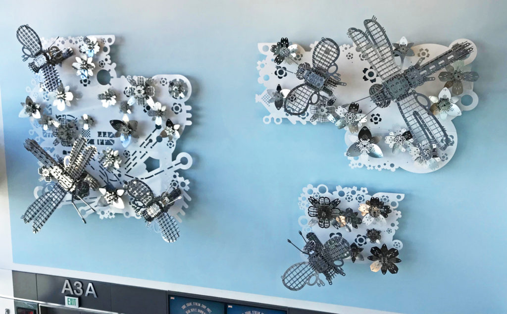
It’s a huge, wall-mounted display of aluminum and stainless steel insects that, in the artist’s words, suggests the way the airport “fuses science, nature, and imagination, to become the transit home for all passengers” — whatever that might mean.
To me, the metalwork moths and six-foot dragonflies represent both natural and human-made flying machines. And they remind me of the erector-set toys that I played with as a kid. Go to gate A3 in SFO’s international terminal, near the Emirates and JetBlue gates.

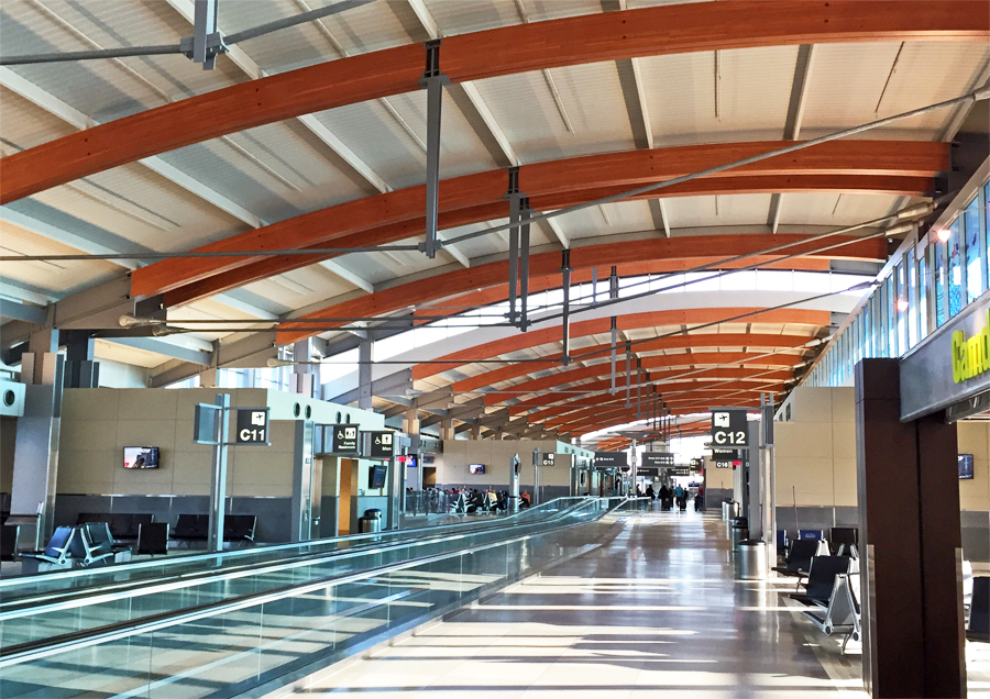
— RALEIGH-DURHAM’S TERMINAL 2
“Ah for the days when aviation was a gentleman’s pursuit, back before every Joe Sweatsock could wedge himself behind a lunch tray and jet off to Raleigh-Durham.” That’s from Sideshow Bob, in an old episode of the Simpsons (back when that show was still watchable), and we love the way he gives the words “Raleigh-Durham” an extra nudge of derision.
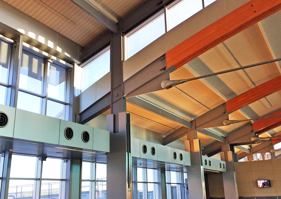
I guess Bob hasn’t seen RDU’s Terminal 2. Home to Delta, American, jetBlue and United, this is possibly the most attractive airport building in America. Opened in 2008, it was the first major terminal with a wood truss skeleton. The design earned architect Curtis Fentress, whose firm also designed Denver International and Korea’s impeccable Incheon Airport, the American Institute of Architects’ Thomas Jefferson Award. “A blend of the region’s economy, heritage and landscape,” is how Fentress describes it. “Terminal 2’s rolling roofline reflects the Piedmont Hills, while the daylit interior provides the latest in common-use technology. Long-span wood trusses create column-free spaces that offer efficiency and flexibility, from ticketing to security.”
All true. And unlike most airport facilities in this country, it’s quiet. Boarding calls and other public address announcements are kept to a minimum. This, together with the building’s architectural style and flair, almost makes you think you’re in Europe.
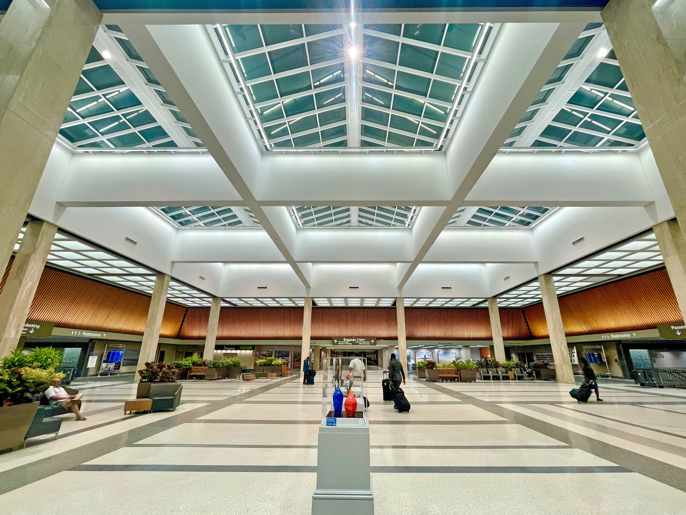
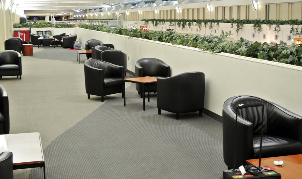
— THE QUIET AREA AT MINNEAPOLIS-ST. PAUL
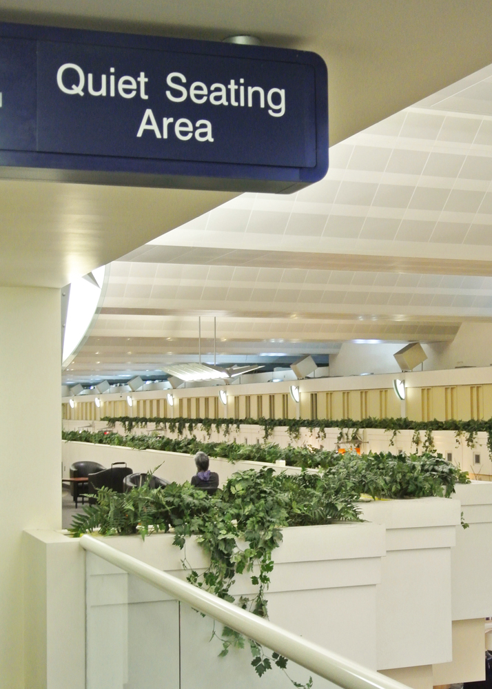
On the whole, the Minneapolis airport is about as architecturally unexciting as a parking garage. It’s an older complex with low ceilings and endless corridors that reminds me of the ’60s-era grammar school that I once attended. And like most American airports, it has a noise pollution problem. But unlike most American airports, it has a place to escape the racket: an upper-level “quiet area” overlooking the central atrium of the Lindbergh (Delta Air Lines) Terminal. It’s difficult to find, but worth the effort if you’ve got a lengthy layover and need a place to relax. Look for the signs close to where F concourse meets the central lobby.
The long, rectangular veranda has pairs of vinyl chairs set around tables. There are power outlets at each table and visitors can log in to MSP’s complimentary Wi-Fi. Delta provides pillows and blankets so that stranded passengers can nap. It’s a bland space without much ambiance, lacking the funky chairs, sofas, and other quirky accoutrements that you might find in Europe or Asia (Incheon Airport’s quiet zones are the coolest anywhere). But it does what it’s supposed to do. It’s comfortable, detached and peaceful. It’s a shame that more airports don’t set aside spots like this.
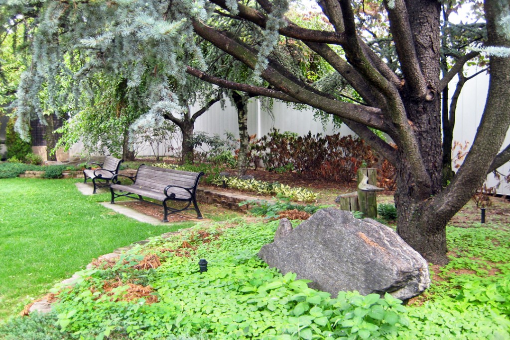
— THE La GUARDIA GARDEN
I’ve written at length about the Marine Air Terminal at La Guardia Airport in New York City. This historic art-deco building, in the far southwest corner of LGA, is one of the most special places in all of commercial aviation — the launching point for the Pan Am flying boats that made the first-ever transatlantic and round-the-world flights. Inside the cathedral-like rotunda is the 240-foot “Flight” mural by James Brooks. What few people know about, however, is the cozy garden just outside. Facing the building, it’s to the right of the old Art Deco doorway, set back from the street.
It’s a quiet, tree-shaded hideaway amidst, grass, flowers and shrubs. Grab a sandwich from the Yankee Clipper and enjoy it on one of the wooden benches. To get there, take the A Loop inter-terminal bus to the Marine Air Terminal. The spot is best appreciated in the warmer months, of course. Like the Marine Air rotunda it is outside of the TSA checkpoint, so you’ll need to re-clear security if you’re catching a flight.
Related Stories:
THE DECLINE AND FALL OF THE U.S. AIRPORT
PLANE, PRANKS, AND PRAISE: ODE TO AN AIRPORT