Author Archive

Welcome to “Hidden Airport”

Unexpected Pleasures at a Terminal Near You.

WITH SCATTERED EXCEPTIONS, airports don’t have a whole lot going for them. They’re noisy, dirty, poorly laid out, and just generally hostile to passengers. As my regular readers are well aware, I’ve made this point in numerous prior posts — perhaps too many times.

Now, so that I’m not always harping on the negative, here’s something different. “Hidden Airport” is a semi-regular feature highlighting little-known spots of unexpected pleasantness.

ALL PHOTOS BY THE AUTHOR

— NEW: Vonnegut at KIND

I wrote about the KIND Gallery in Indianapolis once before (scroll down). It’s time for a revisit, now that they’ve got an installation honoring the city’s favorite literary son, Kurt Vonnegut.

It’s funny how this happened: I was walking along the concourse towards my gate, and I said to myself: They should have something about Vonnegut here at the airport. Twenty seconds later I saw the KIND Gallery and its new exhibit.

There are books, of course, a typewriter (the significance of which is unclear), photos, and some of the author’s sketches.

This is a big one for me. I had long-time infatuation with Vonnegut’s work, beginning in my teens and running into my early 20s. I think I’ve read everything he published. Just a few months ago I re-read “Jailbird,” my favorite of his novels.


— FROM IDLEWILD TO JFK

No sooner did I write about the 100th anniversary presentation at Boston-Logan (see below), when I came across a similar setup at JFK. “From Idlewild to JFK” is a collage of photos following the history of the airport we all love to hate.

Kennedy is a dysfunctional mess half the time, and most of its architectural highlights have been demolished, but it’s nonetheless the most historically significant airport in the nation, if not the world, and this exhibit hits the bullet points: Saarinen’s TWA’s terminal, the Worldport, Pan Am 707s, the Concorde.

The whole thing is a bit half-assed, frankly. The airport deserves more than just a temporary gateside exhibit with a wall’s worth of black-and-white photos, and much is ignored (how is there no mention of I.M Pei’s famous “Sundrome” terminal?).

But it’s better than nothing, and a welcome distraction in the otherwise boring terminal 4. It’s over near the A gates. Have a seat in one of the economy class chairs and relax for a few.

The runway graphics on the floor are cute, I guess. Except there’s no runway 23 at JFK.


— Green Bay Game

I discovered this foosball setup near gate B2 at the pleasant little airport in Green Bay, Wisconsin.

I suppose it could get a little rowdy, but on the morning I was there a couple of kids were quietly knocking the ball back and forth.

Foosball is table soccer, which seems anathema in NFL-obsessed Green Bay (I was taking the Packers to Denver on a charter flight), but what the heck. It’s a welcoming, low-tech, old-school sort of distraction you don’t find much at airports anymore.


— Historical Logan

In terminal E at Boston’s Logan International, near the new security checkpoint, is an exhibit called “Logan 100,” commemorating the airport’s centennial. It’s a collaboration between Massport and the Boston Globe.

We Bostonians take a unusual civic pride in our little airport. More than a mere gateway, Logan is a part of the city. It’s a vibe you can feel as the seven LCD screens sequence through a century’s worth of archival photos, showcasing the people, planes, and events that helped shape Boston over the last century: VIP arrivals (The Beatles, Muhammad Ali), airlines that have come and gone (Northeast, Air New England), and the unforgettable headlines (the Blizzard of ’78, the arrival of Pope John Paul II in 1979).

What’s not here are Logan’s more infamous moments. The Delta and Eastern crashes, for example, or the World Airways incident in 1982. But that’s to be expected, I guess.

If you’re flying out, take a few minutes to stop by. You don’t need to be an airline nerd to appreciate the pictures.

Congrats to Massport and the Globe for having the good sense to come up with this. Now, if you’d please turn off those unbearable promotional PAs that blare in the connector walkway between A and E.


— BANGKOK GREEN

The new concourse at Bangkok’s Suvarnabhumi Airport has opened. A short train ride connects it to the main terminal. The gates are designated with “S,” for satellite.

In one of the more peculiar flourishes I’ve seen at an airport, several of the gateside waiting areas include a wide section laid with artificial grass. I’m not entirely sure what the intent is, but I like it.

Do with it what you will: sprawl out and relax; let your bratty kids run around. If you’ve got your clubs, maybe practice your swing. I laid down for a few minutes and stretched.

You don’t see a lot of green in airports, and the effect is strangely pleasant and refreshing — even if it’s fake. I think they should go one better and install some plants or small trees along the perimeter.


— MSPee BREAK

Yes, it’s a mosaic in the vestibule of an airport men’s room. Minneapolis-St. Paul, concourse F. The artist is Josie Lewis, who presumably is this person. (She may or may not have a similar installation in the nearby women’s bathroom. For obvious reasons I didn’t check. Maybe a reader can report back.)

It feels wasted, maybe, to have such a pretty work of art in such an easy-to-miss space, where the only people who see it are rushing to take a whiz. On the other hand, aesthetic non-sequitirs like this can be charming, popping up where you least expect them. It’s aviation-themed, too, if that’s not too much of a stretch.


— NORFOLK SPECIAL

This one isn’t so hidden. Indeed it’s the entire main terminal of the airport in Norfolk, Virginia.

I’ve always been fond of ORF, and was happy to find myself there on a layover recently, for the first time in at least a dozen years. We love the clean, almost Scandinavian-style architecture, the unencumbered spaciousness, the skylights. I was able to get two great photos; one evening and one daytime, from more or less the same vantage point.

U.S. airports can be dreadful. Sometimes it’s the smaller ones that set themselves apart. Norfolk is a great example.


— CHAIRLESS IN BOSTON

This one is an almost. It’s a squander.

Where we are is Boston, at the south end of the pedestrian bridge connecting terminals A, E, and the central garage, just at the top of the escalator. This tucked-away alcove, right at the end, is a sunny, quiet spot out of range of the loudspeakers, with great views of the tarmac and the skyline beyond. It’s a perfect little spot. Except, there’s nowhere to sit. A hideaway like this needs to be savored. We dig the bottlcap sculpture, don’t get me wrong, but why are there no chairs?

The pedestrian bridge, in place for about twenty years now, was a welcome addition to Logan and architecturally handsome, the floor inlaid fetchingly with sea life mosaics created by Somerville artist Jane Goldman. But if you’re making the walk, the experience is ruined by a constant bombardment of public address announcements. What could be a relaxing six-minute stroll is spoiled by a tape-loop of needless “Welcome to Boston” promotions and parking instructions. This alcove offers a relaxing escape, but without a place to sit it’s easily overlooked.

Note to Massport: Chairs. Get some chairs. And turn off the bloody PAs while you’re at it.


— CINCINNATI READING ROOM

Cincinnati International (CVG) isn’t as as bustling as it once was, with Delta drawing down service after its merger with Northwest. But it’s a fairly busy airport and a pleasant one at that. And over on concourse B you’ll find this little library of sorts.

It’s more of a book swap than a proper library; you’re free to abscond with the title of your choice, or exchange your half-read copy of “Our Country Friends” for something better. Or drop into that funky chair and peruse a few chapters of some shitty crime thriller.

I have to say, the pickings were pretty dismal on the day I dropped by. And it feels a little ad-hoc: we wonder if this isn’t just a place-holder standing in for some unrented retail space, soon to be yet another overlit shop selling magazines and phone chargers. Possibly, but we like the idea, and for the time being it’s a peaceful nook to steal away in.


— BAHAMA CHILL

Nassau’s Lynden Pindling International Airport, in the Bahamas, doesn’t give you much to write home about. It’s an unpleasant complex of noisy kids, dirty fast food joints and hour-long security lines. But just outside, in a space between the domestic and international departure halls, you’ll find this sunny oasis of greenery and water.

We had three hours between flights, and this was the perfect spot to wait things out. No children, no crowds, no racket save for the sound of birds (which, I discovered, is piped in through a speaker). There are shady spots with benches, and the free airport wifi signal is strong enough to stream on.

You can sit inside at a greasy table at KFC, or you can sit here.


— BLEACHER FEATURE

A vast, overcrowded echo chamber of concrete, Mexico City’s terminal two is one of the least enjoyable airport buildings around. Downstairs in the arrivals lobby, however, set back against the rear wall, is one of the most creative and idiosyncratic features I know of: a set of bleachers, seven benches tall and about fifty feet wide, where family and friends can wait for passengers to emerge from the customs hall.

Arrivals lobbies are often a chaotic scrum of jockeying and shoving, people calling out names and craning their necks. From the bleachers, you have a clear view across the crowd, and can easily pick out your mom, your son, or your mistress without having to wade into the mob.

Here’s a low-tech idea that saves space, is eminently helpful, and costs almost nothing. Why have I not seen this anywhere else in the world?


— GATESIDE GRAFFITI

Terminal Four at Kennedy Airport isn’t the most passenger-friendly building, but it has its spots, including the famous Calder mobile dangling from the departure hall ceiling (see below). Now, in the B concourse close to gate 25, you can enjoy this interactive wall mural. It was put in place last summer, presumably as a sort of post-pandemic morale booster for travelers.

It looks like most people just scribble their autograph, but some leave the names of whatever far-flung destinations they’re headed to — or wish they were headed to. You might get your clothes dirty, but grab a giant pencil and jump in there. Give us a “Bayonne, New Jersey,” or a “Smolensk.”


— INDY KIND

Indianapolis International is the rare gem among U.S. airports. It’s spacious, clean, and splashed with natural light. Best of all, and unlike almost every other airport in the country, it’s remarkably quiet. According to Airports Council International, IND is the Best Airport in North America, and the readers of Conde Nast Traveler have dittoed that sentiment multiple times.

Tucked into the A concourse, between gates 14 and 16, is the KIND Gallery. Created in partnership with the city’s Arts Council, it showcases the works of Hoosier artists. The gallery is neither large nor — depending on your tastes in art — particularly breathtaking. But it’s exactly what it should be: an engaging and relaxing little sneak-away spot. My favorite of the current installation is “Cloud Study 1-4,” a four-frame series of cloudscapes by an artist named Kipp Normand.

What do we do at airports? We kill time. And here’s a way to do it that’s a little more fulfilling than staring at your phone or browsing the magazine kiosk.

And about that name, “KIND.” Chances are you’re familiar with the three-letter identifiers for airports, Indy’s being IND. What you probably didn’t know, however, is that airports also have four-letter identifiers. These are assigned by ICAO and used for navigation and other technical purposes. Airports in the United States simply add the letter “K” to the existing three-letter code. KLAX, for example. Or KBOS or KSFO or KMCO. Or, in this case, KIND.


— KENNEDY CALDER

The next time you’re on the check-in level of terminal 4 at Kennedy Airport, look up. Suspended from the ceiling near the western end of the building is a sculpture constructed of balanced aluminum arms and trapezoidal panels. This is “.125,” the famous mobile made by Alexander Calder in 1957, back when JFK was still known as Idlewild Airport.

At 45 feet long, it’s supposedly the fourth-largest mobile in the world. For years it hung in the arrivals hall of the old Terminal 4, better known as the IAB (International Arrivals Building). Later it was moved to the departure level when the terminal was rebuilt. “People think monuments should come out of the ground, never out of the ceiling,” said Calder. “But mobiles can be monumental too.” The name “.125” comes from the gauge of its aluminum elements. What it evokes is, I suppose, in the eye of the beholder. One can detect a certain flight motif, though to me it looks more like a fish.

This wasn’t Calder’s only aviation-related project. In the 1970s he hand-painted two airplanes for Braniff Airways, including a Boeing 727 for the Bicentennial.


— UNDERGROUND ATLANTA

The Hartsfield-Jackson International Airport has its negatives, to be sure. The low ceilings, beeping electric carts and endless public address announcements make the place noisy and claustrophobic. Many of the windows are inexplicably covered over, and the airport’s skinny escalators were apparently designed before the invention of luggage. On the other hand, ATL’s simple layout — essentially six rectangular concourses sequenced one after the other — makes for fast and easy connections. It’s one of the most efficient places anywhere to change planes.

The neatest thing about it, though, is the underground connector tunnel. This is where you go to catch the inter-terminal train, but the better choice is to walk it. (If, like me, you purchased a Garmin Vivofit and have become obsessed with step-counting, note that it takes sixteen minutes and 1800 steps to cover the tunnel’s full walkable length.)

Along the way you’ll pass a series of art and photography installations. Between concourses B and C, is an excellent, museum-quality multimedia exhibit on the history Georgia’s capital. You could easily spend a half-hour here. My favorite section, though, is the forest canopy ceiling in the tunnel between concourses A and B. This installation, made of multicolor, laser-cut aluminum panels is the work of artist Steve Waldeck. Described as a “450-foot multisensory walk through a simulated Georgia forest,” it features an audio backdrop of dozens of native birds and insects.

What a welcome change it is, listening to the calls of sandhill cranes and blue herons instead of some idiotic TSA directive. It takes only two or three minutes to pass beneath the length of it, but these are about the most relaxing (if a bit psychedelic) two or three minutes to be found at an airport.


— The 9/11 MEMORIAL AT BOSTON-LOGAN

The idea of building a memorial to the 2001 terror attacks, at the very airport from which two of the four hijacked planes departed from, ran a fine line between commemorative and tasteless. It needed to be done just right. What they came up with is superb, and ought to serve as a model for such memorials everywhere.

Reached along an ascending pathway that twists upward amidst grass and trees, the main structure is a sort of open-topped glass chapel, inside of which are two vertical slabs, one for each of the two aircraft that struck the World Trade Center — and mimicking the shapes, one can’t help noticing, of the twin towers themselves — engraved with the names of the passengers and crew. There’s one for American’s flight 11, the Boeing 767 that struck the north tower, and the other for United 175, which hit the south tower a few minutes later. The glass and steelwork allow the entire space to be flooded with silvery light, creating an atmosphere that’s quiet and contemplative without feeling maudlin or sentimentalized.

There are no flags or any of the crudely “patriotic” touches one might expect (and dread). It’s everything it should be: beautifully constructed, understated, and respectful.

Officially it’s called the “Place of Remembrance,” and it was built by the Boston-based firm of Moskow Linn Architects, as part of a public competition. The final design was chosen by airline workers, airport representatives, and family members of the victims. The engraved names are separated into columns of crew and passengers, and the names of off-duty United employees on the flight 175 plate include a small “tulip” logo of United Airlines. This might seem a strange touch, but this memorial was built primarily for the community of people who work at Logan Airport. Among the passengers and crew killed on the two jets were more than a dozen Logan-based employees.

But anyone is welcome, of course, and I only wish the memorial were more easily accessible. If you’re at BOS and have some time, it’s worth seeking out. It sits on a knoll just to the southern side of the central parking garage, at the foot of the walkway tunnel that connects the garage with terminal A. Find the tunnel and follow the signs.


— SFO DRAGONFLIES

Airport art installations of one form or another are awfully trendy these days. Paintings, sculptures and mobiles are popping up all over the place. And good for that. Among the best is artist Joyce Hsu’s “Namoo House” sculpture at San Francisco International.

It’s a huge, wall-mounted display of aluminum and stainless steel insects that, in the artist’s words, suggests the way the airport “fuses science, nature, and imagination, to become the transit home for all passengers” — whatever that might mean.

To me, the metalwork moths and six-foot dragonflies represent both natural and human-made flying machines. And they remind me of the erector-set toys that I played with as a kid. Go to gate A3 in SFO’s international terminal, near the Emirates and JetBlue gates.


— RALEIGH-DURHAM’S TERMINAL 2

“Ah for the days when aviation was a gentleman’s pursuit, back before every Joe Sweatsock could wedge himself behind a lunch tray and jet off to Raleigh-Durham.” That’s from Sideshow Bob, in an old episode of the Simpsons (back when that show was still watchable), and we love the way he gives the words “Raleigh-Durham” an extra nudge of derision.

I guess Bob hasn’t seen RDU’s Terminal 2. Home to Delta, American, jetBlue and United, this is possibly the most attractive airport building in America. Opened in 2008, it was the first major terminal with a wood truss skeleton. The design earned architect Curtis Fentress, whose firm also designed Denver International and Korea’s impeccable Incheon Airport, the American Institute of Architects’ Thomas Jefferson Award. “A blend of the region’s economy, heritage and landscape,” is how Fentress describes it. “Terminal 2’s rolling roofline reflects the Piedmont Hills, while the daylit interior provides the latest in common-use technology. Long-span wood trusses create column-free spaces that offer efficiency and flexibility, from ticketing to security.”

All true. And unlike most airport facilities in this country, it’s quiet. Boarding calls and other public address announcements are kept to a minimum. This, together with the building’s architectural style and flair, almost makes you think you’re in Europe.


— THE QUIET AREA AT MINNEAPOLIS-ST. PAUL

MSP Quiet Area

On the whole, the Minneapolis airport is about as architecturally unexciting as a parking garage. It’s an older complex with low ceilings and endless corridors that reminds me of the ’60s-era grammar school that I once attended. And like most American airports, it has a noise pollution problem. But unlike most American airports, it has a place to escape the racket: an upper-level “quiet area” overlooking the central atrium of the Lindbergh (Delta Air Lines) Terminal. It’s difficult to find, but worth the effort if you’ve got a lengthy layover and need a place to relax. Look for the signs close to where F concourse meets the central lobby.

The long, rectangular veranda has pairs of vinyl chairs set around tables. There are power outlets at each table and visitors can log in to MSP’s complimentary Wi-Fi. Delta provides pillows and blankets so that stranded passengers can nap. It’s a bland space without much ambiance, lacking the funky chairs, sofas, and other quirky accoutrements that you might find in Europe or Asia (Incheon Airport’s quiet zones are the coolest anywhere). But it does what it’s supposed to do. It’s comfortable, detached and peaceful. It’s a shame that more airports don’t set aside spots like this.

MSP Quiet Area 2


— THE La GUARDIA GARDEN

I’ve written at length about the Marine Air Terminal at La Guardia Airport in New York City. This historic art-deco building, in the far southwest corner of LGA, is one of the most special places in all of commercial aviation — the launching point for the Pan Am flying boats that made the first-ever transatlantic and round-the-world flights. Inside the cathedral-like rotunda is the 240-foot “Flight” mural by James Brooks. What few people know about, however, is the cozy garden just outside. Facing the building, it’s to the right of the old Art Deco doorway, set back from the street.

It’s a quiet, tree-shaded hideaway amidst, grass, flowers and shrubs. Grab a sandwich from the Yankee Clipper and enjoy it on one of the wooden benches. To get there, take the A Loop inter-terminal bus to the Marine Air Terminal. The spot is best appreciated in the warmer months, of course. Like the Marine Air rotunda it is outside of the TSA checkpoint, so you’ll need to re-clear security if you’re catching a flight.


Related Stories:

THE DECLINE AND FALL OF THE U.S. AIRPORT
AMSTERDAM-SCHIPHOL: THE AIRPORT OF QUIRKY CHARMS
PLANE, PRANKS, AND PRAISE: ODE TO AN AIRPORT


Comments (144)

Feeling the Heat

August 5, 2024

“Meltdown” is the buzzword used when computer glitches throw air travel into disarray, as happened a couple of weeks ago. But is there a more literal application? How do extreme temperatures impact air travel? The question is important, as heat waves pummel the globe and we keep breaking records for the hottest-ever temperatures.

On the most basic level, hot weather affects air travel the way it affects most things: it makes people uncomfortable and wears them down. Things happen more slowly. With all that nonreflective asphalt and open space, airports become “heat islands,” subjecting people and equipment to sometimes unbearable conditions. Imagine what it’s like slinging suitcases out on the tarmac when the mercury hits triple digits.

Workers are subject to overheating, and so is their equipment: tugs, tractors, cart and lifts — all the myriad moving parts of airport logistics. Airplanes themselves, meanwhile, have a lot of internal machinery, both electronic and mechanical, and much of it runs hot to begin with. Throw in soaring temps and things can break down.

Aerodynamically, warmer air is less dense than cooler air, meaning that in hot weather a wing produces less lift. Jet engines don’t like this low-density air either, producing less thrust. Engines also are subject to internal temperature limits — exhaust gas temps, etc. — beyond which operation isn’t permitted. Together, this dictates higher takeoff and landing speeds — which, in turn, increases the amount of required runway.

What all of that means for travelers is that your flight might be weight-restricted and unable to take a full load of people or cargo. How much so will vary with the temperature and runway length.

Outright grounding of flights is rare, but at a certain point that can happen too. Some aircraft have a hard temperature limit — usually around 50 degrees Celsius — beyond which taking off simply isn’t permitted. We also get a detailed paper printout before each departure that factors in weight, temperature, wind, runway length, and so forth, providing us with the speeds, thrust, and flap settings that we’ll use for takeoff. Sometimes, above certain temperatures, data doesn’t exist.

So, you could say there are hard and soft limits. The aerodynamic limits are soft. That is, you don’t know for sure if a flight can safely depart, or at what weight, until you juggle the numbers. The hard limits are the absolute temperature maximums, set by the manufacturer, that you’re not allowed to exceed.

If your flight is weight-restricted — or canceled — you’re liable to get a dumbed-down synopsis over the gateside loudspeaker or from your pilots. Something along the lines of, “We’re sorry but it’s too hot to fly today.” This makes it sound subjective, or up to the whims of the crew, but in reality it’s more scientific.

Extreme heat is no fun for airlines or their customers. Unfortunately, you can expect more of it as climate change causes more and more extreme weather events, including extreme heat waves.

It’ll be especially interesting to see the effects on those carriers whose hubs are located in what are already the hottest places on earth. The Gulf Carriers, for example (Qatar, Emirates, and Etihad) or Saudia, or Air India. Fortunately for them, many of their long-haul flights arrive and depart in the dead of night, when it’s cooler.

All well and good, but I’ve failed to address the one question you’re lining up to ask: Why are are planes so damn hot when parked at the gate?

Well, a plane’s air conditioning is supplied one of three ways:

1. Via the engines. Air for the “packs” as the AC units are called (it’s an acronym from the words “pneumatic air cycle kit”), is plumbed from the engine compressors. This is the most effective way of cooling or heating the cabin.

2. However, planes can’t run their engines at the gate. And so, during boarding and deplaning, air is supplied to the packs via the plane’s APU, or auxiliary power unit. This is a small jet engine usually located up under the tail. The APU can power the packs as necessary, but they won’t run as robustly as when the main engines are supplying the air.

3. Via an external air supply. You’ll sometimes see fat, caterpillar-like hoses connected to the belly of a plane. These provide hot or cold air as requested from an air conditioning unit attached to the jet bridge. The effectiveness of this method tends to vary plane to plane and gate to gate.

Variations in 2. and 3., above, are the reason the cabin is sometimes sweltering. Or, in winter, freezing cold.


Related Stories:

TALKING TURBULENCE
THE DEICE MAN COMETH

Landing photo by Victor Forgacs, courtesy of Unsplash.
Emirates photo by the author.

Comments (10)

Things Going Bump

July 15, 2024

Everyone’s talking about turbulence. Each week now, it seems, we’re reading about this or that flight getting wracked around by unusually rough air. People are being injured, flights are diverting. In one case a passenger died after a Singapore Airlines flight hit severe turbulence over Southeast Asia.

Are dangerous turbulence encounters becoming more prevalent, or are they merely getting more attention?

I honestly don’t know. That’s a bummer of an answer, but I’m unaware of any stats indicating things one way or the other. For now it’s all pretty anecdotal.

That includes my own observations. For instance I seem to notice more and larger thunderstorms these days — over the U.S., over the Atlantic — than I did in years past, but that’s without any objective measuring; it’s just a hunch.

Either way, the media loves a scary-sounding airplane story. In an age when large-scale air disasters have become vanishingly rare, news sources — to say nothing of social media — have taken to hyping minor mishaps instead. That Singapore Airlines incident (the passenger actually died from a heart attack after the turbulence upset) got as much coverage as a crash that killed 200 people would have gotten in decades past.

Another factor is the number of planes in the air. There are more than twice as many commercial flights aloft at any given moment as there were a generation ago. More flights, more people; an uptick in incidents is inevitable.

It’s also possible that yes, turbulence is getting worse. It stands to reason that as climate change intensifies weather patterns and causes bigger, more powerful storms, flying will, to a small but perhaps measurable extent, be bumpier.

How much bumpier is impossible to know, but cases where passengers are hurt or aircraft are damaged will likely remain uncommon. (This is being studied as we speak, though you can expect any results pointing to climate change to set off further squabbling rather than, as it were, clearing the air.)

Also helping are the technological tools now at our disposal. The weather apps that we use in the cockpit are far more advanced than they were even five years ago, and are remarkably accurate when it comes to predicting the where, when, and how bad of turbulence — and how best to avoid it.

Even in worst-case turbulence encounters, meanwhile, the seat belt will probably keep you safe. The vast majority of turbulence-related injuries are suffered by crew members moving through the cabin, or passengers who weren’t belted in when they should’ve been. Flights might get bumpier, but the basics of staying unhurt remain the same.


Related Stories:

EVERYTHING YOU NEED TO KNOW ABOUT TURBULENCE.
SAFETY IN PERSPECTIVE

Comments (6)

Rise & Whine

July 18, 2024

DUBLIN, IRELAND

My custom is to set my alarm an hour or so earlier than our scheduled wake-up. For coffee and Instagram and such.

Having done so this morning, and now with nothing better to mull before the phone rings, it strikes that the name “Half & Half” is both redundant and meaningless.

If a product is half of something, then it’s automatically half of something else, no? A single percentage sum, by itself, should take care of it, obviating any need for a second one. This product should be called “Half.” (Which, admittedly, doesn’t carry much of a ring.)

Further, we ask, “Half & Half” of what, exactly? The name goes out of its way to overstate the obvious, yet fails to inform us what these respective halves consist of. Olive oil? Cranberry juice? Sand? Why the mystery? Indeed, as revealed in the picture above, and despite the kind assurance of ultra-pasteurization, the carton front displays no ingredients whatsoever.

Once again we find ourselves beguiled by the whims and foibles of corporate branding.

Now, in fairness to both mathematics and marketing, the second 50 percent of content could be easily diminished into additional fractions of whatever might compose it. The product could be half of one thing, but smaller amounts of multiple other things. Thus the name “Half & Two Quarters,” or some such.

This makes the whole conversation somewhat semantic (if less fun).

What we also see in the photograph, to our considerable dismay, is one of the more sadly devolved touches of modern carton manufacturing: the plastic screw top.

Those of us of a certain age remember the old-fashioned fold-back carton top. We miss the simplicity once employed to open, then quickly re-seal, a carton of milk or juice or “Half & Half.”

The choreography of the act was more complex than it looked, acquired through habit until performed without thinking, akin to tying one’s shoe: a tear, an unfolding, a bend, a squeeze.

The carton had no separate or moving parts. Rather, it was manipulated through a kind of muscle-memory origami. And when finished pouring, the resultant spout was, even more effortlessly, flipped back and restored to its original shape.

When did the transition to screw-tops begin? I want to say it was the early 1980s.

An inspirational debt is owed here to the author Nicholson Baker. Or vice-versa, perhaps, since this complaint was composed, at least in my head, before I’d read his wonderful book, The Mezzanine — the only other other place, to my knowledge, in which this subject is explored (page 42 in my edition). The book dates to 1986, which gives my timeline credence.

“The radiant idea that you tore apart one of the triangular eaves of the carton,” writes Baker, “using the stiffness of its own glued seam against itself.” The hand-formed, diamond-shaped opening was, “a better pourer than a circular bottle opening, because you could create a very fine stream of milk very simply.”

Indeed. The screw top, barbaric in comparison, with its jagged throw-away pull-ring and propensity to drip and splash, presumably provides more freshness, but at the cost of an almost magically elegant design.

POSTSCRIPT:

Equal parts curiosity and nostalgia had me attempt the old-style maneuver at home, on the carton shown below. Results were mixed. The basics still work, but the molded circular collar now gets in the way. The adhesive seems different as well. The seams are no longer as tolerant to tearing, neither do they re-fold with as much authority.

Comments (28)

Wrong Way Woes

April 23, 2019

DID YOU HEAR the one about the flight that went to Edinburgh instead of Dusseldorf?

On March 25th, a British Airways regional jet took off from London City Airport (LCY) bound for Dusseldorf, Germany. An hour or so later, the passengers found themselves in Edinburgh, Scotland. Not until the jet touched down did they realize they were headed to the wrong city.

Reporting on this incident has been inconsistent at best. Obviously certain outlets find the whole “the pilots flew to the wrong airport!” angle irresistible. But that isn’t what happened. The pilots, the flight attendants, and their aircraft were dispatched, flight-planned, and fueled for a trip to Edinburgh. That’s where they were expected to fly, and that’s where they went.

The passengers, on the other hand, thought they were going to Dusseldorf. In other words, the plane didn’t fly to the wrong city. The passengers were put on the wrong plane.

The breakdown was apparently between the technical staff (pilots, dispatchers and flight attendants) and the airport personnel who processed and boarded the passengers. The former were Edinburgh-bound. The latter were handling a flight to Germany — or so they thought.

But, you’re thinking, wouldn’t the “welcome aboard” spiel by either the pilots or cabin crew have given things away? We always mention the destination, don’t we? And surely flight attendants would have noticed “Dusseldorf” on the customers’ boarding passes, right? The signs and announcements at the gate, too, would have referenced Edinburgh. Could all of this have somehow been missed?

I, for one, can see it happening. Those PAs are sometimes perfunctory, and how many people are listening to begin with? And I can easily — easily — imagine a scenario where the gate personnel and flight crew found themselves on separate pages, regardless of any boarding announcements or signs above the podium. The fact this was a contract company flying on British Airways’ behalf, rather than an actual BA aircraft operated and overseen by BA personnel, could also have been a factor.

Embarrassing, sure. But not the same thing as two pilots taking their plane to the wrong destination. Which, I’m the first to admit, has happened. More than once…

In 2013, a Southwest 737 destined for Branson, Missouri, instead ended up at a small general aviation field nearby, touching down on a runway less than four thousand feet long. Only a few months earlier, a 747 freighter operated by Atlas Air found itself at the wrong airport in Kansas. In June, 2004, a Northwest Airlines flight from Minneapolis to Rapid City mistakenly landed at Ellsworth Air Force Base. And, in 1995, a Northwest DC-10 touched down in Brussels instead of Frankfurt. And this is only a partial list.

The idea of highly trained aircrews with troves of technology at their behest landing astray sounds, I’ll agree, amusing, quaint, or even patently ridiculous. So how does it happen? Improperly keyed coordinates? A navigational computer gone crazy? Or is there a more visceral, seat-of-the-pants explanation, such as a tired crew mixing up a pair of similar-looking runways.

If there’s a common thread, it’s that often in these cases pilots were flying what we call a “visual approach.” Most of the time, jetliners land using what we call an ILS (instrument landing system) in which controllers guide us onto a pair of radio beams — one vertical, the other horizontal — that form a sort of crosshair that we track to the runway, either manually or by coupling the ILS to the plane’s autoflight system. There are also what we call “non-precision” instrument patterns, in which a GPS-guided course takes you to a few hundred feet or less above the pavement.

But a visual approach, as the name implies, is almost entirely pilot-guided. This is when high-tech goes low-tech. Essentially you eyeball the airport through the windshield, report “field in sight” to ATC, get your clearance and go ahead and land. When available we back-up a visual with whatever electronic landing aids might also be available (an ILS signal, usually), But sometimes our orientation is based entirely on what we see through the window.

Visual approaches are very common, very routine, even at the biggest and busiest airports. Airline pilots perform thousands of these approaches every day without incident. However, you need to be sure of what you’re looking at. This is particularly true at smaller airports, where cues on the ground (roads, coastlines, buildings etc.) aren’t as obvious, and where you might not be familiar with the surroundings. Certain combinations of circumstances make a mistake more likely: a nighttime visual with low-altitude maneuvering, for instance, at an airport you’re not used to, with perhaps a similarly laid-out airport nearby.

In the winter of 1990 I was copiloting a small turboprop when we were cleared for a nighttime visual approach to New Haven, Connecticut. As it happens, the lights and orientation of nearby Bridgeport, Connecticut, appear strikingly similar to those of New Haven. After a minute or two we realized the error and corrected course. All of this happened far from the runway, and, somewhat in our defense, we were flying a 15-seat Beech-99 — a vintage relic from the Age of Aquarius, with as many electronic accoutrements as my mountain bike.

In addition to whatever human errors catalyze such events, weather and air traffic control (ATC), to name two, can lend a hand in getting from point A to, as it were, point C. In the case of that DC-10 finding its way to Belgium instead of Germany, air traffic controllers had been given the wrong information, and began issuing a long and complicated series of vectors and course changes to the crew, sending it toward Brussels. Airspace in Europe is complex and congested, and roundabout routings aren’t uncommon. Thus it wasn’t necessarily obvious to the crew that they were being led astray. By the time the crew realized they were being vectored to Brussels, they decided to land there rather than have to recalculate fuel reserves and orchestrate a last-second re-routing. In the end, it was probably safer to land at the wrong airport than the right one.

The act of landing a plane is, on one level, inordinately simple. At the same time, it’s a maneuver beholden to technology. It can be one, or the other, or both, depending on circumstances: the aircraft type, the approach being flown, the weather, the airport. There are times when an old-school, seat-of-the-pants skill set is exactly what’s required. Other times it’s all but impossible to find a runway without help from the instruments and screens in front of us. Either way, though, it comes down to judgment and decision-making. Despite everything you hear about autopilot and the alleged sophistication of modern jetliners, it’s the fight crew — the pilots — who are very much flying the airplane. Sometimes it takes an embarrassing mistake to make this clear.

Comments (2)

Memorial Day

May 27, 2024

IT WAS THE FRIDAY of Memorial Day weekend, 1979. I was in seventh grade, and a diehard airplane buff. It was a warm and sunny afternoon, and I was sitting in the dining room of the house I grew up in when the phone rang. It was a friend from school. He told me to turn on the television.

It had been a sunny day in Chicago, too, when just after 3 p.m. American Airlines flight 191, a McDonnell Douglas DC-10 with 271 people on board, roared down runway 32R at O’Hare International Airport, headed for Los Angeles. Just as the plane lifted off, its left engine broke loose. The entire engine, which weighed about eight thousand pounds, together with its connecting pylon and about three feet of the wing’s leading edge, flipped up over the wing and slammed back onto the runway.

As the engine ripped away, it severed hydraulic lines, releasing the hydraulic pressure that held the wing’s leading edge slats, deployed to provide critical lift during takeoff, in place. The slats then retracted, causing the left wing to stall. The plane rolled sharply to the left and plunged to the ground, disintegrating in a trailer park just beyond the airport perimeter.

Everybody aboard was killed, along with two people on the ground. With 273 fatalities, the crash of flight 191 was, and remains, the deadliest air disaster in U.S. history.

Descriptions of the accident are jarring enough. But we can see the horror, too, quite literally. Because a man named Michael Laughlin captured what might be the most haunting aviation photographs ever taken: a sequence of pictures showing the stricken jet literally sideways in the sky, in the throes of that ghastly twist to the left. And then the explosion. I don’t have permission to republish the photos here, but Google will oblige your queries.

When pylon cracks were found in several other DC-10s, the entire U.S. fleet was grounded for five weeks by the FAA. American, United, Northwest, Western and Continental were forced to pull all of their DC-10s from service. Foreign carriers were banned from flying DC-10s into the country.

NTSB investigators would eventually lay most of the blame on faulty maintenance practices and FAA oversight thereof. American — and other airlines, too — had been using a workaround procedure that caused unseen cracks to form in the engine pylon. But design flaws played a role as well. Unlike other planes, the DC-10’s wing slats were held in the extended position by hydraulic pressure, not by a mechanical lock. When the detached engine sheared the hydraulic lines, the slats retracted and the left wing essentially ceased flying.

The stall warning system also lacked a critical redundancy. It was powered only from the left-side electrical system, which had failed when the engine broke away. Thus, the pilots never realized their jet was stalling. Had captain Walter Lux and his crew understood, aerodynamically, what was happening, it’s very possible — likely, even — the catastrophe would’ve been averted.

I’d flown with my family on an American DC-10 on a vacation to Bermuda only two months before O’Hare. In the photo below you can see my mother (in pink), my sister (yellow), and my grandmother (gray), climbing the airstairs on the Bermuda tarmac. It’s possible — who knows — this was the same jet that would plummet to earth on May 25th.

The DC-10 had a checkered past even before O’Hare. In 1974, the horrific crash of Turkish Airlines flight 981 outside Paris was caused by a defectively designed cargo door and a poorly reinforced cabin floor. McDonnell Douglas, in a race wtih rival Lockheed to produce a three-engined widebody jet, had hurriedly built a plane with a door that it knew was unsound; then, in the aftermath, they tried covering the whole thing up. It was reckless, maybe criminal.

The plane’s reputation was such that some people refused to ride on one. This included one passenger booked on AA 191 who, learning that he’d be boarding a DC-10, switched his travel plans at the last minute, effectively saving his life.

After the 191 crash, American began swapping out the “DC-10 Luxury Liner” decals from the plane’s nose, replacing them with a more generic “American Airlines Luxury Liner.”

So where am I going with this? I’m not sure, to be honest. But here on the 45th anniversary of flight 191, on Memorial Day no less, the story feels important.

And it hardly needs saying that what happened to the DC-10 reminds us in no small way of the ongoing drama of Boeing’s 737 MAX. The similarities are uncanny: multiple crashes, a grounding, a manufacturer accused of negligence and shoddy design.

In the case of the DC-10, fines were paid, lawsuits were settled, technical fixes were put in place. (Among the lawsuits was one against McDonnell Douglas filed by the family of Captain Lux.) The plane soldiered on and Douglas regained the public’s trust (mostly; the 1989 United crash at Sioux City was another black eye). Time works wonders that way. The Clash would even shout out to the DC-10 on “Spanish Bombs,” from the London Calling album.

How things will pan out for the MAX, and for Boeing, remains to be seen.

For a thirteen year-old airplane nut in Boston, the most exciting thing about the FAA grounding in ’79 was a temporary influx of exotic airplanes into Logan. For a month carriers would substitute other types. United’s DC-10 to Chicago became a 747 — the only 747 I’d ever seen in that carrier’s livery. Swissair brought in DC-8s, Lufthansa sent 707s. And so on. New planes, new colors. I couldn’t get to the airport fast enough.

You can always count on a kid, I guess, to find a silver lining in something so awful as a plane crash.

The DC-10 wasn’t the prettiest plane of its day, lacking the grace of its main competitor, the Lockheed L-1011 TriStar. Both were three-engine widebody jetliners with room for around 250 people, and both were built with a center engine mounted in the tail. But the TriStar was the sleeker by far, with that center engine integrated into the rear fuselage through a sexy, S-shaped intake duct. Douglas just jammed the engine through the base of the fin, like they didn’t know what else to do with it. For the same reason, there was no mistaking it. Few planes had a more distinctive profile.

 
DC-10 PHOTO BY THE AUTHOR

Comments (45)

Deadly Turbulence

May 28, 2024

LAST WEEK, a passenger died and multiple more injured when a Singapore Airlines Boeing 777 encountered severe turbulence while en route from London to Singapore. The encounter happened over Myanmar and the flight diverted to Bangkok. Then, on May 26th, twelve people were hurt when a Qatar Airways jet hit severe turbulence during a flight to Dublin.

The media is off and running, no doubt triggering panic among the many flyers for whom turbulence is an acute fear.

If you’re one of those people, the first thing I can do is refer you to the turbulence essay found in the Q&A section of this website. You can read it here.

The second is to emphasize the rarity of incidents like this one. Any turbulence encounter powerful enough to hurt scores of people and tear away ceiling panels and overhead lockers, is a frightening prospect. And as climate change intensifies weather patterns and creates more powerful storms, we may see more of them. But they are, and should remain, exceptionally uncommon.

And maybe most important of all, it’s been reported that most, and possibly all, of the injured passengers were not wearing seatbelts. If you’re belted in, even the worst turbulence is unlikely to cause harm. Keep your belt on anytime you’re seated. Crews will often make a PA reminding you to keep your belt on on anytime you’re seated. This is a good example why.

We should also mention that the man who passed away on the Singapore flight died from a heart attack, not from any sort of impact trauma caused by the turbulence directly.

Prior to last week, if I’m counting right, the most recent turbulence-related fatality on a commercial jet occurred in 2009. Before that, a passenger was killed aboard a United Airlines flight in 1997. That’s two or three deaths in a roughly 25-year span, during which close to thirty billion — with a b — passengers traveled by air, aboard tens of millions of flights. Try to let those numbers sink in. This is the kind of thing even the most frequent flyer (or pilot) won’t experience in a lifetime.

What happened is unfortunate and scary, but it’s not a reason to freak out and cancel your flight because the turbulence app on your iPhone shows yellow.

The media focus, meanwhile, has been relentless. An accident in which one person died has received as much attention as a disaster that killed 200 people once would have. That’s not an exaggeration; I can remember when major crashes, in other parts of the world, would be buried on the second or third page of the newspaper. Most people didn’t even know they occurred.

This is one of those “for better or worse” things. It’s precisely because of how rare crashes have become that we hyper-focus on the smaller stories.


Related Stories:
EVERYTHING YOU NEED TO KNOW ABOUT TURBULENCE.
SAFETY IN PERSPECTIVE

Photos by the author.

Comments (13)

Crossovers

When Culture and Air Travel Intersect

Crossovers. That’s my name for those moments when history, culture, art or politics intersect unexpectedly with commercial aviation. They underscore the many ways, not always recognized, that air travel touches our lives.

This will be an ongoing series. I’ll add to it as opportunities come up.


— NEW: AEROPOLITICS

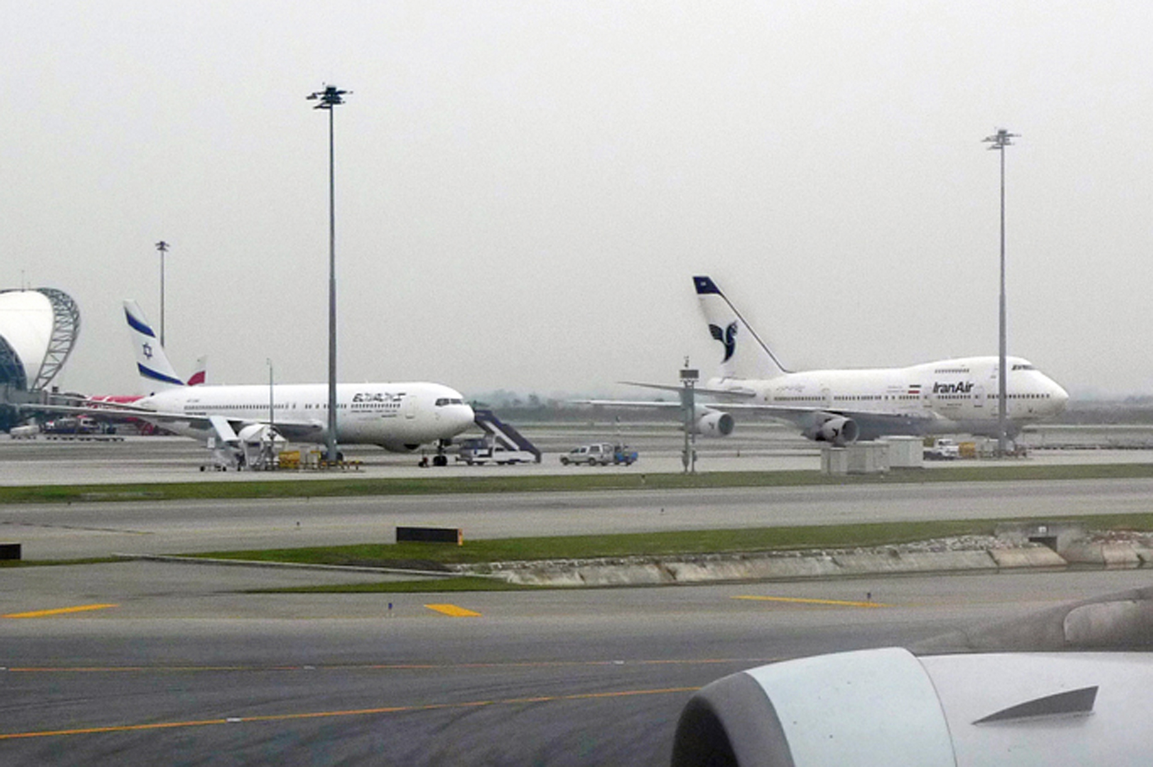
This one speaks for itself. A 767 of El Al, the Israeli carrier, buddy-buddy with an Iran Air 747 at Bangkok’s Suvarnabhumi Airport. I took this photo a decade ago, but the theme couldn’t be more timely.

Was this by accident, do you think, or were the authorities at BKK pushing for a sort of tarmac detente?

It’s hard to imagine, but in the days before the revolution in Iran, El Al flew scheduled service between Tel Aviv and Tehran. Iran Air had routes from New York to Tehran via London and Paris. Somewhere in a box is a picture of an Iran Air 747 that I took at Kennedy Airport in 1979, using an old Kodak Instamatic, from the rooftop parking lot of terminal 3.

Photo by the author


— HISTORY IN BLUE

This mural is in Portugal, near the city of Aveiro. Put up in the 1960s, during the glory days of Pan Am, it remains mostly intact. What makes it special is that it’s constructed using azulejos — the traditional, blue and white glazed tiles seen all over Portugal.

A similar Pan Am billboard can be found on a hillside above the Portuguese town of Leiria. Whether they’re actual azulejos or just painted to look that way I’m not sure. Either way it’s impressive, and Pan Am’s signature colors lend themselves nicely to the azulejo style. To think that so much effort and style was once put into an airline advertisement.

If you’re ever in Lisbon, be sure to visit the Museu Nacional do Azulejo, also known by its boring English name, the Tile Museum. It’s one of the city’s lesser known attractions, but home to one of the world’s largest ceramics collections, full of beautiful murals and mosaics.

Photo by Rui Vaz, courtesy of the Pan Am Historical Foundation.


— TAIL TALE

If you’ve followed the MH370 saga, you’ve no doubt grown familiar with the Malaysia Airlines logo. It’s seen all the time in news posts and articles. What you might assume is a meaningless abstract branding tool is in fact a cultural emblem: the logo uses the shape of an indigenous Malaysian kite known as the wau bulan, or moon kite.

True story: In 1993 I was in the city of Kota Bahru, a conservative Islamic town in northern Malaysia close to the Thai border, when we saw a group of little kids flying wau kites. At the time I didn’t realize where the airline’s logo had come from, but I recognized the pattern immediately. It was one of those crossover moments we aerophiles really savor.

Malaysia Airlines was formed in the early 1970s after its predecessor, Malaysia-Singapore Airlines (MSA), split to become Singapore Airlines and Malaysia Airlines. Both carriers are renowned for their service, and cabin crews of both airlines wear the iconic, floral-pattern Sarong Kabaya batik — an adaptation of the traditional Malay kebaya blouse.


Comments (12)

Graffiti Geek

April 11, 2024

THE PHOTO ABOVE was taken in Boston, a week or so ago in the newly expanded section of terminal E.

The plane is an Airbus A340. But what’s important is that yellow box. See it, along the right edge of the main boarding door? Any guesses what it’s for?

Turns out it’s a sort of dry-erase board — an empty placard onto which crewmembers can write greetings to the passengers. “Welcome aboard,” and that kind of thing. Maybe everyone signs their names, or someone draws a whimsical sketch of mountains or a palm tree, depending where you’re off to. On the interwebs you can see reels and photos of flight crews getting creative.

Things like this restore my faith in commercial aviation. It’s one of those personal, friendly little touches that customers remember. And it costs virtually nothing. (It’s bloggable too, and good for publicity.) Airlines need to think like this more often.

So good on Lufthansa.

And good on me. Because I thought of it first.

I once concocted my own version, from a template I’d made on my computer. I’d print out a sheet of paper, with my airline’s logo and the standard “Welcome Aboard” at the top. I’d write in the pilots’ names, the flight number, and the expected flight time. Then at the bottom I’d sketch a small pictorial of the arrival weather: a sun, for instance, or a raincloud, and next to it the temperature in both Celsius and Fahrenheit (these were usually international flights). Using masking tape, I’d affix the piece of paper to the same spot where Lufthansa’s yellow rectangle is.

It was a pleasant way of saying hello, I thought, and gave customers something to look at while bottlenecked at the end of the jetway.

Not everyone agreed, however, which is why I gave the practice up. More than once I was chewed out by flight attendants, who claimed that people were pausing to read the sign, which meant it took longer to board. Other times, pilots I was flying with took issue with their names being shared.

Whether or not these objections were justified, I stopped doing it. Which made me feel nostalgic, and a bit resentful, when I learned about Lufthansa.

But, I don’t know, maybe it’s best that I stopped. The geek factor was, I admit, a little heavy. Walking past that Lufthansa jet, I pointed out the yellow block to one of my colleagues, and told him how I’d once improvised the same idea using paper and tape. He shot me a puzzled look. “You did what?

Try to forgive me. I was back from a five-year furlough and excited to be flying again.

Litter. Litter would have been a valid gripe. I didn’t always remember to take down the sheets before the door was closed. And, no, they were never still attached when we landed. More than a few of my homemade greetings have long ago disintegrated into Jamaica Bay, no doubt, or found their way into airport storm drains.


PHOTOS BY THE AUTHOR

Comments (10)

Room With a View

March 28, 2024

I’M A SUCKER for a good wallopping view. And who isn’t? A view stirs the soul. It hits those hard-to-reach visceral notes in the way a simulation — a painting, say — can’t.

I’ve seen some spectacular ones: Machu Picchu on a clear day; Hong Kong from Victoria Peak; an unforgettable rainforest panorama from a canopy walk in Brunei; the fantastical mountains of Torres del Paine in Chile; and so on.

Sometimes, though, you want something easy, and that’s where hotel rooms come in. Here, the magic is presented to you, no effort required, to be savored from the comfort of your bed or balcony. It’s thrill and chill at the same time, both exciting and relaxing. I’ll take a three-star room with a view over a five-star room without one, any day.

I spend over a quarter of my life in hotels, at work or on vacation, so I’ve had my share. They tend to be cityscapes, mostly. My favorite of which, thus far, was a nighttime vista of Dubai from floor 60-something of the J.W. Marriott.

But urban panoramas get redundant after a while. It’s the greener settings I prefer. Mountains, oceans, forests. For instance, watching the sun come up over the Serengeti, from a tent at the Ole Serai safari lodge in Tanzania.

And I remember a place in Ecuador, overlooking a valley. It was a hacienda-style hotel perched at the top of a mountain. A floor-to-ceiling window looked out over the town, more than a thousand feet below. And it wasn’t a gradual or tapered descent; this was straight down, a sheer vertical drop. Was it Otavalo, maybe? Or Baños? It was twenty-five years ago and memory fails me. A dig through an old Lonely Planet guide is no help either.

Which is too bad, because the room was incredible. You could sit and watch the clouds sweeping past, below you. Standing outside, the atmosphere made a hissing noise. It was, best I could tell, the sound of the clouds condensing. I have no idea of this is even possible, but I swear those clouds made a noise as they billowed by.

Nothing would ever beat that view, I thought.

And nothing did, until just a few weeks ago, when I stayed at the Ladera Resort on the Caribbean island of Saint Lucia. I’d broken the bank for a winter vacation, and while I expected the view to be special, judging from the online pics, I didn’t expect it to be this special. Stepping into the room, I actually laughed out loud.

It was one of those open-plan rooms with only three sides. The fourth side was a huge, unscreened balcony facing directly toward St. Lucia’s famous Pitons — a pair of party hat peaks, nearly three-thousand feet tall, that are part of an ancient caldera. The private pool was special enough, but it was the view — a sort of West Indies Machu Picchu — that stole the show.

That’s a custom of mine, by the way: immortalizing this or that gorgeous view with my ridiculous feet in the shot. Visit my Instagram stream and you’ll see others. Here’s a more pure version, sans toes.

Imagine feasting your eyes on that, dawn to dusk. I didn’t feel much like leaving the room.

So that’s the new number one. It was also the most expensive hotel room I’ve ever paid for, and to help assuage the guilt of having blown so much money, I think of it as compensation — a reward for all of the shitty and underwhelming views I’ve been stuck with over the years: all those times I’ve pulled back the curtain to behold a parking lot, an HVAC unit, an expanses of urban decay or, as Jonathan Richman put it, suburban bleakness. Heck, in Amsterdam one time I had a hotel room with no windows.

Meditating on the Pitons helps make up for what happened to me last summer at the Pullman hotel in Dakar, Senegal. I’d stayed in the Pullman many times, and my favorite thing about it was the view from the upper floors of the harbor and, in the distance, the famous (or infamous) Goree Island.

It had been several years since my last visit, and I was excited. But when I got to my room, a surprise was waiting. The top photo shows the view from my room in 2009. The lower photo shows almost the identical view in 2023. Speaks for itself. Progress or something.

The curved building with the triangular top is an old property that I once nicknamed “the Graham Greene Hotel,” because it reminds me of the sort of place where the famous novelist would have stayed, making journal entries in a sitting room with potted palms and a ceiling fan.

I was pleased to see it’s still there, and looks like it’s been renovated. The sight of that monolith, however, was devastating.

That’s nothing, though, compared to some other places. Allow me revisit a few…

If I remember right, this first one is a Marriott outside Detroit. Cars, the Motor City… I guess it works, in a way.

From the Crowne Plaza we take in a splendorous HVAC array, with the Atlanta airport in the distance. Traffic, fast food, a strip mall: it’s everything you love about America. In a gloomy overcast to boot.

Is there anything more aesthetically demoralizing than a gas station? Though I guess you can barely see it, with all the ducting in the way. I forget where this was, which is just as well.

A view you can hear. The roar and churn of the cement mixer, some jackhammering, a concrete drill or two. It’s Oakland, California, but I don’t recall the hotel.

The exquisite colors of Phoenix, Arizona. There’s a desolation to this photo that’s strangely evocative. Or not. I’m just trying to make it seem less ugly.

When you think of the island of St. Maarten, chances are this view from the Sonesta isn’t what you picture.

Seen enticingly from the Five Towns Inn, this Burger King is one of many fine dining establishments along Rockaway Turnpike in Lawrence, New York, just outside Kennedy Airport.

And this last one is Newark. Because of course it is.

I’ll add to this list as the misfortune presents itself.

(I need to confess, however, that the last photo isn’t mine. It was submitted by another pilot with whom I was commiserating on this topic.)

And don’t put too much stock in which particular hotels these are. Views can vary significantly room to room. A 40-th floor view from one side of a building might be a lot prettier than a third-floor view from another.

Maybe it’s ironic, meanwhile, to hear an airline pilot going on about views from the ground rather than those from aloft. So it goes, though. As regular flyers know, airplane scenery tends to be muted and indistinct. Altitude sucks away much of the grandeur. I’ve seen some amazing things — the glaciers of Greenland, the Sahara at dusk — but it’s mainly terra firma where the beauty is.


ALL PHOTOS BY THE AUTHOR, except for “Newark Afternoon,” courtesy of Dave English.

Comments (21)