


December 3, 2021. Odd Angles.
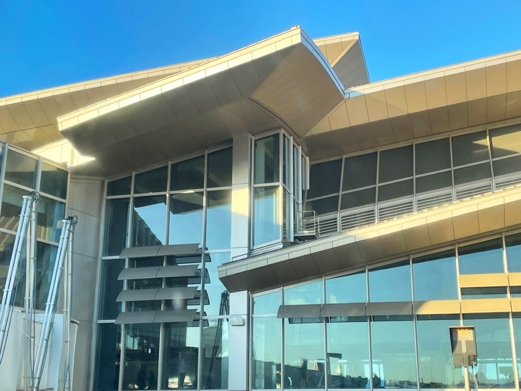
This photo, snapped at LAX, shows a segment of that airport’s Tom Bradley Terminal. Now, I’m all for architectural flourish, but this manic convolution of angles makes my head spin. Have you ever seen such a complicated design?
The interior of the Bradley is equally disorienting. Arriving from overseas the other day, we endured an incomprehensible series of ups, downs, lefts, rights, switchbacks and escalators before finally reaching the immigration hall.
This is not unusual. I had a similar experience at Miami a couple of months ago. The journey — and it was very much a journey — from jetway to the passport kiosk was like finding one’s way through a topiary maze.
Why? Why are so many airport buildings constructed like this? Is it simply to drive the price up?
Strikes me that airport terminals should better resemble railway terminals, with a large central hall and offshoots for boarding and deplaning. Organized and simple, with a minimum of twists and turns. Such a blueprint, as many of the grander railway terminals have proven, still provides ample opportunity for the designers to show off.
Indeed many airports follow this model, to varying degrees. But many do not, and passengers are left to navigate their way through an origami of architectural excess.