

February 7, 2022. New Look.
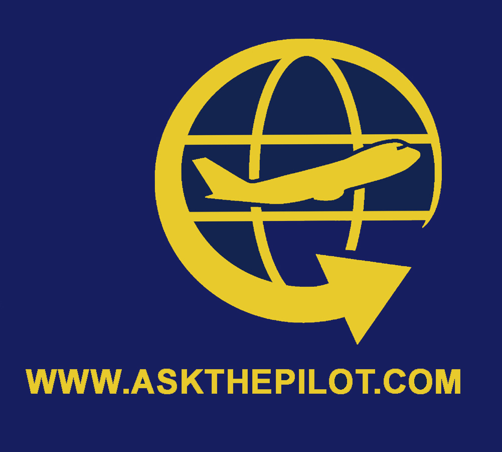
After a long delay, I’ve at last gotten around to introducing a new logo. Refresh your browser, and behold.
Try not to hate on it. If you find it unexceptional, remember that I subscribe to the belief, espoused by more than one famous designer, that a truly effective logo must be unencumbered enough for a child to draw freehand, from memory, with a pencil. It should not rely on colors, textures, or complicated details. Hence the simplicity.
Regular readers know of my disdain for the “swoosh” motifs that have become so commonplace in modern branding. Hopefully that circular arrow isn’t too much of a violation. It’s a swoosh, I guess, but it conforms to the above rules and doesn’t feel gimmicky to me.
I wanted to stay with the basic elements of the original logo: the arrow, the globe, the plane. The arrow and the globe suggest travel. The plane is a plane, though you’ll notice I replaced the generic propeller version with a 747 silhouette — because of course I did. There’s no “official” color for the mark. It looks good in gold, white, black. It’ll often be set against a navy blue field, as that’s the background color of the website, but the pattern itself is the important part, not the colors.
Now I can finally get some hats and t-shirts printed up.
I had nothing to do with the old logo. It was assigned to be by the editors at Salon.com twenty years ago, when I began writing a column for that magazine. I have no idea who created it. Salon also conceived the “Ask the Pilot” name, which I confess I’ve always despised. I might change that too, if the right replacement came along.