
October 3, 2019. Word Shapes.
I want to know more about the Emirates typeface — the lettering the airline uses in its marketing, advertising, and so on. Who came up with it? Does it have a name? What is it meant to evoke?
It looks like this…
Or like this, as seen on a first class menu…
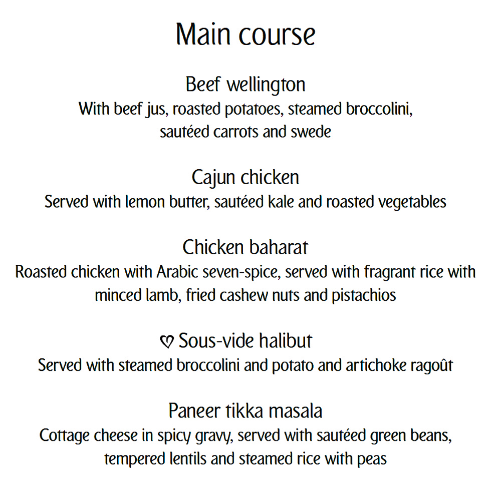
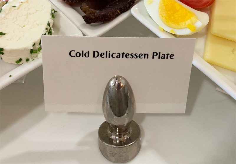
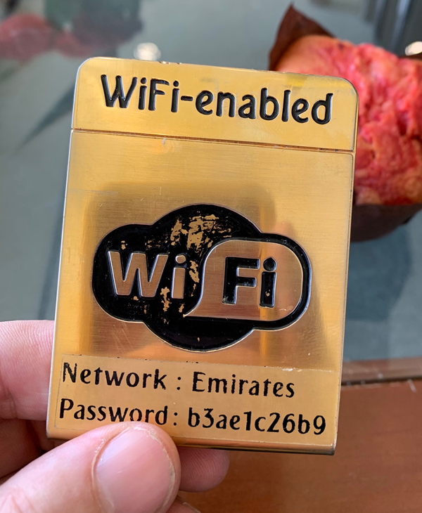
Typeface design has always been part of a carrier’s branding, but I’ve never seen an airline use a proprietary font with such devotion. At Emirates it’s everywhere: on the side of the plane, in its promotional literature, and on virtually every printed sign or notice. I was in the Emirates lounge in Johannesburg the other morning and even the little buffet placards used it.
It’s handsome and ultra-distinctive, with just a dash of — what can we call it? — exotic flair. Notice how the jaunty cant of the lowercase “e” and “a” synchs with the airline’s calligraphic logo. It’s a subtly powerful tool for communicating the Emirates identity, and I wish more airlines did this sort of thing.
Photos and thumbnail composite by the author.