October 9, 2024. Des Couleurs Magnifique.

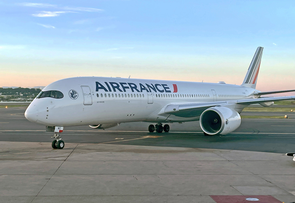
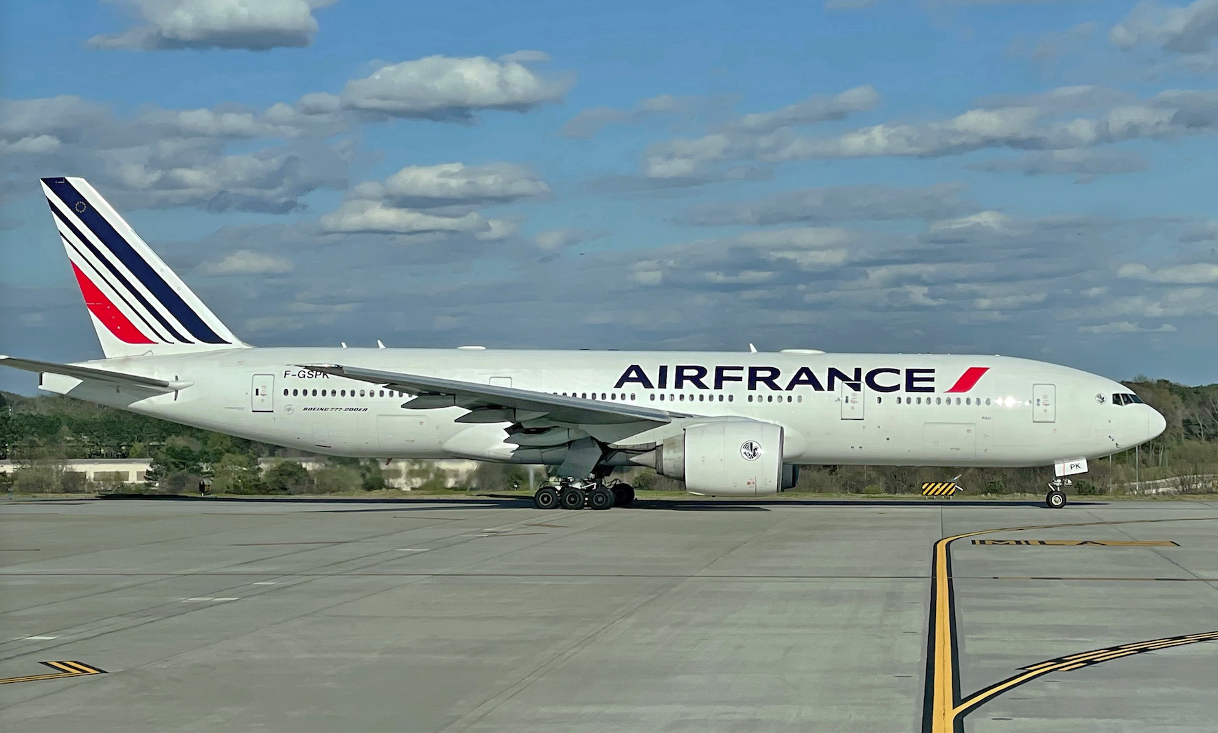
Apropos of nothing, a shout-out to Air France for the longevity of its paint scheme. It’s donwright impressive how long the airline has worn its current livery. As well it should; it’s one of the industry’s best.
Back in the late 1970s, Air France was one of the first major carriers to ditch the horizontal “cheat line” striping and move to what aviation nerds call the “Eurowhite” look. And for more than four decades it’s served them well.
There have been minor changes over the years. The tail stripes have been softened, and, most recently, the typeface was revised and now spells the compound “AIRFRANCE.” But the template overall has stayed the same. I can think of no other airline whose colors have been so consistent.
The circular logo near the cockpit (see upper photo) is called the Hippocampe Ailé, and it dates to the 1930s, featuring a Pegasus head with the tail of a mythical sea dragon. We’re glad Air France hasn’t ditched this emblem, deeming it too anachronistic or some such. On the contrary, they’ve enlarged it and moved it to the front.

Photos by the author.


